Van Gogh at the Lake – Atmospheric Perspective

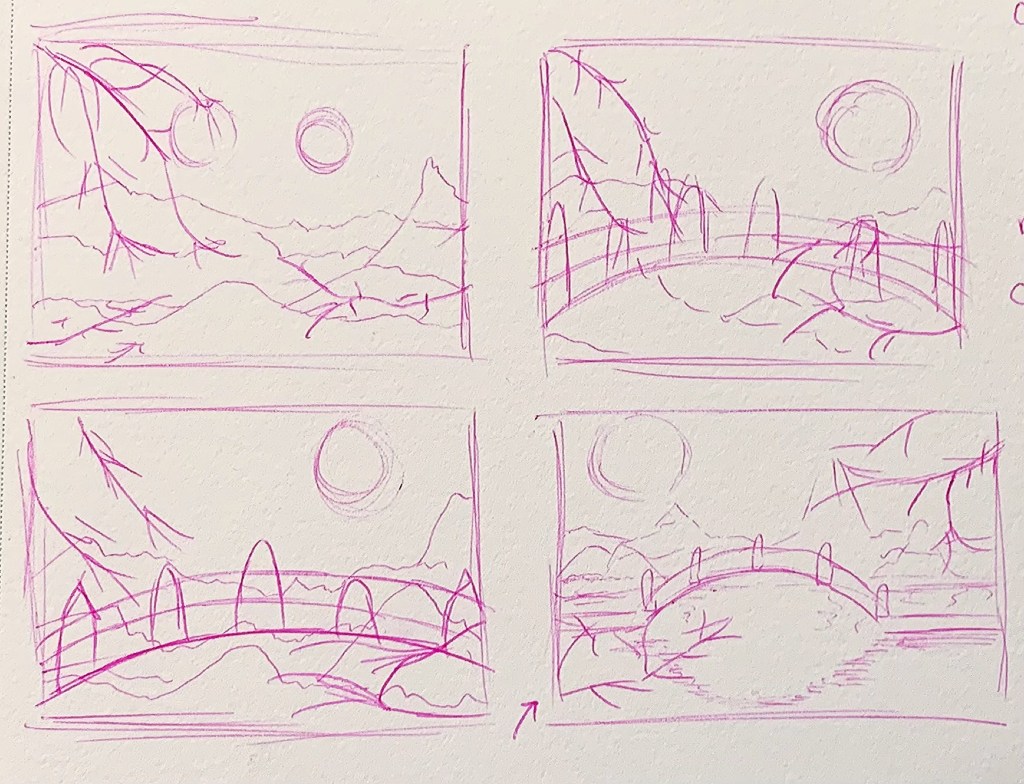
Upon looking through the images in my camera roll I felt that none of them really had a clear sense of foreground, middle ground and background which led me to make the decision to combine two images. I first decided on the image of a lake I took in Angel Fire NM as what I wanted for the background but when it came to the foreground I had two possible options that I was considering. The first was an image I took at the Van Gogh Experience and the second was of some lilies. After drawing a few thumbnail drawings I decided to go with the image from the van gogh experience because I wanted to experiment with drawing the large swirl and have it overlap with other elements of the images.

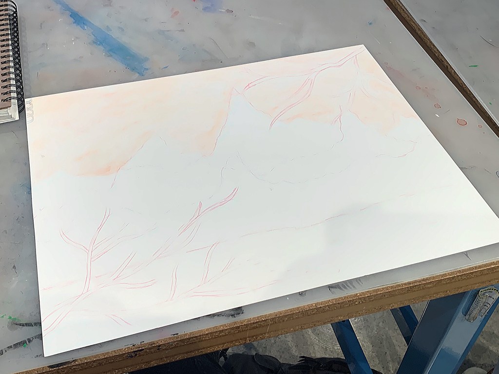
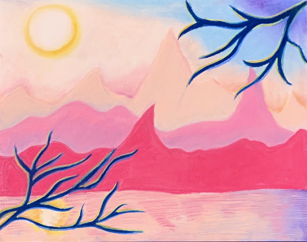
Starting off the drawing process I struggled with the order in which I should approach each section because though I knew starting in the back and moving forward would be a good strategy, I was having trouble deciding what tones needed to be in the background in order for it to push back in space. After working in class I made the decision to start fresh since I wasn’t happy with how I started to tone the background. In the new attempt I started off by working on the sky and really wanted to experiment with filling in the area relatively loosely and did the same with blocking in the different sections of trees in the background. Moving to work on the foreground I wanted to focus on making sure that it had the most variation in tone.

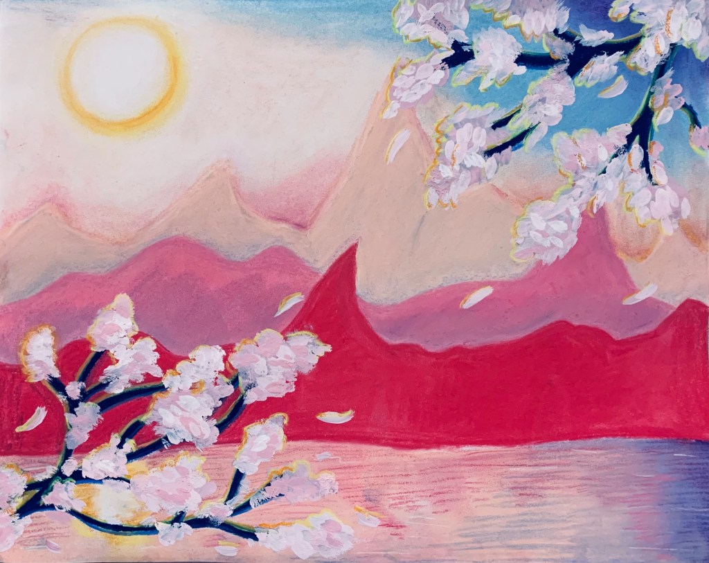
Though for a while working I just wasn’t going as dark in some areas as I should have been which made it so the swirl and houses in the front were not coming forward like they should. After critique I went back in and redefined some areas along with adjusting the size of the lanterns so that they moved back in space. In making areas darker especially the swirl I think I was able to create a more distinct sense of foreground middleground and background.

Atmospheric Perspective: Mr. Shell and His Family

When going through this assignment’s brainstorming process, I went through my camera roll to see if I had any pictures that demonstrated atmospheric perspective. I found a few images that I could see myself using for inspiration for my assignment and then asked the professor which one she thought would be best as I really didn’t care which one I did.

I started my sketch for my drawing a little confused as to how I should approach drawing a conch shell as there are a few of them in my drawing. As I started to sketch out my shells I started to label what colors were in the undertones of each shell so that I wouldn’t have to continuously be looking at my phone at the reference photo. After sketching out my project I started to add color in the form of colored pencil and proceeded to shade and add some dimension by using graphite. I am not yet done with my drawing but, will update you when I am. I think that my drawing would benefit by adding some more texture in the foreground. I was also encouraged to add some more contrast in the foreground. I plan on adding a little more to my drawing before I deem it complete. – Erin

Atmospheric Drawing

For my atmospheric drawing I chose to use a frame from an old video project I did of my little sister as my reference. I referred to the image for the sizing, spacing and objects in the scene, but went off of script and chose a different color scheme. I wanted to achieve a more moody atmosphere and attempted to recreate the kind of weather that happens before it storms. When the sky turns gray, the grass looks yellow, and there’s a cool breeze. 

Continental Club: Atmospheric Perspective

I started this project by looking through some old photos of mine on Lightroom, which is where I found my source image.

I decided to just focus on one panel of the panorama, which is the part with two people on stage and another man looking on. I chose this image because I like the story behind it, the man on the right is going to play on stage next and he’s watching his son’s band open for his.

I was really worried about this project, because my basic linear perspective knowledge is very rusty, but Hollis helped me a lot with getting my angles right. I was also worried that this image was too ambitious because I’d have to draw the human figures and I haven’t studied anatomy at all and have no idea how to draw people properly. My solution to this was to backlight my drawing and have the figures be silhouettes.

After translating what was in my sketchbook, I got a little stuck and couldn’t figure out what was wrong with it. Then I realized I forgot the ceiling.

Lastly, I added the ceiling, fixed some scaling issues and added final details. Overall, I’m happy with it; I want to continue to polish it up but I’m afraid I won’t have time with the way my life has been lately:(

The Pink Range – Atmospheric Perspective Project

I struggled with an idea for this project for a bit, so I turned to scrolling through Pinterest to help generate ideas. From the scrolling, I came across a beautiful scenery of this Japanese bridge over a large body of water with cherry blossoms and tree branches in the foreground. Then, I got this picture of a beautiful sunset happening over mountain ranges. From these two images, I thought about combining my favorite elements of both pictures into one piece.

I then made some thumbnail sketches to get a better idea of what I wanted and to see where each element should go.

I settled with a combination of the top-left and the bottom-right for my final piece. From there, I sketched my drawing into a bigger mix-media page.

I also decided to use pastel sticks as a way to experiment with a new medium and thought it would be an easier way to achieve the color gradients that I wanted the piece to capture especially with the sunset sky and the reflections in the water.

I kept the piece relatively within a pinkish tone and decided to make the branches a dark blue since I felt having them be black would be too harsh for the piece.

Lastly, I finished the entire piece by mixing some dust of the pink and red pastel sticks with white acrylic-gouache paint to get an opaque look for the cherry blossoms on the branches. For the cherry blossoms, I used varying shades of pink and white to get a look of the different shades cherry blossoms to have especially under the sunset lighting.

After getting feedback for my work, I was suggested to try making the cherry blossoms more in focus and defined by using a technical pen to trace some of the cherry blossoms so they have that more defined form like they would being in the foreground. Then, I was told that the closest mountain range in red/hot pink should be made a little softer since it felt to defined for being far away so I tried to blend out the red/hot pink pastel more to be softer.

In the end, I did not expect this piece to turn out as well as it did, and I ended up really liking the end result. I am proud of myself for experimenting with a medium out of my comfort zone and using what I could to keep the theme of using mediums I don’t normally use in my work. I enjoyed the process and finishing this piece to the very end.

David Adey

David Adey is a multimedia collage artist residing in San Diego, California. He began his career doing graphic design work for highly renowned companies such as Hasbro and Pepsi, and eventually ventured out more towards physical media. Most of his current work revolves around collage and unification of differing parts. He places emphasis on contrast and unification; In his artist’s statement, he explains “An experienced designer learns that the more distinct the elements are from each other, the more effectively they work together. Unity then is not achieved through uniformity but through juxtaposition.” Adey creates juxtaposition within his work by collecting a variety of colors, textures, and shapes, and incorporating them all into a single coherent piece. Another concept explored throughout Adey’s work is the relation between the human body and the digital world, as seen in his works Hide and Gravitational Radius (view below) which tie back to his roots in the world of marketing and consumerism.

Adey’s work has been exhibited in multiple galleries around the globe, including the Minneapolis Institute of Art and the Orange County Museum of Art.

David Adey, Gravitational Radius, 47 x 47 x 3 1/2 , digital images, laser-cut digital print, pins, foam panel, 2012
Description: “Fashion and celebrity images are collected from various online sources via Google
image search. Digital prints are laser-cut and pinned to a foam panel.”

David Adey, Inspiration/Expiration, Ceramic, 2016
Description: “A permanent public commission for The County of San Diego, installed at the pedestrian entrance to the parking structure at Cedar and Kettner Blvd. in downtown San Diego. Approximately 3,300 hand made clay impressions of various tire treads are glazed in over 500 unique colors.”

David Adey, Hide, 120 h x 54 w x 3 1/2 inches, Laser-cut paper, fluorescent acrylic and pins on pvc foam panel. 2014.
Description: “Three dimensional scan of artist’s body containing over 75k triangulated faces is unfolded and flattened in one piece, then divided into a diptych.”

Sources:

https://www.davidadey.com

https://www.pointloma.edu/faculty/david-adey-mfa

https://www.artistaday.com/?p=13285

Jeremy Lipking

Jeremy was born in 1975 at Santa Monica, California and is 47 years old. There’s not much about him, but from his website, he uses oil paint for all of his work, and it looks very realistic. Many viewers are drawn to his art thinking that it looks just like a photograph. However, Lipking’s vision is the opposite of what a camera does. A photograph tends to flatten an image, reducing all relationships of color and shade to a stiff mechanical pattern. Lipking’s skill lies in his ability to probe in and around his subject. With a highly sensitive eye, he sees nuances of value and hue that the camera and most people can never see. More incredibly, he is able to translate his highly nuanced vision into a painted image. Seeing one of his paintings involves entering into the pictorial world he has created. Like all great realists, he has the ability to generate powerful fictions. Here are 2 of my favorite paintings of his

https://www.lipking.com/

Judy Pfaff

For my research I decided to do Judy Pfaff. She was born in London in 1946. She got her bachelors degree from University Saint Louis and her MFA from Yale University. Pfaff works in multiple mediums such as painting, sculpture, printmaking, etc. She uses materials such as, string, lights, or really any material that can be used to a larger scale. She works with spacial awareness that completely changes the environment showing a lot of spiritual and historical standpoints. Judy Pfaff uses her space in rooms to a unique degree as to how each piece she installs is different from the next.

She wasn’t only an installation artist, she was also a teacher. She taught at the California Institute of the Arts and now works at Bard college as the co-director.

Here is two examples of her art installations:

Transforming Traditions 2000-01

https://www.judypfaffstudio.com/#/sculptors-recollected-2018/

2000-2001 Judy Pfaff: Transforming Traditions

Hedwige Jacobs

Hedwige Jacobs is a Dutch artist who was born in Singapore, but currently lives and works in Houston, Texas. She has a background in Fine Arts, having earned a BFA from the Royal Academy of Arts in the Netherlands and an MFA from the Pennsylvania Academy of Fine Arts in Philadelphia. Her work has been exhibited in various galleries and art spaces such as Women & Their Work and DiverseWorks in Austin, Texas, The Amarillo Museum of Art in Amarillo, Texas, Friedman Benda Gallery and The Drawing Center in New York City, and Galeri Utama and ION Art Gallery in Singapore.

Jacobs work explores themes related to human interaction and society. She has developed a specific visual language over time, which is evident in her work. This language often includes imagery related to organic growth and woven structures. Her art also depicts lively human interactions and environments that suggest a specific event or place.

Here are some examples of her work:

“peeking inside! sharing space? the space within”, 2018, BOX 13 window box space site specific installation

http://www.hedwigejacobs.com/albums/pools/

http://www.hedwigejacobs.com/albums/pools/

Sarah Sze

For this week’s research post I decided to research the artist Sarah Sze. She was born in Boston in 1969 and attended Milton Academy, Yale University, and School of Visual Arts. She is currently a notable professor of visual arts at Columbia University. Sarah is an American artist who focuses on challenging the limitations of paintings, sculptures, and installations. She creates works from references that cannot be captured in the world by a camera. Ideas can often be limited to reference photos and her work and, to me, feels like something out of an abstract dream. Her work is influences by Futurists, Cubists, and her love for Russian Constructivists. Her installations in particular, draws from Modernist traditions of a found object and then builds large-scale installations using ideas from said object(s). Some notable mentions: Sze represented the United States at the Venice Biennale in 2013. She also won the MacArther Fellowship in 2003. Her Contemporary use of collage, space, and architecture will continue to help other artists “challenge” their own artistic limitations.

12 Landscapes (After Object), 2019 Hidden Relief, 2001