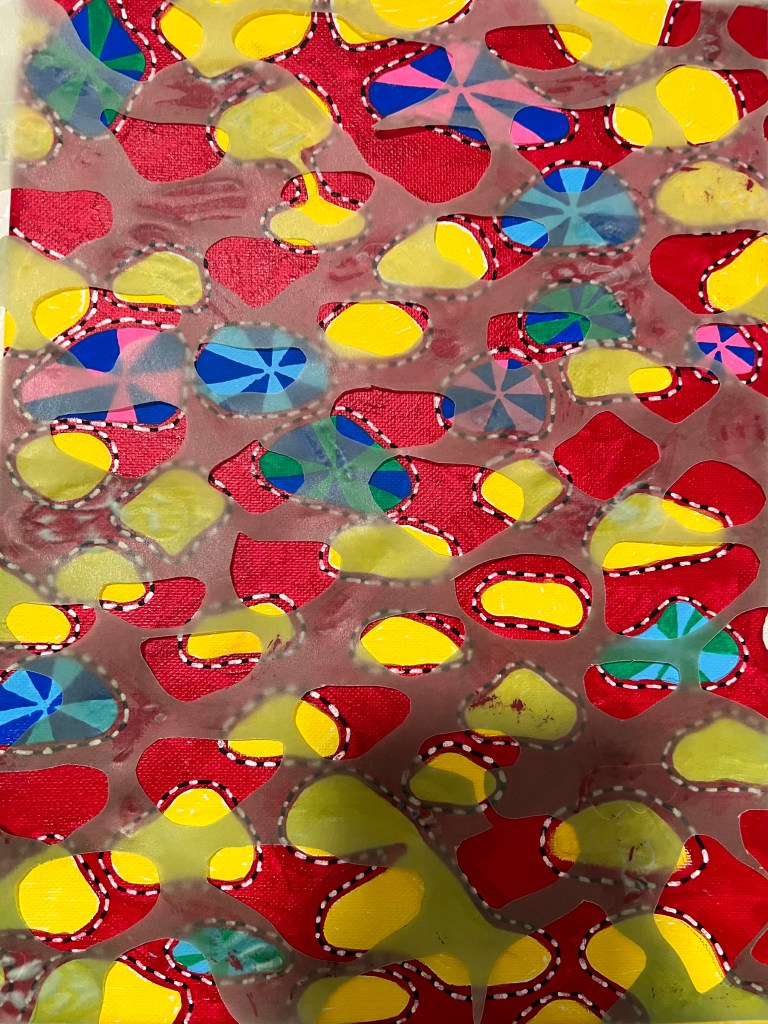
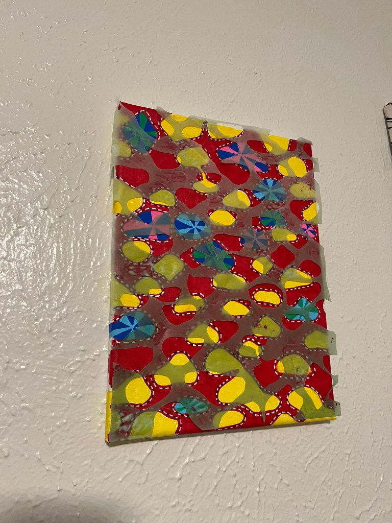
For my transparency project I utilized this thin blue paper I had. It originally had clouds all over it that I had to trim out, leaving holes on the page. A pattern of circular shapes popped into my head which is why I made the abstract pattern underneath. The colors are a bit hard to look at for me, I could have picked a better color combination in the end. Another thing I would have fixed was the splatter of red paint on some areas.
During the painting process, I found that it was therapeutic to make the striped lines and fill in the circles with lines. Pattern is something I love incorporating into my work, I love the organic nature of it. In the end, it was a fun project but I would definitely make something different next time, more aesthetically pleasing.
Lynda Draper is a ceramicist whose work pushes the limits of the medium. In her work often you will see narrow tubular forms that have been described as drawing like. Draper studied education and ceramics at UNSW, she is currently head of ceramics at the National Art School.
Draper is quite process oriented, finding that her best works evolve as she works allowing herself to exist in an almost subconscious reverie as described by Sonia Legge in an article titled “Home and also somewhere else very far away: Lynda Draper”. Taking this into account draper often will only create preliminary sculptures when she is without clay. Looking at the construction of the work itself Draper uses a variety of enamels, glazes and lustres on the surface of works. To build the works she uses handbuilding techniques such as coiling and pinching. Due to the delicate nature of the forms that she creates she often builds directly on a shelf that can be placed in the kiln to be filed.
A final interesting aspect of Draper’s work is that she has spoken about how some of her work is brought about by memories/personal experiences. She has spoken specifically about how some of her works were brought about from revisiting her childhood home and how working on the pieces allowed her to confront objects of her past that were once distressing to her. This is interesting to know because her works and the shape and colors used in them evoke different emotions.
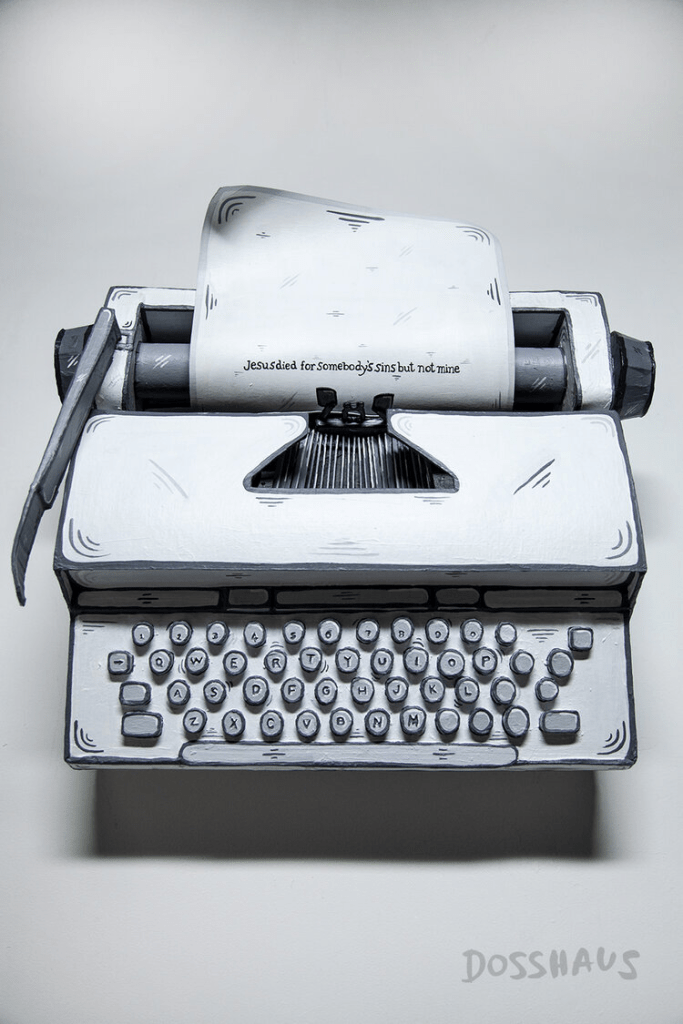
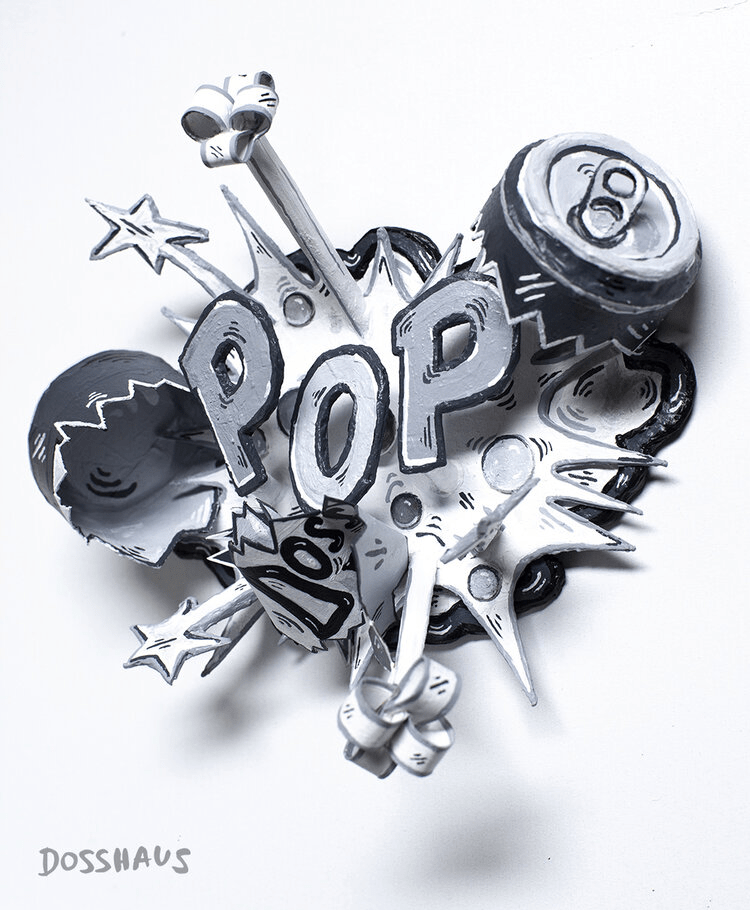
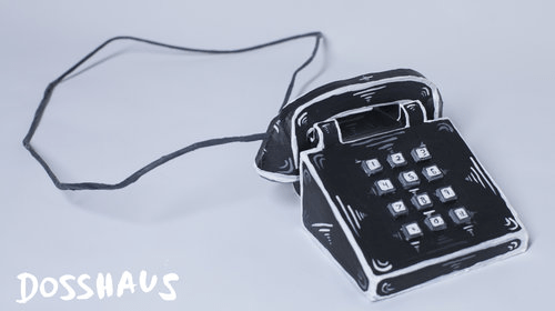
There’s not much I can find on Dosshaus when it comes to his age, where he’s from, and where he was born in. However, what I do know, is that he’s an art collective founded in 2011 and the nom de guerre of David Connelly. Created in response to a society saturated with social media-generated images in which reality itself seems all the more relative, Dosshaus uses recycled cardboard, paper, and acrylic to create its own highly idealized universe. He also has his own art exhibits at Oceanside Museum of Art and Torrance Art Museum. As awards go, he won in outdoor sculpturing at Lucca, Italy on August 2018. No more awards sadly. As for what kind of art he does besides sculptures, he does installations, performance art, fashion, film, video, and record and posts them on his Twitter, Instagram, YouTube, and Facebook.
I personally think his sculptures are so creative and artistic. It’s like as if I’m actually looking at a live action cartoon of certain objects that we usually see and use. I’ve never see anything like this before, so it’s kind of special.
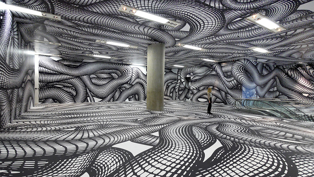
This week I chose to research the artist Peter Kogler. Peter was born in 1959 in Innsbruck, Austria. He was mostly inspired by the 1970s where that was a period of growth in the arts. He is internationally known, holding exhibitions all over the world such as: Galerie Sylvane Lorenz, Paris, Galleriea dell’Ora in Rome, and Museum Moderner Kunst Stiftung Ludwig in Videnna. Peter is widely known for his hypnotic room installations, taking architecture and creating it into surreal environments. He uses paints and projections to create his own wallpaper on spaces that are often forgotten, like stairwells, corridors, and entrance halls. He states in a 2014 interview, “I have always been very interested in the question as to how far my visual or artistic idioms can be transformed by technological developments and moves to different media”. His concepts create optical illusions that play with time and space. I enjoy his work because it’s interactive. I feel that any work or installation that allows the viewers to interact, or be a part of it, help engage them more. It’s as the audience is a piece of the work. The rooms would feel incomplete if no one was able to walk around them.
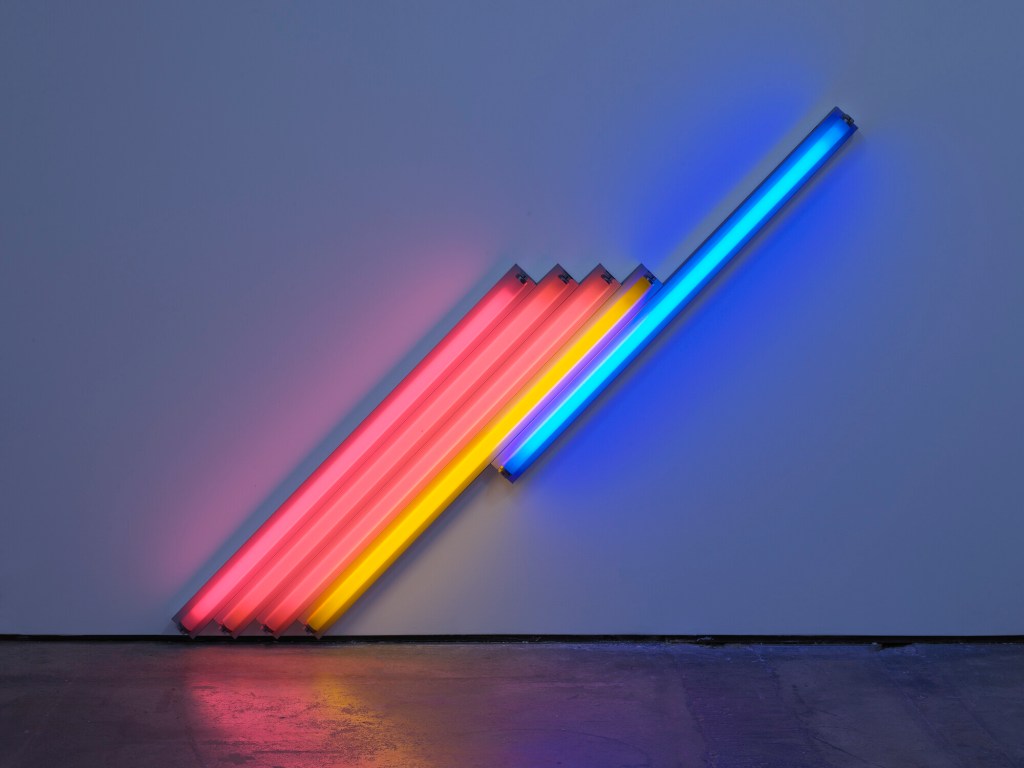
This week I decided to research Dan Flavin, an artist that works with lights. He studied at the University of Maryland Extension program in Korea to get his art degree. He also went to Hans Hofmann school of Fine Arts in New York in 1956. In 1959, he started working in drawing and painting that influenced the start of his abstract expressionism. In 1961, he created bunch of drawings for sculptures that had electric lights, which really where his success comes handy. He went on to take those drawings and make lights into monochromatic canvases, then later on worked with fluorescent tubes.
I feel as though his art works super well when drawing in space. I love how his installations provide these reflections onto the ground and made the piece bigger then what it actually seems to be. Especially when moving in different directions, you can make the reflection longer or shorter. Even though Dan Flavin offers this minimalist style, he makes his art super fun to look at. I think this is something I would want to try and create in the future.
El Greco was born, Domenikos Theotokopoulos on the island of Crete located in Greece on October 1, 1541. His father was a tax collector and there is not much information out there about his mother. Theotokopoulos’s brother was a merchant who did pretty well for himself however he spent the last few years of his life living with his brother.
He went to Cretan School where he studied various types of art. A main focus of study for him during this time was Post-Byzantine Art as well as classics and ancient greek art. Around 1567 he left to pursue an art career in Venice, Italy but soon after moving there, he moved to Rome, Italy. In 1577 he left Italy and moved to Spain where he spent the majority of his life and where he died. He moved to Toledo, Spain where he completed nine paintings for the church of Santa Domingo one of which was The Assumption of the Virgin. Soon after he had done some commission pieces for the king of Spain, King Phillip II.
From 1597 to 1607 El Greco experienced great success. During this time he painted in the styles of, painting, sculpture, and architecture while later being known for his contributions to Mannerism and the Spanish Renaissance movements. He died soon after this increase in artwork on April 7, 1614, in Toledo, Spain, and was buried at the church for which he did many paintings for.
The Assumption of the Virgin was painted with oil paints from 1577-1579 in Toledo, Spain. You can now find it at the Art Institute of Chicago in Chicago, Illinois.View of Toledo painted with oil paint on a canvas during 1596-1600 in Toledo, Spain. You can now find this painting at the Metropolitan Museum of Art in New York City, New York.
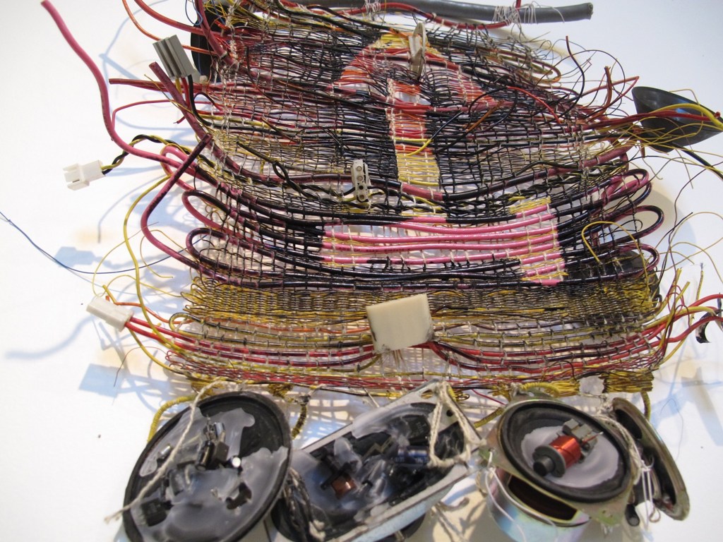
Robert Mertens is an artist and curator born in Wisconsin. His work covers a wide range of mediums, and he often uses material like fabrics, wire, and found items to create large, eye-catching sculptures. In his website bio, it is stated “His work revolves around the intersections between technology, religion, science and myth. These pieces combine new media with traditional fibers craft and culminate in performances, installations and powered sculptures.” I was intrigued by Robert’s work because of the rugged appearance of his pieces- aged fabrics, stained material, and overall coherence of pieces that you normally wouldn’t picture together. Aside from traditional artwork, Robert is also trained as a sound technician and creates soundtracks that reflect human life. Currently, Robert lives in Virginia and works at the James Madison University’s School of Art, Design and Art History as a creative director. He has held six solo exhibitions since 2010, and his work has been featured all around the country.
For this new week’s research post, I have chosen to cover the artist Bharti Kher. Bharti Kher is an artist who is at the center stage of the contemporary art scene in India. In the span of Kher’s nearly three-decade-long career, she has done paintings, sculptures, and installations that have explored the relationship between the body, its narrative, and the nature of things. Kher finds her inspiration from the history and philosophy of India and more so from mundane moments. Using a refined contemporary sensibility, the artist addresses topics of culture and tradition with the use of sentiment unique to India as well as an abundance of color. Kher is internationally known for her signature use of bindi in her works. She explains how most people see the bindi as either a symbol of marriage or aesthetic, but it is actually a representation of the third eye which forges a link between the spiritual world and the actual world.
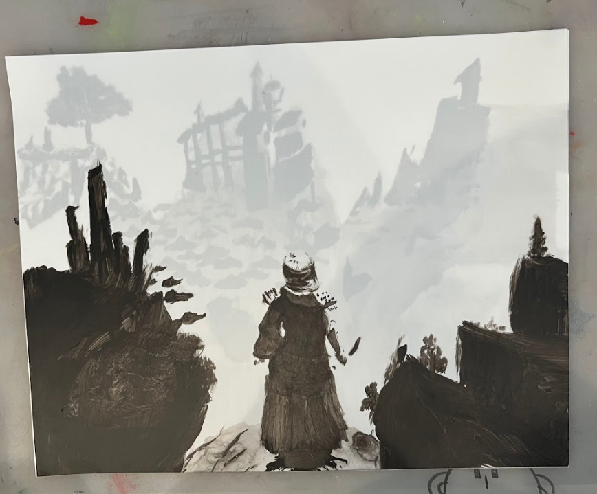
When the project was first introduced I was drawn to the idea in animation of creating a foreground, mid, and background in three separate layers to illustrate the large space when animating, by moving each layer at a different speed across the screen. I saw the translucent paper had the same quality, and wanted to create a scene from a video game to see if the same quality could be mimicked with the idea of layering the two papers. The game I had pulled inspiration from was Elden Ring. In this game, it’s very common to come across these large open spaces that create a desire to explore. I wanted this same quality to exist in my piece so I thought I would be perfect for reference. I used black acrylic paint and began layering onto the paper to build value because I was reducing the color image to black and white. I wanted to really focus on the implied shape of the hair, sword, and landscape without overdoing it. Overall I think this was a great experiment, I would love to in the future go back and add in some highlights of white to help increase the range of values.
Eric Rieger, or his street name “HOTTEA,” is a Minneapolis, Minnesota-based graffiti yarn artist who uses colorful yarn to make interesting and non-destructive street art.
Rieger started out as a graffiti writer who spray painted his work before he ran into a cop during one of his graffiti ventures and the cop used a taser gun on him. As Rieger describes the encounter:
“The story goes I got tasered like four or five times. […] I went to jail and seeing my family going through all that pain, and just knowing that if this happened again they’d be going through the same amount of pain again, and I just couldn’t do that, and so I stopped doing graffiti art.”
After that experience, Rieger decided to focus on getting his graphic design degree from Minneapolis College of Art and Design before graduating in 2007. Rieger became a freelancer for a bit before he started missing the excitement and enjoyment he got when he made graffiti. Within the same year, Rieger’s grandmother passed away and although they had a language barrier between them with him speaking English and her Spanish, the two often bonded and communicated through knitting. It is from this that he decided to combine the knitting skills he learned from his grandmother in a transformative, non-destructive way to create his graffiti writing again.
“I thought with my love of typography, how can I involve typography and yarn with street art? […] And then hence came about the fencework.”
This is when he started making his yarn art on fences and most often would be the words “HOT TEA” which is where it developed into his street name and became a part of his identity.
The reason for HOT TEA, as explained in Reiger’s Vimeo bio section, is meant to show how the two words as interconnected and have a relationship with one another to present themselves as new combined meaning that wouldn’t exist if the two were separated. One word cannot exist without the other or else they both lose their combined meaning.
As best phrased in the Vimeo bio: “Like the phrase itself Hot and Tea are two totally different words brought together to represent something new, which reflect on the media and surfaces that the [HOT TEA] project makes use of.”
Rieger’s work as a graffiti yarn artist exploded as his work was seen all over Minneapolis. From there, Reiger’s work evolved beyond the streets and began having installation showings inside buildings and being hired by businesses to create work for them. Even though his work can now be enjoyed indoors, he still enjoys and creates his street work outside to be viewed by all who pass by.