David Blandy

David Blandy is a British artist known for his works that explore themes of identity, race, and pop-culture. Blandy studied Fine Art at Central Saint Martins College of Art and Design in London, and later earned a Masters in Fine Art at Slade School of Fine Art. His art spans video, installation, performance, and gaming, often drawing on personal experiences and family history. Blandy’s work has been exhibited internationally, and he has won numerous awards for his contributions to contemporary art.

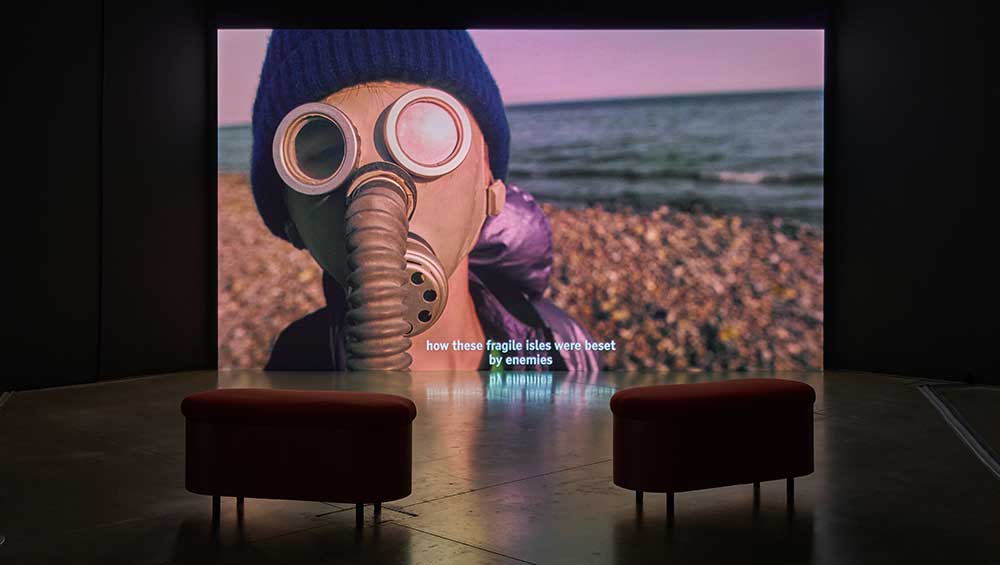
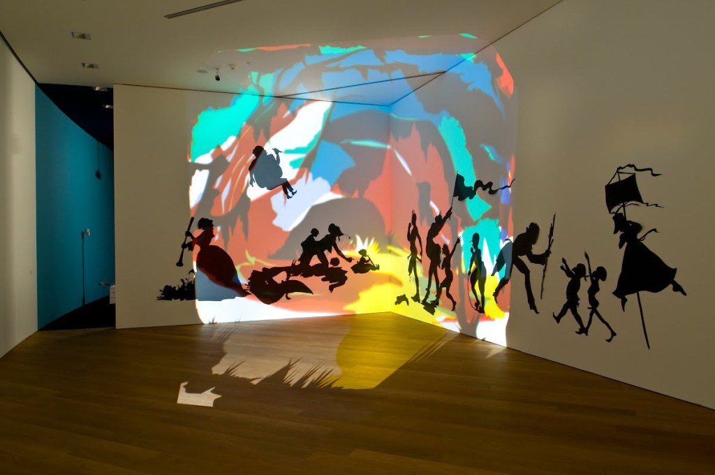
David Blandy’s exhibition, “Atomic Light”, consists of four interconnected films. The exhibition draws on Blandy’s family history, exploring how historical events such as the atomic bombing of Hiroshima and Nagasaki and the Second World War have shaped our world. He often combines found footage with his own filmed material, as well as animation and computer-generated images. Blandy is particularly interested in exploring the cultural and historical resonances of different types of media, and he often incorporates vintage footage from sources like old movies, television shows, and newsreels into his work.

https://www.studiointernational.com/index.php/david-blandy-atomic-light-review-john-hansard-gallery-southampton

Marc Camille Chaimowicz

Marc Camille Chaimowicz is a French artist based in London who specializes in installation, performance, sculpture, and design. Chaimowicz’s work often explores themes of memory, domesticity, as well as the connection between art and everyday life.

One of Chaimowicz’s most significant works is “Nuit Américaine,” a large-scale installation that was first exhibited at the Serpentine Gallery in London in 2016. The installation was named after a term used in the film industry to describe the technique of shooting night scenes during the day, using filters to create the illusion of darkness.

“Nuit Américaine” consists of a series of rooms that are furnished with a range of objects, including furniture, textiles, and decorative items. The rooms are designed to create a sense of domestic intimacy and comfort, while also evoking a dreamlike, surreal atmosphere.

https://www.studiointernational.com/index.php/marc-camille-chaimowicz-nuit-americaine-review-wiels-brussels

Petrit Halilaj

Petrit Halilaj is a contemporary artist from Kosovo who specializes in installations and sculptures that explore issues related to identity, memory, and displacement. His work is deeply rooted in his personal experiences growing up in Kosovo during the war and the subsequent period of reconstruction and transformation.

Halilaj’s work has been exhibited in major museums and galleries around the world, including the Tate Modern in London, the New Museum in New York, and the Stedelijk Museum in Amsterdam. He has received numerous awards and honors, including the Mario Merz Prize in 2014 and the 2020 Hugo Boss Prize.

“Very volcanic over this green feather” is one of Petrit Halilaj’s installation. This work was first exhibited at the Fondazione Merz in Turin, Italy in 2018, and later at the Palazzo Grassi in Venice in 2019.

George Tooker

He was born August 5, 1920 , in New York City and was named after his father. As a kid he took art lessons and spent quite a bit of time hanging around museums. For school, he went to Philips Academy and transferred to Harvard University to graduate with an English degree. For his art career he went to study under Reginald Marsh at the Art Students League of New York. Here he got most of his artistic influence at the start of his career.

George Tooker did lots of impressionist paintings in the late 1900s. They were all mainly for social and political characteristics. This is because of the wars and impacts it had during his time. Most of his work had negative connotations on how people are feeling during those trying times.

“George Tooker’s work expressed a 20th-century brand of anxiety and alienation. Above, “The Subway” from 1950.
Credit…Whitney Museum of American Art” (William Grimes)

This piece from the 1950s, shows the lives of office works being alienated and isolated. All the colors are very similar and it feels as though theres no way out. Gates are all over the place and the people in the painting look super anxious or nervous.

George Tooker, The Waiting Room, 1959, egg tempera on wood, 24 x 30 in. (61.0 x 76.2 cm.), Smithsonian American Art Museum, Gift of S.C. Johnson & Son, Inc., 1969.47.43

This creepy drawing made in 1959, showing the frustrating times that George Tooker had at the bureaucracy while trying to obtain permits. He shows how worn down everyone is. Something I notice is his color palette is the same as The Subway. This is probably how he saw everyone in real life. Realistic and mundane.

Citation:

https://americanart.si.edu/artwork/waiting-room-24195

https://whitney.org/collection/works/3052

Daria Aksenova

Daria Aksenova is an artist known for her suspended narrative shadowboxes made with layers of paper and ink. Aksenova focuses her work on telling stories of mythology and folklore with the use of cinematography through constructed dynamism of layering hand-cut and inked paper to make her complex works. These works are then suspended inside decorative boxes for all to view and enjoy.

Aksenova’s work is primarily in black and white and the reason she uses that color scheme over using more colorful variations is that it challenges her creativity by removing the distraction of colors to pay more attention to the details of composition, anatomy, light, tone, and narrative. Technically, Aksenova’s work isn’t fully achromatic since some of her inks have sepia and blue undertones that add some subtle coloring to her work, but primarily nothing more colorful beyond that.

Aksenova has stated that her “mission is to bring back our childhood imaginations that are drowned out by the everyday bustle in our ever-busy lives.” So Aksenova turned to children’s stories of folklore and mythology in order to “draw the viewer back to the [stories] of their youth, hoping to create artwork that inspires the dreamer within.”

Cartoonish Amalgamation – 3D/Cardboard Post

For this project, I wasn’t all that excited about working with cardboard, so I tried to just dive into the project and not do any prep work for it. I only had the idea to get some cardboard boxes and cut a bunch of different small shapes out of them. After doing that and having a bunch of shapes, I started to just assemble together to form some sort of sculpture. 

I used a combination of super glue and cutting slits into the cardboard pieces to make these pieces stick together. Getting close to using up all the pieces for the cardboard sculpture, I realized that I needed to make it taller to fulfill the height requirement of the project. After some thought, I decided to grab a random piece of cardboard that was still partially still intact to use as a base to hold the whole sculpture up. From there, I drew the outlines and extra lines for each part of the sculpture to make it appear more 2D comic book-like. Then, I was done with the project.

Not the biggest fan of this project, but it got done and it wasn’t completely bad looking. I think if I had more time and motivation to work on this project, it could have ended up looking better.

Cardboard Sculpture

I started by digging through the recycling to find cardboard. Once I found a good box I began to cut it into different shapes. I then connected the different shapes by cutting slits in the cardboard. Then, I hot glued the pieces that needed extra reinforcement. After the sculpture was built, I took it to my partner’s house to use his spray paint. I spray painted half of it black and the other half white because I wanted to create a duality between a light and dark side.

Using posca pens, I drew patterns on each of the different pieces of cardboard. On the black side I drew with white pen and on the white side I drew with red, blue, green and yellow. I was going to make the whole thing black and white but I decided that was too predictable. I really like how the drawings ended up transforming the sculpture.

This was a challenging assignment for me because 3D work is usually way out of my comfort zone. Overall, I’m happy with how it turned out.

Keith Sonnier

Keith Sonnier was born in Louisiana in 1941. He went to Southwestern Louisiana Institute in 1963. He also went to Rutgers University in 1966, and graduated with his MFA. He studied under quite a few people and classmates where after he graduated, moved to New York City with a few of them to experiment together.

Keith Sonnier is a sculpture artist that experimented a lot with mediums. In the late 1900s he worked with latex, transmitters and incandescent light. He also started using neon light as well. He would draw in space with the neon tubes. He was one of first people in his fields to work with neon tubes. An experiments that he did with neon lights was at an installation for “Mies van der Rohe’s Neue National galerie in Berlin in 2002, entitled BA-O- BA Berlin” and since then he’s put up other temporary installations that involve neon lights. One of his more permanent works that was installed was in Los Angeles. It is called Motordom which lights up neon blue and red and is in a courtyard of Thomas Mayne.

He also did lots of work in Europe as well so a lot of his work is seen everywhere across the world. Some of the work he did are shown below:

Ba-O-Ba III  1967

BA-O-BA SERIES

Glass and Neon

Dis-Play II   1970

DIS-PLAY SERIES

Foam rubber, fluorescent powder, strobe light, black light, neon, glass

Cite: https://www.keithsonnier.net/sculpture-1970s.html

Kara Walker

For my research post, I will be covering the American contemporary artist Kara Walker who explores themes of race, identity, gender, sexuality, and violence in her work. Walker works with a variety of mediums such as painting, installations, film, and printing, and is mostly known for her black cutout silhouettes that fill the space in a room. Walker’s work leads the audience through a critical understanding of the past by exposing the ongoing physiological damages that have been brought on by slavery and its tragic legacy. The first image I have included below is of Walker’s piece titled “Daytime Rebellion”, 2001. This piece includes a projection of colors and shapes being cast on the wall over her cutout silhouettes made from black construction paper. While the whimsical angles and decorative details may be the first thing the audience notices, the longer you stare you will realize the disturbing nature of the image dealing with themes of sexual subjection and violence. 

http://Kara Walker: Darkytown Rebellion, 2001
https://www.google.com/amp/s/www.mprnews.org/amp/story/2007/02/20/karawalker

Robert Rauschenberg

Robert Rauschenberg was an American painter and graphic artist born in Port Arthur, Texas who specialized in abstract expressionism. He took an experimental approach to art making which resulted in him being considered as one of the most influential American artists. Along with painting, he also worked with photography, printmaking, paper making, and performance art.

In his landmark series of Combines he mixed the materials of art making with ordinary things. With this series, Rauschenberg endowed new significance to ordinary objects by placing them in the context of art. The work ranged from free standing to wall-hung pieces, influenced by surrealism and the pop art movement.