The “Line Surface Space” installation by Kawahara Krause Architects is a site-specific project created for the 2012 DMY International Design Festival in Berlin. The installation consists of a series of interlocking wooden panels that form a continuous, undulating surface. The wooden panels are arranged to create a dynamic, three-dimensional space that visitors can move through and interact with. The installation challenges traditional notions of architecture and space, blurring the boundaries between interior and exterior, form and function.
Visitors to the installation are encouraged to explore the space and engage with the panels designed to create a sense of movement and flow. The panels are connected by hinges and pins, allowing them to flex and shift as people move through the space. The “Line Surface Space” installation represents a creative and innovative approach to architectural design, emphasizing the importance of experimentation, collaboration, and pushing boundaries. By creating a dynamic, interactive space that challenges traditional notions of architecture, the installation invites viewers to question their own assumptions and engage with the built environment in new and exciting ways.
Rachel Schmidt’s installation “Out of Balance” is a mixed-media work exploring environmental degradation and climate change themes. The installation features a series of abstract paintings and sculptural elements that are arranged in a way that suggests a disrupted natural landscape. The installation’s centerpiece is a large, suspended painting resembling a swirling vortex of blues and greens. This painting is surrounded by smaller, circular canvases suspended from the ceiling, creating a sense of movement and imbalance. In addition to the paintings, “Out of Balance” includes various sculptural elements made from natural materials such as driftwood, rocks, and feathers. These elements are arranged to suggest a disrupted ecosystem, with rocks piled haphazardly and feathers scattered on the ground. Through “Out of Balance,” Schmidt seeks to raise awareness about the urgent need for environmental stewardship and the consequences of neglecting our planet’s natural systems. The installation invites viewers to reflect on their relationship to the environment and consider how their actions can contribute to a more sustainable future.
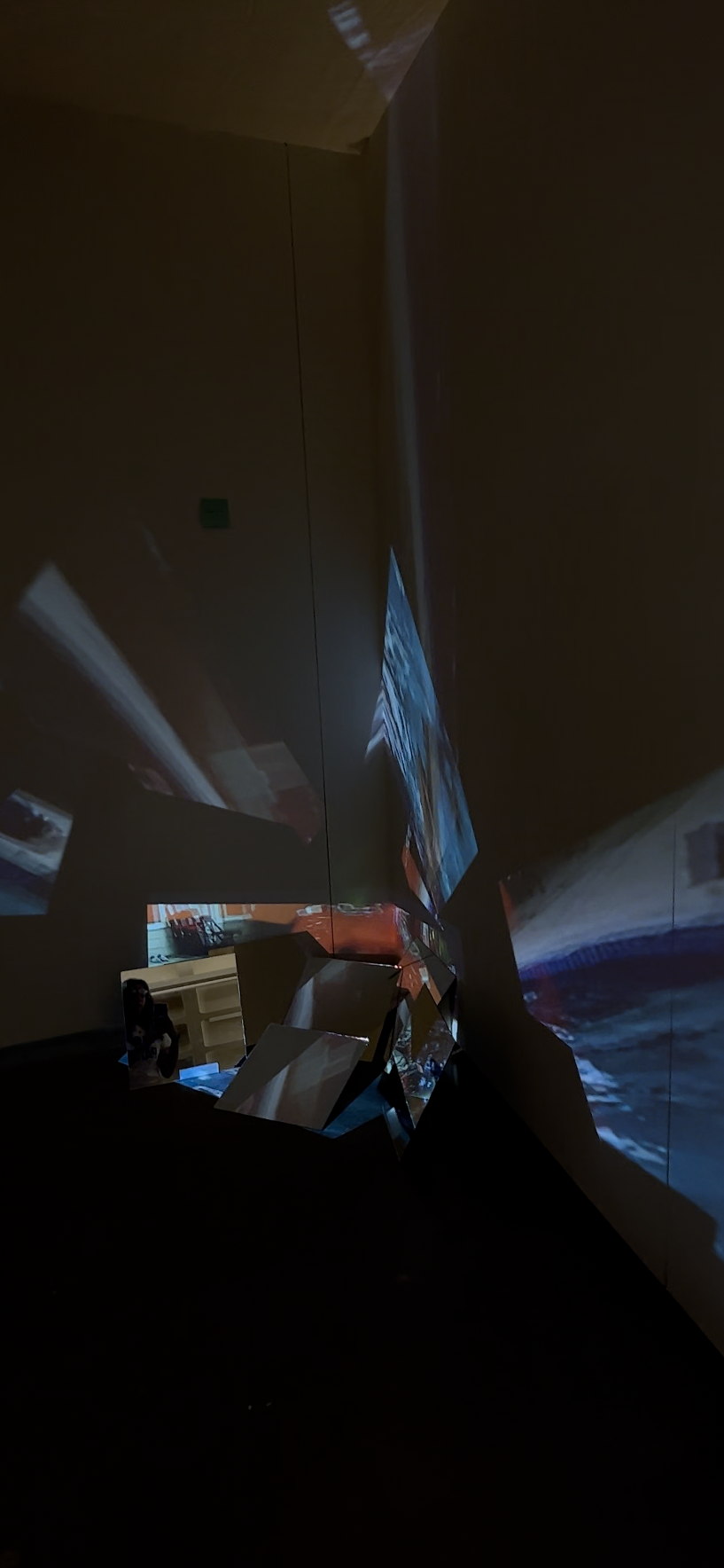
For my final project, I knew that I wanted to work with video since it’s my favorite medium. And I knew I wanted to explore how memories become fragmented over time, so I decided to create an installation that reflects this theme.
My initial idea was that i wanted to project a video onto mirrors to create multiple reflections of distorted iamges. I knew this would add a unique element to my project and help me explore the concept of fragmentation in a more visual and tangible way, and I think it also ties into Drawing into Space.
During the video editing process, I went through old hard drives and found some footage of interviews I would do with my friends and from parties. I collaged some videos together, or overlapped some, and cut some parts out to make them distorted. I also had multiple audios of friends talking on top of each other to add to the theme of fragmentation. Ultimately, I wanted the video to express how it feels to try to remember a specific moment, and the struggle to try to do so as time goes on.
After almost finishing the video, my computer shut down, and I lost all of my progress! It was frustrating, but I had to start over, and I finally got it done.
The next step was buying the mirrors, and setting them up ended up being my favorite part! I experimented with different ways of setting them up, and at first, I wanted to shatter them. But, I ended up liking how they looked propped up on the floor because it made the video reflect all over the walls.
Overall, I’m happy with the way my final art project turned out, and I feel like I was able to explore the concept of fragmented memories in a unique and meaningful way.
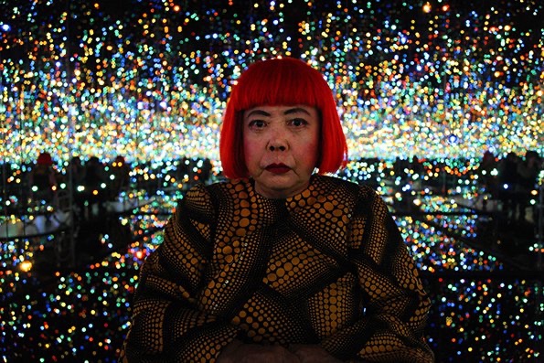
Yayoi Kusama is a renowned Japanese artist who has made significant contributions to contemporary art. Born in 1929 in Matsumoto, Japan, Kusama moved to the United States in 1957, where she developed her signature art style characterized by vibrant colors, bold patterns, and repetitive motifs. She is also known for her avant-garde installations that often involve the use of mirrors and lights to create immersive and interactive experiences for the viewer.
One of Kusama’s most famous works is her immersive installation, “Infinity Mirrored Room – The Souls of Millions of Light Years Away” (2013). The installation consists of a small room lined with mirrors on all sides and a shallow pool of water on the floor. The room’s walls and ceiling are adorned with hundreds of LED lights that change color and intensity, creating an illusion of a vast and infinite space.
When visitors enter the room, they are enveloped by pulsating lights and reflections, which create a mesmerizing and otherworldly experience. The installation highlights Kusama’s fascination with the infinite and the cosmos and her interest in creating immersive environments that blur the boundaries between art and reality.
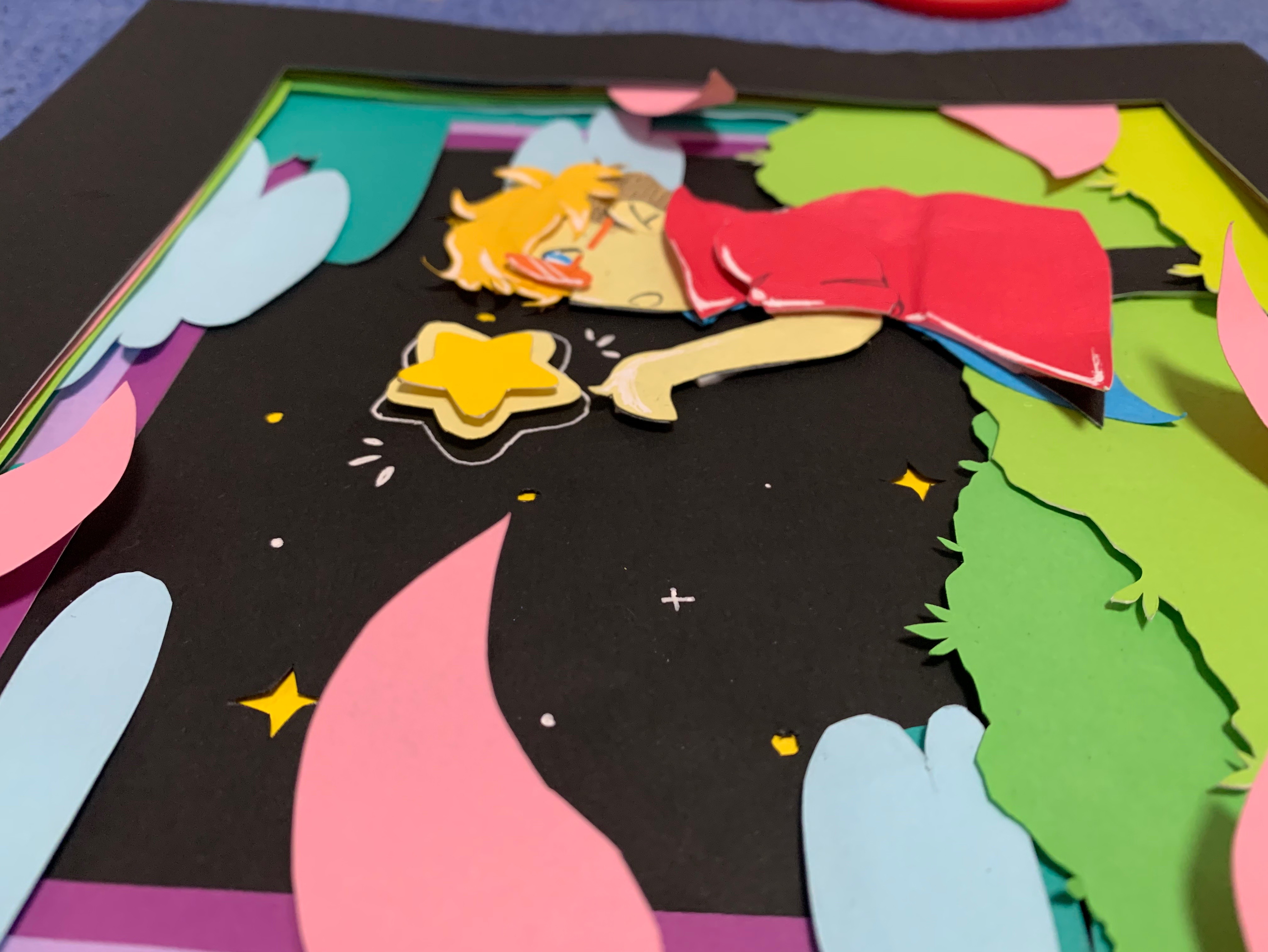
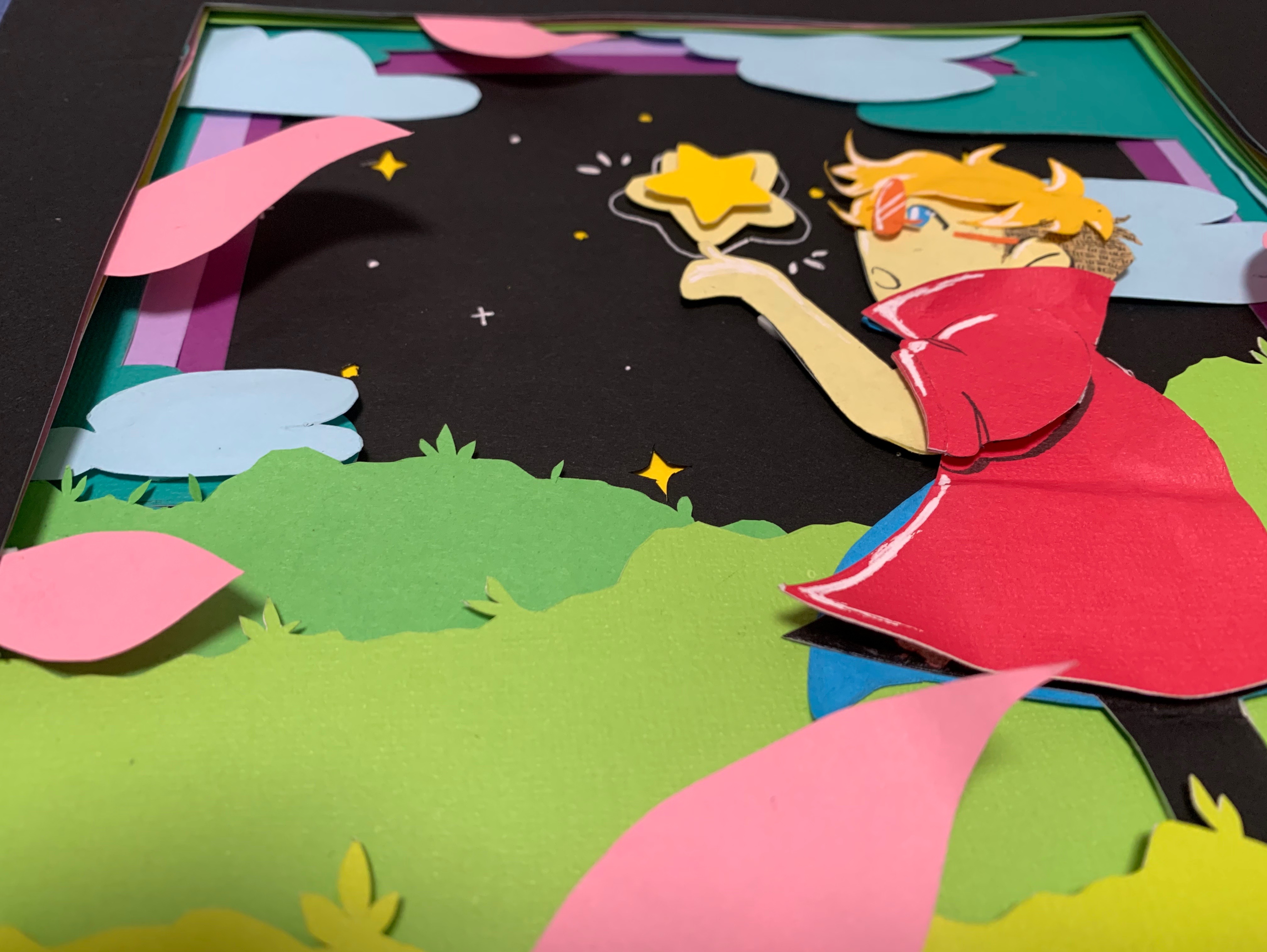
For my Individual Project, I decided to do a layered paper art scene. The idea was that I wanted to use colorful paper layers to create a whimsical 2D scene that had some 3D depth to it. I was heavily inspired to do this based on two artists I did research blog posts on: Ale Rambar and Daria Aksenova who are both artists that utilize paper and paper layering to create their 3D work. From Rambar, I used some of his topographic method for making some elements of my scene pop-out more while with Aksenova, I drew more from the idea of a story scene being created with the layered art.
The base idea for this project was that I was going to use a combination of colorful card stock and regular paper and have them be layered on top together with tape and glue. So, I made sure to buy colorful card stock, colorful printer paper, an X-acto knife, a cutting mat, a roll of adhesive foam tape, and some double-sided tape.
I started off by making some sketches of the scene I wanted to create before settling on the middle sketch.
After deciding on the sketch, I made a digital render of the layered scene, so that I have a better idea on how many layers I’m going to use, what each layer should look like, and in what order they need to be in to get the desired scene result.
Afterwards, it came down to choosing the colored paper and card stock that best matched the layers I digitally rendered and sketching on them so I can cut them out accordingly. Once all the layers were cut out, I was able to stick them together using both the double-sided tape and the adhesive foam tape. The double-sided tape was for layers that I wanted to be close together with little-to-depth between them, and the adhesive foam tape was for layers that I wanted more depth and space in-between. Since I couldn’t find a shadowbox frame that would fit this final piece, I ended up making a paper frame on the front so it looks like a frame border and acts like a window into the scene.
How does my project address the theme of “Drawing Into Space”? It uses layered paper that adds depth to the piece and has overlapping shapes going on to really sell that. Plus, the use of negative and positive space with the paper layers is what is being used to “draw” each element into the overall scene, and when all combined, show a collated scene with depth to it because of the layering.
If I had more time to work on this project and wanted to improve on it, I would’ve loved to add all the other details with the flowers, leaves, and branches that are in my digital rendering of the scene, and I wish I would have gotten a thicker adhesive foam tape so that the layers had more depth to them. I also would’ve loved to have put this in an actual shadowbox frame that was the perfect size for it.
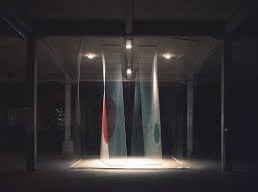
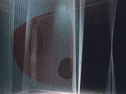
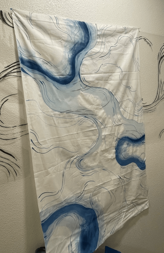
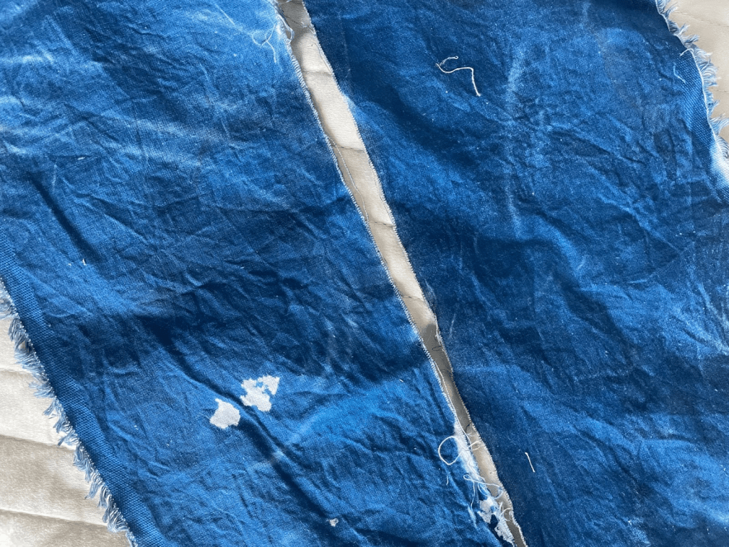
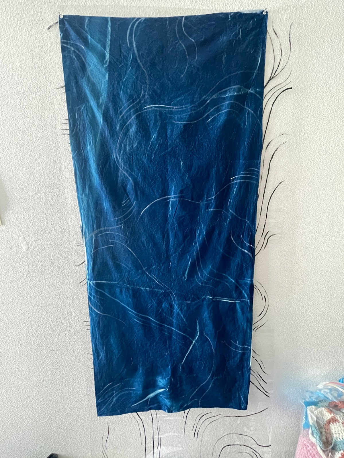
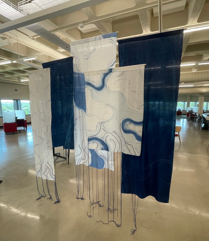
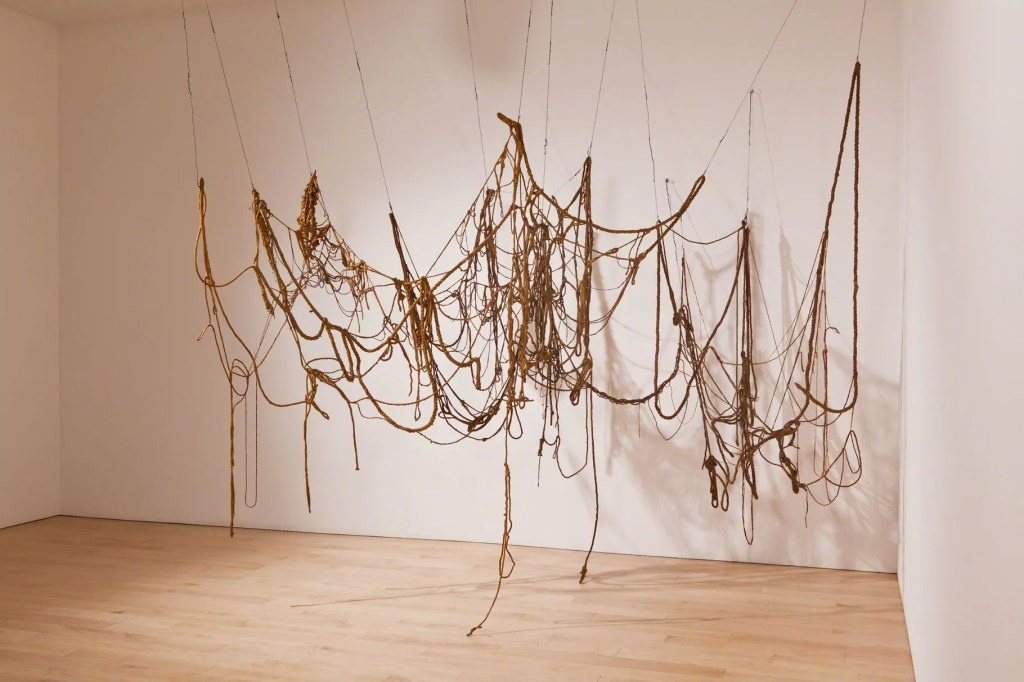
For my individual project I decided to make something that was hanging because I enjoyed making the earlier translucent assignment, so I wanted to explore making a larger version. Like with that project I wanted this one to also be monochromatic and blue. With the lines on each panel I wanted to play with the idea of something that felt like it flowed and and also was entangled which is why I chose to also use yarn that would hang and be bunched up on the floor.
I decided to have five panels total three with cyanotype and two that I would paint on. I later changed this so my final piece ended up having 2 cyanotype panels and three painted panels. Below is my initial sketch of the project.
The first thing that I did was research what fabrics work best with cyanotype and found that cotton is one of the better materials to use. From there I purchased the fabric and began experimenting with painting on the fabric. I used watered down acrylic paint to paint on the fabric. On these panels I also glued on yarn as more lines that would then hang down to the floor.
Before exposing my large cyanotype panels I started by doing a smaller test run.
I then moved on to the bigger panels, to make my negative that I would lay on top of the fabric when exposing it I painted on cellophane with acrylic paint.
After exposing rinsing and letting the panels dry there were parts of them that I didn’t feel like enough of the lines transferred so I used some white acrylic paint to fill in those areas.
Once all the panels were finished I made a casing at the top of each one so that I could run a wooden dowel through to hang them. The wooden dowels each have screw eye hooks on each end to use fishing wire to hang them.
If I were to improve something about this project it would have been my approach to the cyanotypes a little differently. I would have purchased plexiglass so that I could have had my negative been compressed down on the fabric better I think then the lines would have come through stronger. Though with that said overall I really enjoyed working on this piece and am happy with how it came out. I explored drawing into space with this project with my use of lines, and more specifically using the yarn to have the lines come off of the panels into the space.
When starting this project, I had quite a large goal as to where I wanted to go with this project. I found inspiration from an interior designer, Jade Connor Design chandeliers. I had originally had this idea for a project proposal when we were starting our group projects and since it wasn’t used I figured this would be a great opportunity to do that project.
Initially, I wanted to have a tall floor lamp for my base structure however, GoodWill did not have one so I bought a regular table lamp and lamp shade for the base of my project. I completely took apart the lampshade so that I could start tying the yarn to it and create my piece. I then needed to find some yarn and I was really struggling to find a color and texture that I wanted to work with. I finally wandered into the clearance aisle at Hobby Lobby and found what I deemed the perfect reel of yarn for this specific project.
I knew I wanted to use layering as an aspect of my lamp but was not sure to what degree I wanted to use it. I went back and forth as to how I would layer and tie the yarn to make it interesting. I finally just started to cut two different lengths of yarn and tied them around the lamp structure with a pattern as to where the yarn would be tied. Once I had tied everything on and around the piece as a whole, I felt as though it was missing something so, I added another layer of yarn that was longer which kind of emulates the look of a jellyfish.
The final product of my project is interesting. I think that if I added another material, potentially grey pearls it would look really cool. The budget was really starting to come after me so I opted not to do that. Given how much money I was allocating to this project I feel as though it turned out well.
Progress Photo: almost done with the projectThe Final Piece on display in the gallery
Eva Hesse is known as one of the first artists thought to be a post-minimalist. She was born in 1926 in Hamburg, Germany, but moved with her family to New York in 1939. Her upbringing was tumultuous due to her parents divorce, and just 1 year later, the suicide of her mother. She studied art at the Pratt institute, Cooper Union, and later Yale University. Her work began as drawings and paintings. She married Tom Doyle and they moved to Germany. During the 15 months she was there Hesse began to experiment with sculpture. She used non-traditional materials to create abstract forms. After returning to New York her and her husband divorced and she began creating a plethora of work. She died in 1970 from a brain tumor.
Judy Pfaff is an artist from Tivoli, New York. She got her BFA from Washington University in Saint Louis in 1971, and then earned her MFA from Yale in 1973. Her work incorporates both 2D and 3D elements to create otherworldly installations. Like collage, she carefully places each element to make a sort of organized chaos. Her work is symbolic due to many elements of her work being discarded after exhibitions, much like mandalas which are seen as temporary objects. Though her work doesn’t seem to directly pull from religious imagery, she does compare it to that of a cathedral in contradiction to the concept of mandalas. Her installations have been displayed in many major museums, and she has permanent works in the Tate Modern, MoMA, The Whitney, and many more prestigious institutions.
Ivana De Vivanco is a Chilean sculptor and installation artist. She was born in Santiago, Chile, in 1981 and currently resides in Berlin, Germany. De Vivanco’s sculptures are mainly made from materials such as wood, metal, resin, and ceramics. Her works often incorporate elements of nature, such as branches, leaves, and stones, and explore themes related to ecology, anthropology, and the human relationship with the environment. De Vivanco’s installations often involve the use of light and shadow to create a sense of depth and movement within her sculptures. De Vivanco has exhibited her work in numerous solo and group exhibitions in Chile, Germany, Switzerland, and the United States. She has also been the recipient of several awards and grants, including the DAAD scholarship for artists in Berlin and the Fondart National Fund for Cultural Development and the Arts in Chile.