Jenny Saville: Plan

Jenny Saville is a talented painter born in Cambridge, England 1970. She likes to focus on the human form and all of its flaws. Her pieces glorify the body in its strangeness and variety. Her painting titled, “Plan” is a great example of her style of subject matter. She touched on the idea of liposuction and the reasons behind it. She enjoyed seeing the marks (like surgery marks) as a map. The lines draw over the topography of the skin giving it geography in a sense. The head of the figure is also hers. She inserted herself to be involved in this idea of self-examination; she is part of the work. “Plan” is a very intimate painting taking the idea of female beauty standards and standing them on their head. The idea of abundance and a mature physique is not recognized in mainstream media. She depicts large women sensually and in power of themselves.

I enjoy the social critique of the majority of her work. There is a long and introspective thought process when you see her work. Something you have been told is sinful and gluttonous is now natural and desirable.

21-Jenny Saville, Plan

Gagosian.com

Wikipedia Article

Oneonta.edu

“As If It Were Already Here” by Janet Echelman

Janet Echelman is a multimedia artist whose focus and experimentation on the other side of the globe led to some fascinating mastery of installation art. Specifically, it is her colorful nets that hang between buildings and/or in public spaces that capture attention and wonder. In addition to this notoriety, Echelman has been the recipient of multiple honors of public recognition, such as the Guggenheim Fellowship, the Harvard University Loeb Fellowship, a Fulbright Lectureship, and the Aspen Institute Crown Fellowship. She also conducted a TED talk–“Taking Imagination Seriously”–that has since been translated in 34 languages and has been viewed over a million times.

The installations–net-like sculptures woven from materials like polyester twine and polyethylene ropes–are designed to be strong yet effortless, and are suspended in place between rigid buildings as they respond to natural occurrences such as weather and sunlight. She was inspired to use nets as a new approach to volumetric, imposing sculptures after observing some local fisherman with their nets while in India during her Fulbright fellowship. After collaborating with these fisherman and hoisting the resulting sculptures on poles, she realized that the lightness of the material made capturing the subtle movements of the wind possible. In the installation, “As If It Were Already Here,” the construction of the strands of rope respond to differences between day–when it appears transparent and casts a shadow below it–and night–when it is illuminated and appears as a sheet billowing in the wind.

As If It Were Already Here Boston installation by Janet Echelman

As If It Were Already Here Boston installation by Janet Echelman

This particular work is a reflection of its Boston, Massachusetts location above the Rose Kennedy Greenway. The form of the sculpture is reminiscent of the hill that once stood on the now-flattened site, and the streams of color are a nod to the traffic lanes that used to be a feature on Boston’s elevated highways before being scrapped in favor of an underground highway in central Boston.

De Zeen Magazine. Janet Echelman creates aerial rope sculpture made of super strength fibers. 16, July 2015.

Janet Echelman Portfolio. “About” Section.


Takehiko Inoue

Takehiko Inoue is the writer, artist, and creator of the international hits Slam Dunk, Vagabond, and Real. He has won multiple awards for his achievements as an “mangaka”.

He has mostly dedicated his subject matter around basketball, which is one of his passions. Being so his first hit, and one of the most popular japanese comics of all time, is Slam Dunk, the story of a high school basketball team. This manga alone has sold more than 100 million copies.

His development as an artist started as an early age. In many interviews he acknowledges his grandfather as the one person that motivated him to continue polishing his skills. His personal motto is to “Challenge something that is beyond your capabilities.” This has launch him to do entire comics with just a calligraphy brush, or attempt to do immense ink drawing for a museum, among other stuff. He has been a force to be reckoned within illustrators and comic artist.

Chan Hwee Chong

blog2a

blog2
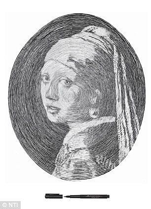
Chan Hwee Chong creates spiral illustrations of famous paintings. Using a single line and the push-pull technique to create different layers of shadows and depth. What began as a commission by Faber and Castell to show the precision of their artist pens gave Chan Hwee Chong fame. Hwee Chong is a man from Singapore who is currently living Germany as an art director at a German design studio ‘Kolle Robbe’ in Hamburg. He focuses on exploring typography and art installations in a public space that provoke our senses. Recently Hwee Chong created in collaboration with other artists the Lightstix Graffiti.

LightStickGraffiti_1-01_670.jpg

The Lightstix Graffiti is an inventive way to create a drawing in a public space that glows and catches the attention of passerby’s, like a beacon. The graffiti fixes glow-sticks onto a surface and then arranges them in such a way to create an image, or a drawing. Resulting in a glowing, beacon in an otherwise dark landscape.

GreatWall4_670.jpg

Vincent van Gogh in Saint-Remy and Auvers

I came into possession of a book which depicts and describes the works done by Van Gogh after he left Arles and went to stay at a facility in Saint-Remy to be cared for. Most of his works from that time are heavily influenced by the spaces he observed from his room or the grounds of the facility. While I chose paintings for this post, there are also a plethora of drawings in the collection as well.

Below is his painting referred to as “Country road with Cypress and Star” and his traditional heavy handed marks, which blur the line between a drawing and a painting, are effective in seemingly showing details that would be closer to the viewer in space and then they proceed to become less harsh as the painting moves further into space. The use of the road as a physical landmark that leads you from foreground to background is what makes full use of space in this work. One follows the road to the back middle and the cypress trees behind the small cottage throw you up into his night sky and beyond.

Van_Gogh_-_Country_road_in_Provence_by_night

Below is another painting from entitled” Enclosed Field with Ploughman” and I think it attempts and succeeds to show us such an expanse of space. For me it is how he uses his marks to created concise movement in some areas that lead you off and away into the distance while other areas are more haphazard and created the illusion of detail that is closer and more apparent. His skies also are extremely important in creating a sense of space, using his mark making to show rolling clouds that always lead off the canvas and never are wholly contained within the painting. Finally his windmills help create the illusion of receding farther and farther back help add to the wide and open feeling in this painting. The one in the middle sets the far away point but then a smaller one to the side shows us how far back he can see from his vantage point and only goes to create miles between the viewer and the hills in the distance.

Vincent_van_Gogh_-_Enclosed_Field_with_Ploughman_-_Google_Art_Project.jpg

Mathew Borett


Born in 1972 in rural Ontario, this versatile artist began to grow his creativity along with his allergy to hay. As a boy he dabbled between making elaborate hay forts in his family’s barn and drawing and using the computer graphics of the time.

Today he plays with computer graphics and installation instead of hay and produces beautiful abstracted architecture. He is an up and coming artist, just recently hitting 10,000 followers on instagram.

His drawings have an illustrative expressive quality mixed with an MC Escher approach.

matbbmatb

His current series is called:

Play Time with Hypernurnia

“At work I used to take quick modeling breaks and crank out a little building or some random structure. Usually I’d email it to myself and then dive back into work and often forget all about it. So I spent some time rounding up those old models, and came across a whole set of trees I also forgotten about. I like how they lend a different sense of scale than is found in most of images.”

Hypernurnia78.jpg


He turns these into reference for his series of 96″ x 42″ images, printed on archival paper and mounted on dibond. They express almost a post apocalyptic feel.

POLAR_DUNES.jpgancient_mars.jpg

http://www.mathewborrett.com

Yoshitaka Amano and the fantasy of depth

Yoshitaka Amano is a Japanese fantasy illustrator and painter, best known for his illustrations and concept art done for the video game series Final Fantasy. His work has a beautiful flow and elegance that I always found to be inspiring, with thin lines and watercolor being often his main form of mark making. Something I’ve always admired in his work, and in particular in some of his concept art, is his ability to create depth through both the usage of scale and positioning. Since his work normally involves fantastical creatures and structure, I always loved how much depth and sense of scale he gets, mainly due to the scope of most of these pieces.I also believe that his organic lines add to the overall  fantastical feeling his pieces have, and how impressive these structures are.

Sources:

http://amano-artwork.tumblr.com/

http://finalfantasy.wikia.com/wiki/Magitek_Armor

http://theabsolutemag.com/21586/games/yoshitaka-amanos-art-for-final-fantasy-vi/

http://vignette4.wikia.nocookie.net/finalfantasy/images/8/87/Amano_Party_III.jpg/revision/latest?cb=20111128215005

http://finalfantasy.wikia.com/wiki/Yoshitaka_Amano

Val Britton

Val Britton was born in 1977 in Livingston, NJ, and now currently resides in San francisco, CA.  For her BFA, Britton attended and graduated from the Rhode Island School of Design, and from there she received her MFA at the California College of the Arts.  Britton has found numerous successes through her art which has resulted in gallery shows, grants, residencies, and commissions.  Britton is known for her paper and mixed media works which represent maps, astronomy, and diagrams.  Britton was inspired by her father who was a long distance truck driver.  When he passed away early in Britton’s life, she found inspiration within the maps that her father had to use to navigate his long travels.  Britton uses numerous methods within her pieces; from staining, to collage, to printing, stitching, etc., although this may be a long process, Britton finds it meditative, and claims that her pieces blur the lines between imagination and memory.  Britton’s goal in her pieces is to create movement, since her pieces are abstract she says that this is her challenge.  Currently, Britton is trying to figure out a way to push her work to represent a tension of imposed order and pandemonium.  Britton says that the retelling of our stories of our journeys, and the reconstruction of those experiences, work together to create an understanding of the now, and so the retelling itself is in fact a journey.6798889531_57e8ec1fdc_z

Collapsible City

2012
Approximately 6′ h x 7′ w
graphite, ink, tempera, and collage on paper

“Statement – Val Britton.” Val Britton. N.p., 2000. Web. 24 Jan. 2016. <http://valbritton.com/statement.php&gt;.

Mia Pearlman

Mia Pearlman was born in the USA in 1974.  Ever since graduating from Cornell University in 1996 with her BFA, Pearlman has taken the art world by storm; with publishings in numerous contemporary art books, residencies, galleries, and commissions.  Some of Pearlman’s most successful works of art were a part of her recent show of installations in the Foley Gallery on the East Side of New York.  These installations were a part of her “Slash Paper Under the Knife” show, and were open to the public from, November 19, 2014 – January11, 2015.  Pearlman creates giant paper installations on the walls which play with space and natural light.  The New Yorker states that Pearlman’s pieces were,“The best pieces, notably Mia Pearlman’s crashing waves of cut and painted paper in the windows, dig into the connection between creation and destruction.”   An example of some of her work is, INRUSH, the goal of this piece (since it sat on the corner of the gallery) was to make it seem like there was no distinction of interior and exterior space by playing with natural light.  The unique quality and factor of Mia Pearlman’s work is the fact that everything is completely hand cut.  Her installations create a whole new space, and draw the viewers away from their current situation and into a whole new world.INRUSH_center_det250


“Mia Pearlman – Cloudscapes.” Mia Pearlman – Cloudscapes. N.p., n.d. Web. 24 Jan. 2016. <http://miapearlman.com/CUT_PAPER/cut_paper.htm&gt;.

Heather Hansen

hansen 1
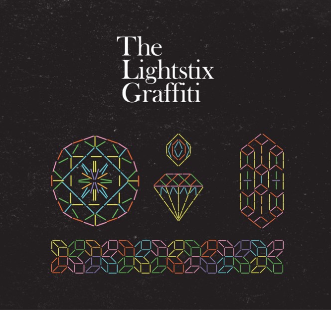
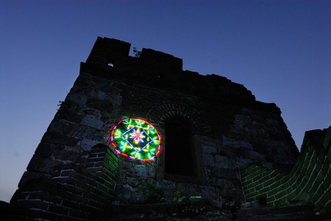
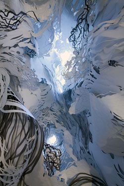
Photo by Bryan Tarnowski, 2014 http://www.thisiscolossal.com/wp-content/uploads/2014/01/heather-3.jpg

Heather Hansen is a performance artist who creates large scale charcoal drawings through her body and movement. Hansen works as a process-orientated artist where a great portion of the art is in the performance itself and not just in the finished product. Her body moves from gesture to gesture, leaving behind the evidence of movement through the long gestural lines of charcoal.

One of Hansen’s more recent exhibitions is the Value of Line at Ochi. Here she created performance pieces, as can be seen below, in front of spectators as she draws with her gestures. Hansen’s explains her work of “download[ing] my movement directly onto paper, emptying gestures from one form to another”. Much of her work relates to this process of relaying gestures on to paper, with the finished product as layered and symmetrical expressive lines. Her work relates to drawing into space with her process of creating. The space occupied by her body during creation, the movement of the gestures across the paper from one to another, and the suggestion of time and movement in the finished product, all translate to the theme of drawing into space.

http://www.ochigallery.com/heather-hansen/#lightbox[group-330]/10/


hansen 2Photo by Spencer Hansen at Ochi Gallery, 2014. http://www.thisiscolossal.com/wp-content/uploads/2014/01/heather-12.jpg

The artwork below draws attention to an implied 3D space of an interior and exterior of the spherical shape.

hansen 3.jpg

Heather Hansen EGLA-1 9.26.15, 2015, charcoal on rice paper 59” X 84”. http://www.ochigallery.com/wp-content/uploads/2014/01/EGLA-19.26.15_EMAIL-605×415.jpg


hansen 4.jpg

Heather Hansen EG SUWON1 8.19.15, 2015 charcoal on canvas, varnish 134” X 134”. http://www.ochigallery.com/wp-content/uploads/2014/01/EGSUWON1.8.19.15_EMAIL.jpg

Post by Rebecca Lempereur, 1/24/2016