This sculpture was intended to use natural materials to make a life size bee hive that would allow for students to relax on campus in a space that allowed both light and shade. Due to time constraints the materials did end up being plastic and metal rods instead of more natural means. It was made by first cutting and assembling different sized rings that were then interlocked and connected by zip ties. Then we made large sheets of these interlocked rings before assembling them onto the metal base we had previously made. The intention of the design was to allow for interactivity among students which I believe would have been better achieved if there was some blankets or grounding items to invite people onto the floor. I think adding string into the hoops would also make the space feel more secluded and again invite more visitors. It was a very interesting process and the team of us who assembled it worked very well together so I think something akin to this could easily be remade in the future.
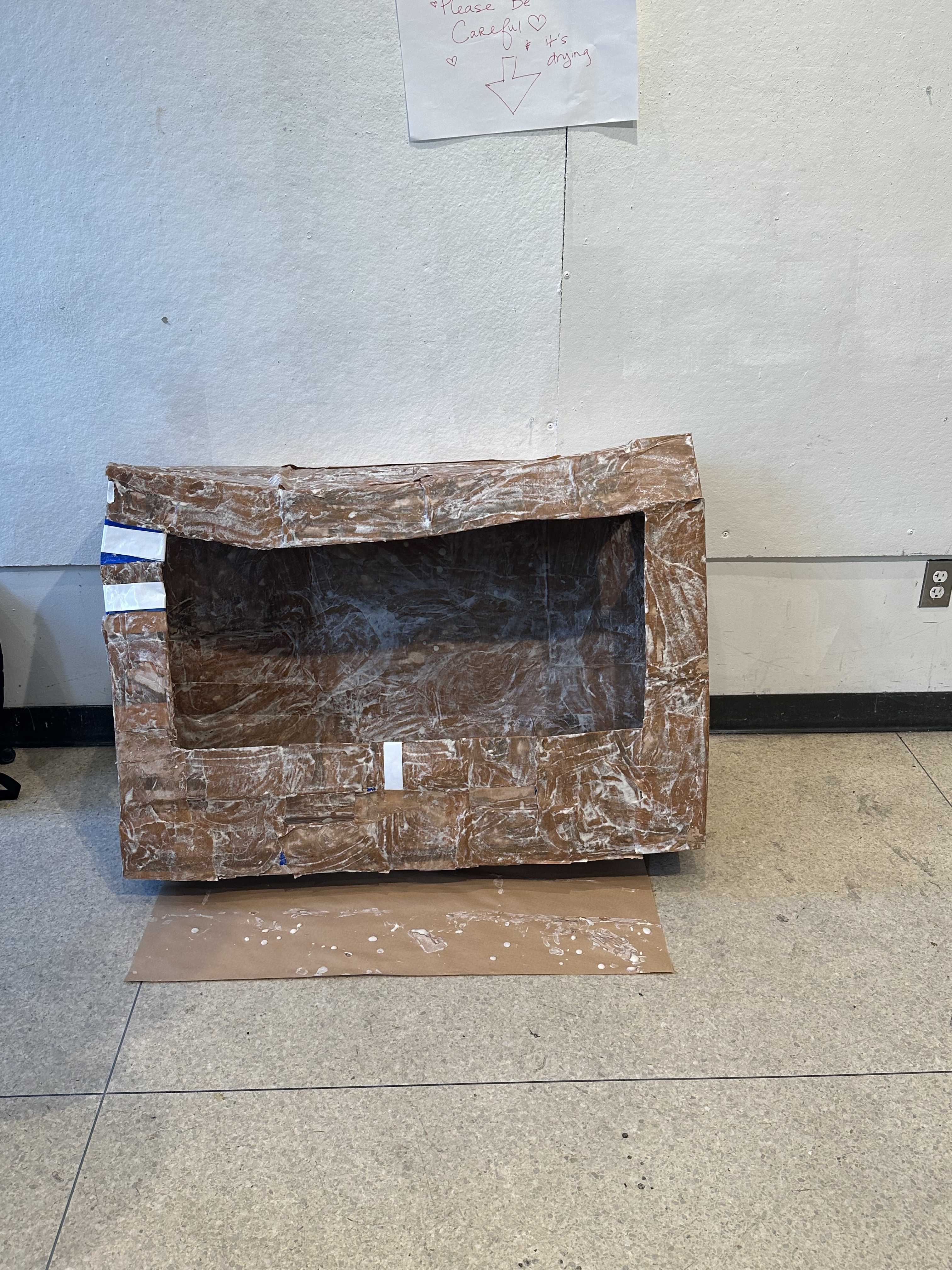
In this project I was really working through a process rather than looking for a particular outcome. I worked with recycled materials: cardboard, newspaper, and fruit packaging. I started by creating the base of my project using paper-mache.
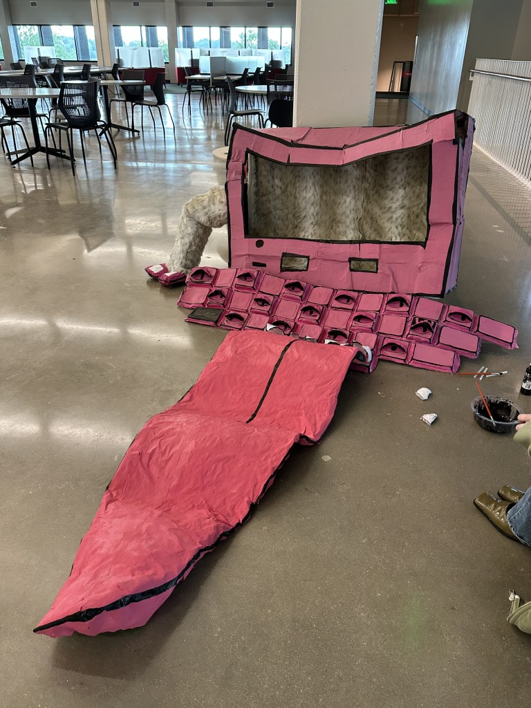
The keyboard went well but the computer face itself started to warp because of the moisture from the paper-mache. It was here that I decided I really needed to push the idea that this is not meant to be realistic but lives in alternate cartoon world. I started the painting process where I painted the whole thing black and then used pink to outline the edges but this did not give the effect of a 2D cartoon in a 3D world so I went back and repainted the whole thing pink. After everything was painted and the outlines were drawn I was still unhappy with it. It didn’t give any of the imagination that I wanted it to and it fell flat. I then decided to add fur to the inside of the computer. Once that was done it began to come alive; with the animal print inside I thought to make this into a living thing. It was then that I started to paint eyes onto the keyboard keys but even then it fell flat. I then started making 3D eye lids to put atop the painted eyes and it started to feel better. It was after our final crit that I spoke about wanting a large tongue exiting the spacebar mouth. So in the final hours of the project I made a 3-4 foot tongue. This was a hasty decision but really brought the piece together in my opinion. It allowed for a more experiential piece, one that you have to interact with as you walk around.
As I was working I also decided that to made the leaning seem purposeful I would create a furry arm that looks as if the monster is propping itself up and possibly about to start dragging itself forward. This was incredibly fun to work on but if I were to redo it there would be several things I would change. Firstly, I would work to make the main screen more structurally sound as I intended. I would also double it in size so that people could walk through it maybe even sit in it as if they were being eaten by the monster. I would also add the 3D elements into the eyeballs, making them different shapes, and really working on a realistic paint job. Overall I am very happy with the work and hope it makes at least a few people uncomfortable.
Martin Venezky is an artist based in San Francisco who takes a unique approach to the mostly digital world of graphic design. He begins by curating binders of images and graphics, over 30 fully unorganized binders, that he will pick at random and use for his next piece. What is so incredible about Venezky’s work is that his final products are quite large but he will use pieces that, when cut out, measure about a centimeter wide. It is in the continuous adding of smaller pieces that make his work so enthralling.
He was a designer before the digital era so his preferred method of working has always been analog. He believes that you can’t understand the scale or impact of a design when it’s on your computer; he also finds it dreadfully boring. One of the many things I admire about him is how he refuses to strive for perfect. He enjoys the awkwardness of the analog process and how things will hardly ever be perfectly symmetrical or perfectly in line; instead they have character and interest. However without perfect digital tools, he still is able to find logic within his work. He uses influences from his life to create his work; he was really into old model cars at one point and so then began to design in a way that reflected how machinery was shown in magazines. (shown bellow)
Which also happens to be one of my favorite works of his to date.
Hi! My name is Meg (Margaret) and I am a graphic design senior. My interests this past year that I wish to explore more is the diverse ways in which femininity are expressed and felt and how those experiences can create unity between peoples. I hope to work on created pieces that are out of comfort zone, expressive, and highly experimental. I find that a lot of my artwork is done with a preconceived notion of how work should be made and I am excited to move beyond that and get a little wild.