Individual Project- Harper

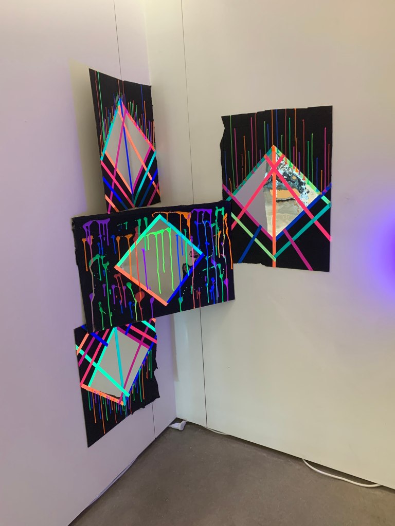
When I first started this project, I know exactly what I wanted to do. I wanted to work with neon colors in a dark environment! I was influenced by this bar I went to in downtown San Marcos that was a dark room FULL of neon colors all over and I wanted to do something similar.

When I first started, I spray painted some cardboard black and added neon tape around the edges of the mirrors. I put the mirror on the cardboard and started to drip the paint downwards.

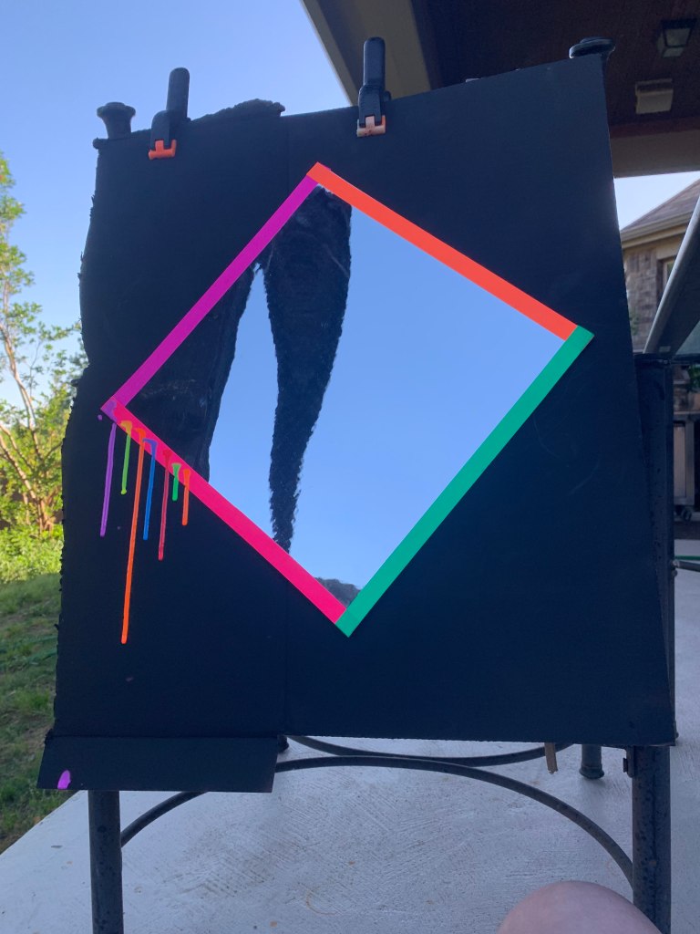
When I was done adding the paint, I thought it wasnt enough and I added more tape at the top which was such a payoff.

I decided to do this do all of them besides the center piece. I dripped the paint all over the cardboard this time instead!

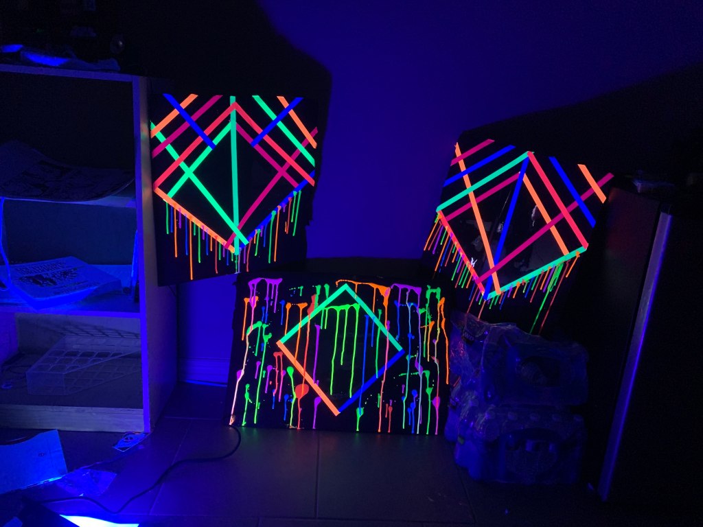
The work was meant to be shown in complete darkness in order to get the full effect of the piece.

When installing my piece, the room was a brighter than I thought. It was difficult to make it darker but thats okay! I really enjoyed putting up my first installation ever!

3D Cardboard Project

When starting this project, I found these white tubes to work with. I wanted to cut into them and add cardboard pieces almost making this staircase. The problem I found with that is how difficult it was to cut through them. I ended up using a saw and hatchet. When I finally got done add the holes and adding in the cardboard, it looked less like a staircase and more like a messed up deconstructed object from another planet. Thats where I got the idea of adding the triangular pieces to the board. Its still quite incomplete as I never got to add my drawing onto it. I think if I was to go back to touch it up with some ink, the project would look so much cooler.

Irving Amen

In 1918 Irving Amen was born in New York City. Interestingly enough is that World War I had ended. He had started his life in art at the age of four years old where he started to draw. In the 1940s he served in the Armed forces, going overseas to fight in the war; which at the time was World War II. He ended up making two murals. One in the United States and one in Belgium.

Once he returned from the army, he went to Paris in the 1950s to study art. In 53, he went on to travel in Italy. There he did lots of woodcutting and paintings. One of the pieces he did is called, “Piazza San Marco #4”

In the 1960s, he traveled to many other places in Europe as well. He went on the design a set of stained glass windows in Ohio which are absolutely beautiful. He did the Twelve Tribes of Israel for Agudas Akim Synagogue. (shown below)

His work had themes to them, often relating to religion, his environments of when he traveled, and many more. He died in 2011 in Coconut Creek, Florida.

https://www.annexgalleries.com/artists/biography/45/Amen/Irving

George Tooker

He was born August 5, 1920 , in New York City and was named after his father. As a kid he took art lessons and spent quite a bit of time hanging around museums. For school, he went to Philips Academy and transferred to Harvard University to graduate with an English degree. For his art career he went to study under Reginald Marsh at the Art Students League of New York. Here he got most of his artistic influence at the start of his career.

George Tooker did lots of impressionist paintings in the late 1900s. They were all mainly for social and political characteristics. This is because of the wars and impacts it had during his time. Most of his work had negative connotations on how people are feeling during those trying times.

“George Tooker’s work expressed a 20th-century brand of anxiety and alienation. Above, “The Subway” from 1950.
Credit…Whitney Museum of American Art” (William Grimes)

This piece from the 1950s, shows the lives of office works being alienated and isolated. All the colors are very similar and it feels as though theres no way out. Gates are all over the place and the people in the painting look super anxious or nervous.

George Tooker, The Waiting Room, 1959, egg tempera on wood, 24 x 30 in. (61.0 x 76.2 cm.), Smithsonian American Art Museum, Gift of S.C. Johnson & Son, Inc., 1969.47.43

This creepy drawing made in 1959, showing the frustrating times that George Tooker had at the bureaucracy while trying to obtain permits. He shows how worn down everyone is. Something I notice is his color palette is the same as The Subway. This is probably how he saw everyone in real life. Realistic and mundane.

Citation:

https://americanart.si.edu/artwork/waiting-room-24195

https://whitney.org/collection/works/3052

Keith Sonnier

Keith Sonnier was born in Louisiana in 1941. He went to Southwestern Louisiana Institute in 1963. He also went to Rutgers University in 1966, and graduated with his MFA. He studied under quite a few people and classmates where after he graduated, moved to New York City with a few of them to experiment together.

Keith Sonnier is a sculpture artist that experimented a lot with mediums. In the late 1900s he worked with latex, transmitters and incandescent light. He also started using neon light as well. He would draw in space with the neon tubes. He was one of first people in his fields to work with neon tubes. An experiments that he did with neon lights was at an installation for “Mies van der Rohe’s Neue National galerie in Berlin in 2002, entitled BA-O- BA Berlin” and since then he’s put up other temporary installations that involve neon lights. One of his more permanent works that was installed was in Los Angeles. It is called Motordom which lights up neon blue and red and is in a courtyard of Thomas Mayne.

He also did lots of work in Europe as well so a lot of his work is seen everywhere across the world. Some of the work he did are shown below:

Ba-O-Ba III  1967

BA-O-BA SERIES

Glass and Neon

Dis-Play II   1970

DIS-PLAY SERIES

Foam rubber, fluorescent powder, strobe light, black light, neon, glass

Cite: https://www.keithsonnier.net/sculpture-1970s.html

Dan Flavin

This week I decided to research Dan Flavin, an artist that works with lights. He studied at the University of Maryland Extension program in Korea to get his art degree. He also went to Hans Hofmann school of Fine Arts in New York in 1956. In 1959, he started working in drawing and painting that influenced the start of his abstract expressionism. In 1961, he created bunch of drawings for sculptures that had electric lights, which really where his success comes handy. He went on to take those drawings and make lights into monochromatic canvases, then later on worked with fluorescent tubes.

I feel as though his art works super well when drawing in space. I love how his installations provide these reflections onto the ground and made the piece bigger then what it actually seems to be. Especially when moving in different directions, you can make the reflection longer or shorter. Even though Dan Flavin offers this minimalist style, he makes his art super fun to look at. I think this is something I would want to try and create in the future.

citation: https://www.guggenheim.org/artwork/artist/dan-flavin

Edwards Hopper

Edward Hopper was born in 1882 in New York. In 1900 he went to New York School of art and did illustration and proceeded his work as a illustrator after his schooling 1906. Later he went on trips to Europe which changed his way of doing art in the future. What really influenced his was the architecture and traditional art that influenced his work, especially in Paris, France. During the 1900s was when impressionism became more present. He found influence through artist such as the classic Monet and Van Gogh. Due to the references and influence, he started using a lighter color palette and quick strokes. He went on to do lots of paintings of landscapes and in 1942 his most famous piece, Nighthawks, was put in the Art institute of Chicago.

Nighthawks, one of my favorite paintings, was created during the war to reflect how Americans felt during the period of the war. You can see how the lighting on the diner is portrayed and how the influence of Europe is translated in his pieces.

Chop Suey by Edward Hopper is another impressionistic painting. The lighting is also shown in this painting such as the others that he has done. The light on the characters is carefully placed and done wonderfully. In this painting he also captures this moment of loneliness even though each person has company. I believe its due to the closure. It feels very alienated due to the sign being hidden and same for the other girl and table to the left

https://www.edwardhopper.net/chop-suey.jsp

https://www.edwardhopper.net/

Galaxy Mountain- Translucent Layers

For this weeks project, I used two layers to create a mountain area with a galaxy moon and background. My idea for this was simplistic due to not working in layers before. The medium I decided to use was black waterproof India ink.

I started with this circle as a moon and I flicked ink all over the page. I also messed around a little and spread some of the droplets around with my brushes. I thought it looked pretty good there.

I started on my top layer that portrays mountains, some waves, and a little bit of a mess. Lesson learned: don’t paint outside on a windy day. I did mess up a little, I tried to cover it up with more mountains but it looks funky, but that okay.

Luo Zhongli

The person I did this week is Luo Zhongli. He was born in Chongqing in 1948. He works in realistic paintings and famously known for doing portraits. He was also known for developing a lot of chinese art back in the 1980s. During that time (1982) he went to school at Shichuan Fine Arts Institute. He then went to the Royal Academy of Fine arts in Belgium in order to get an Masters of Fine Arts in Oil painting.

Luo did this painting called Father which is one of his best works. This piece below is revolutionary. It spread all across the world and helped bring a lot of attention to Chinese artist. For the painting itself, its a point of view of peasants and allowed people to bring thought into how they were treated.

Zhongli was awarded the National Golden Award which was huge for Art in China at the time. His work ended up being put up in the Chinese art museum.

Luo Zhongli had quite a few exhibitions in America in New York and Havard Art museums while he was still in school for his MFA.

Reconciliation
signed and dated ‘Luo Zhongli 1991’ and signed in Chinese (lower right)
oil on canvas

This is another example about his research in peasants and trying to get his audience to look into history and understand this piece. The medium he used is Oil on canvas. The colors he uses in his paintings are correlated to a palette that he uses for most of his paintings. The reason for this is because of religious motifs. In this painting, he uses red and blue for the buffalo. This symbolizes the strength and rage in the buffalo.

Citation:

https://www.artnet.com/artists/luo-zhongli/biograp

https://www.christies.com/en/lot/lot-6080108

Jason Eatherly

An artist from the Midwest, moved to Austin Texas. He started to paint when he was 12 years old. Because of the love and support of his mother, he continued working from small interior pieces to giant murals. Jason is a muralist that places his work on the streets of Austin and lost spaces. This means broken down structures and weathered environments.

Jason Eatherly doesnt keep any of his work but gives his art out to the people to see. A lot of pieces are collaborated with companies that try to make a change in the world. For example, Eatherly has worked with LIFEWTR, a water bottle brand that supports local artist and to help art in the education system.

“Favorite air bnb”
26x36in.
Oil on canvas

“Where we go is fun.”

40x60in.

acrylic and oil on canvas