Jacqueline Surdell

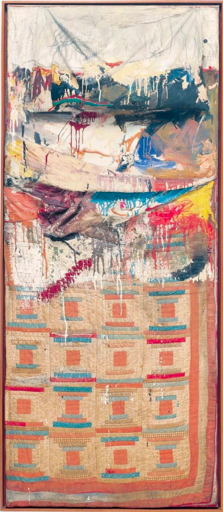
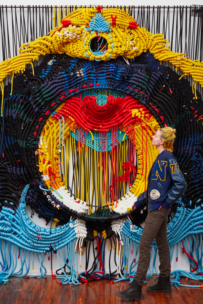
Jacqueline Surdell is a Chicago-based artist born in 1993. Surdell is an artist that uses long pieces of rope, fabric, and silky ribbons to make her colorful abstract tapestries.

While growing up in Chicago, Surdell was heavily influenced by her grandfather’s physical labor working in steel mills and her grandmother’s conceptual labor as a landscape artist. These combined influences created Surdell’s artistic view of “life and work, body and labor, industry and craft, and the high-brow traditions of plein-air landscape painting, merged.” Through this, Surdell became more interested in both athleticism and artistry as she grew older which helped with her work since it requires a lot of physical labor and full-body movement to create.

We Will Win: Our Banner in the Sky (after Frederic Edwin Church) (2020)

Materials: cotton cord, nylon, paracord, fabric, and ribbons

Dimensions: 84 x 108 x 12 inches, 120-inch bar.

Because of the sheer amount of materials used and how large her tapestries are, Surdell’s work tends to be suspended by wood or steel rods with each tapestry weighing an average of 150 pounds. Surdell also had to create her own massive handmade looms just to be able to create her work. Surdell’s work is actively seen as a bridge to unite the mediums of painting and sculpture together where she knots and looms materials together with the spontaneity of contemporary painting to reimagine woven canvas.

Score!
Installation, 2022

Asymmetry
Installation views of Asymmetry, a two-person exhibition featuring the work of Robert Moreland and Jacqueline Surdell
March 12 – May 4, 2022

Tang Kwok-hin

Tang Kwok-hin is a Hong Kong mixed-media artist with a Master of Fine Arts from the Chinese University of Hong Kong in 2008. Tang’s work tends to be based on “daily and personal contexts to narrate hidden stories” to blend the boundaries of art and human conflicts to express the concerns of human conflicts and their effects on the surroundings. Tang’s work deals with own experiences and personal conflicts such as “growth, inheritance, locality, freedom, urbanization, consumption, nature, politics, norms, existence, etc…”

04:45 PM (2013)

Glass, paper, wood, transparency and adhesive C-print cutout

19.685 x 19.685 inches (50 x 50 cm)

These themes and stories in Tang’s work are based on his own background growing up in a village in Kam Tin which explains his relationship between urbanization and nature. Through his surroundings and introspections of his life, Tang uses his work as a “comprehensive approach to reveal emotions, thoughts and essences deep down at particular moments among chaos” in his life.

Tang uses this connection between art and human conflicts to make collages out of premade objects and materials to give them new meanings by way of exploration and reconstruction.

Image Sources:

TANG Kwok Hin: Needs  鄧國騫《百貨》

TANG KWOK HIN: MIXED MEDIA COLLAGE

Window to a New World – Collage/Overlap Project

For this Collage/Overlap project, I only had a vague idea of having something open to a different world like a portal or a window to view it. So I worked with that idea and started to pick out images from magazines that I thought would work well together and make the idea of viewing into a different world a reality.

When I started to assemble the scraps of magazine paper together to try to form a cohesive image, I started to like the idea of a bedroom having a window that opened up to a weird portal of a world. The curtain of the bedroom picture bothered me and I was about to cut them out completely before getting the idea to cut them out to a certain amount and fold them accordion-style. Doing this made the curtains not take up too much room on the paper and the folded curtains added a small 3D/pop-up element that made this piece all the more interesting to look at.

From there, I liked the idea of having some of the elements of the collage pop out and have a 3D element to the piece, so some of the element pieces of the collage aren’t fully flat on the paper but rather pop out and slightly move when you pick it up. I felt this added to the overall feeling of weirdness and viewing into a different world a lot more versus if I had made every element on the collage flat.

I then decided to focus on finishing up the bedroom part of the piece to make it feel complete. So I tried to gather more pieces of magazine pictures to finish and develop a bedroom. After the piece was done, I decided that I would make the piece have a comic book/cartoonish feel to it by having dark outlines and some white highlights on some of the elements of the collage. I used India Black Ink with a paintbrush to make the black outlines and White Acrylic-Gouache to make the shiny highlights.

In the end, I love the end result of the Collage/Overlap project and what I ended up with was something I didn’t expect to have. Letting my mind guide me through this piece and just seeing whatever I felt would work together seemed to make this piece interestingly weird to look at.

Robert Rauschenberg (1925-2008)

Robert Rauschenberg was an American artist born on October 22, 1925 in Port Arthur, Texas. Rauschenberg’s popularity and work started to emerged when he and many other artist were challenging the rise of the Abstract Expressionism movement. 

“I think a picture is more like the real world when it is made out of the real world.” – Robert Rauschenberg

Rauschenberg got his notoriety from his Combines series from 1954 to 1964. Combines was a collection of Rauschenberg’s well-known works that has combined aspects of painting and sculpture from real-world materials and objects combined with abstract painting. At the time, his work made ironic nods to Abstract Expressionism by using self-expressionism to counter the modernist aesthetic as a way of displaying his belief that “painting relates to both art and life.” His works were predominantly mixed media with his main interests being photography and printmaking.

Bed (1955)

Materials: Oil and pencil on pillow, quilt, and sheet on wood supports

Dimensions: 75 1/4 x 31 1/2 x 8″ (191.1 x 80 x 20.3 cm)

Over the following years of life, Rauschenberg’s work would expand to a variety of other fields beyond art such as choreography, printmaking, engineering, writing, and many other fields where he could collaborate with others. This would help to expand his artistic philosophy of collaboration and commitment to humanitarian causes.

Nectar (1993)

Materials: Inkjet dye transfer on paper

Dimensions: 42 x 29 1/2 inches (106.7 x 74.9 cm)

One of Robert Rauschenberg’s most iconic works is that of “Buffalo II” which is a silkscreen painting that ties the world of art and politics together. The work is over 8 feet tall that used a combination of pre-existing pop culture images with the various drips and painterly gestures. Buffalo II served as a bridge between the decline of Abstract Expressionism and the rise of Pop Art movement.

Buffalo II (1964)

Materials: Oil and silkscreen ink on canvas

Dimensions: 96 x 72 in (243.8 x 183.8 cm)

The Pink Range – Atmospheric Perspective Project

I struggled with an idea for this project for a bit, so I turned to scrolling through Pinterest to help generate ideas. From the scrolling, I came across a beautiful scenery of this Japanese bridge over a large body of water with cherry blossoms and tree branches in the foreground. Then, I got this picture of a beautiful sunset happening over mountain ranges. From these two images, I thought about combining my favorite elements of both pictures into one piece.

I then made some thumbnail sketches to get a better idea of what I wanted and to see where each element should go.

I settled with a combination of the top-left and the bottom-right for my final piece. From there, I sketched my drawing into a bigger mix-media page.

I also decided to use pastel sticks as a way to experiment with a new medium and thought it would be an easier way to achieve the color gradients that I wanted the piece to capture especially with the sunset sky and the reflections in the water.

I kept the piece relatively within a pinkish tone and decided to make the branches a dark blue since I felt having them be black would be too harsh for the piece.

Lastly, I finished the entire piece by mixing some dust of the pink and red pastel sticks with white acrylic-gouache paint to get an opaque look for the cherry blossoms on the branches. For the cherry blossoms, I used varying shades of pink and white to get a look of the different shades cherry blossoms to have especially under the sunset lighting.

After getting feedback for my work, I was suggested to try making the cherry blossoms more in focus and defined by using a technical pen to trace some of the cherry blossoms so they have that more defined form like they would being in the foreground. Then, I was told that the closest mountain range in red/hot pink should be made a little softer since it felt to defined for being far away so I tried to blend out the red/hot pink pastel more to be softer.

In the end, I did not expect this piece to turn out as well as it did, and I ended up really liking the end result. I am proud of myself for experimenting with a medium out of my comfort zone and using what I could to keep the theme of using mediums I don’t normally use in my work. I enjoyed the process and finishing this piece to the very end.

Yoshio Ikezaki – Painter and Papermaker

Yoshio Ikezaki is a Japanese artist and papermaker born in Kitakyushu City in 1953.  He then went on to receive a Bachelor of Art and Master of Fine Arts from Florida State University in painting before moving back to Japan to study traditional Japanese papermaking. For six years, Ikezaki studied and experimented with traditional Japanese papermaking under master papermakers, Shigemi and Shigeyuki Matsuo. He would later employ what he had learned to produce his own paper for his paintings and sculptures, giving him complete control over the paper’s thickness and fiber distribution; this allowed him to take into account the Sumi-ink’s reactions to varying fiber ratios while manufacturing paper for his paintings.

Ikezaki’s Sumi-ink paintings are deeply associated with his childhood memories of the  Kitakyushu Island landscapes he saw. He sees and paints these landscapes as “slow-moving photographs” where it displays all the natural elements of the landscape to his audience. Ikezaki’s art has a mysterious and evocative quality that stems from his use of his own Sumi-ink, which gives his work movement and vitality and moves viewers as they look around it.

Ikezaki’s work utilizes Ma which is defined to be a “Japanese aesthetic term to designate an artificially placed interval in time and space which include meaningful voids created by the deliberate use of blank space.” This balance and use of positive and negative space is an essential, prevalent theme throughout his paintings and sculptures.

Timeless Wind 106

Sumi-ink on paper, 30 x 40 inches, 2016

The Green Wonderland

Sumi-ink and Japanese watercolor on paper, 30 x 40 inches, 2018

The Winter Wonderland

Sumi-ink and Japanese watercolor on paper, 30 x 40 inches, 2018

Introducing… Me!

Hullo, I am Laramie Torres (he/they), a senior at St. Edward’s University majoring in Video Game Development with a minor in Graphic Design. I would consider myself to be a 2D Character Artist and Animator hoping to make my dent in the world with my work whether it be in games, animation, or comics. 

Taking Drawing Into Space was originally to fulfill elective requirements for Graphic Design, but after learning more about what this class has to offer, I changed my tune on the course and thought it might be good for me as an artist to experiment and explore what it means to create something outside of the traditional and digital ways I have done before. I can’t wait to see what we will make in this class and how I grow as an artist throughout my time in this class.

When it comes to drawing, I have been doing it for as long as I can remember wanting to make up my own stories but didn’t start to get serious about doing art until the 3rd grade. Since then, I have become fascinated with drawing my favorite characters from different media and creating my own characters that I love. Drawing means a lot to me because it became beyond wanting to tell stories and express my love for my favorite media. It evolved into a way I relax, think, or project my innermost feelings in a way that made drawing a visual language that I use to communicate to myself and others around me.