“A Wish for You” – Individual Project

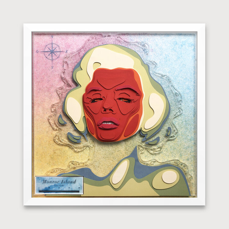
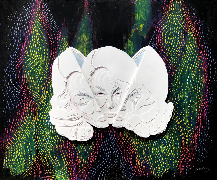
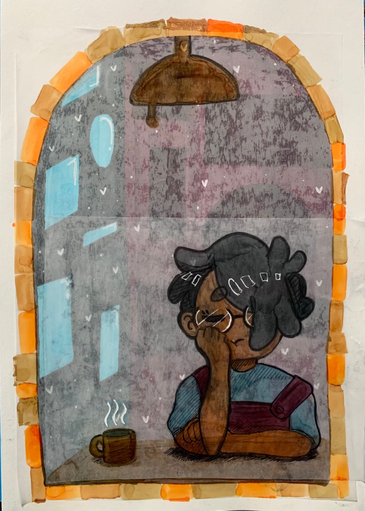
For my Individual Project, I decided to do a layered paper art scene. The idea was that I wanted to use colorful paper layers to create a whimsical 2D scene that had some 3D depth to it. I was heavily inspired to do this based on two artists I did research blog posts on: Ale Rambar and Daria Aksenova who are both artists that utilize paper and paper layering to create their 3D work. From Rambar, I used some of his topographic method for making some elements of my scene pop-out more while with Aksenova, I drew more from the idea of a story scene being created with the layered art.

The base idea for this project was that I was going to use a combination of colorful card stock and regular paper and have them be layered on top together with tape and glue. So, I made sure to buy colorful card stock, colorful printer paper, an X-acto knife, a cutting mat, a roll of adhesive foam tape, and some double-sided tape.

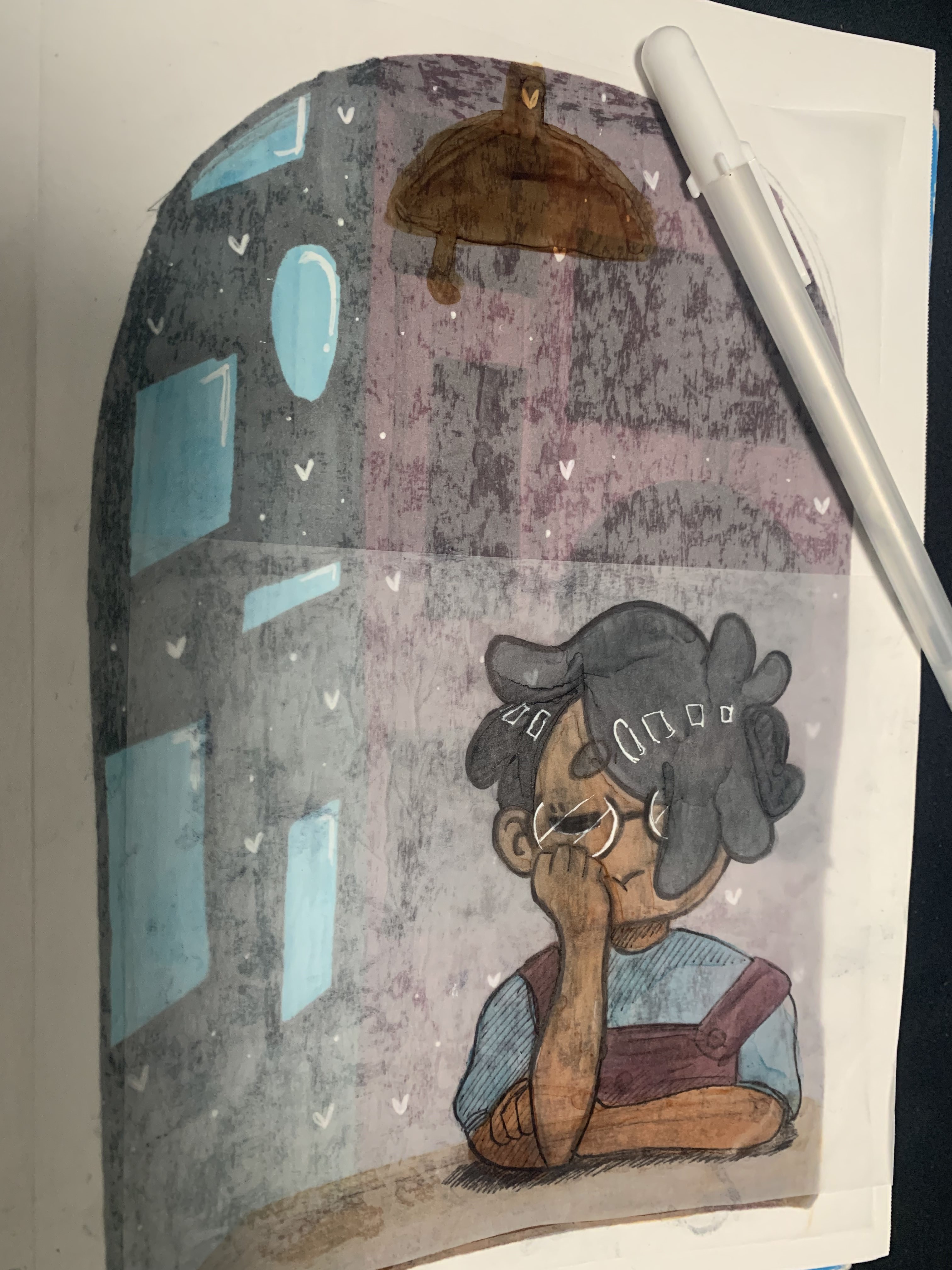
I started off by making some sketches of the scene I wanted to create before settling on the middle sketch.

After deciding on the sketch, I made a digital render of the layered scene, so that I have a better idea on how many layers I’m going to use, what each layer should look like, and in what order they need to be in to get the desired scene result.

Afterwards, it came down to choosing the colored paper and card stock that best matched the layers I digitally rendered and sketching on them so I can cut them out accordingly. Once all the layers were cut out, I was able to stick them together using both the double-sided tape and the adhesive foam tape. The double-sided tape was for layers that I wanted to be close together with little-to-depth between them, and the adhesive foam tape was for layers that I wanted more depth and space in-between. Since I couldn’t find a shadowbox frame that would fit this final piece, I ended up making a paper frame on the front so it looks like a frame border and acts like a window into the scene.

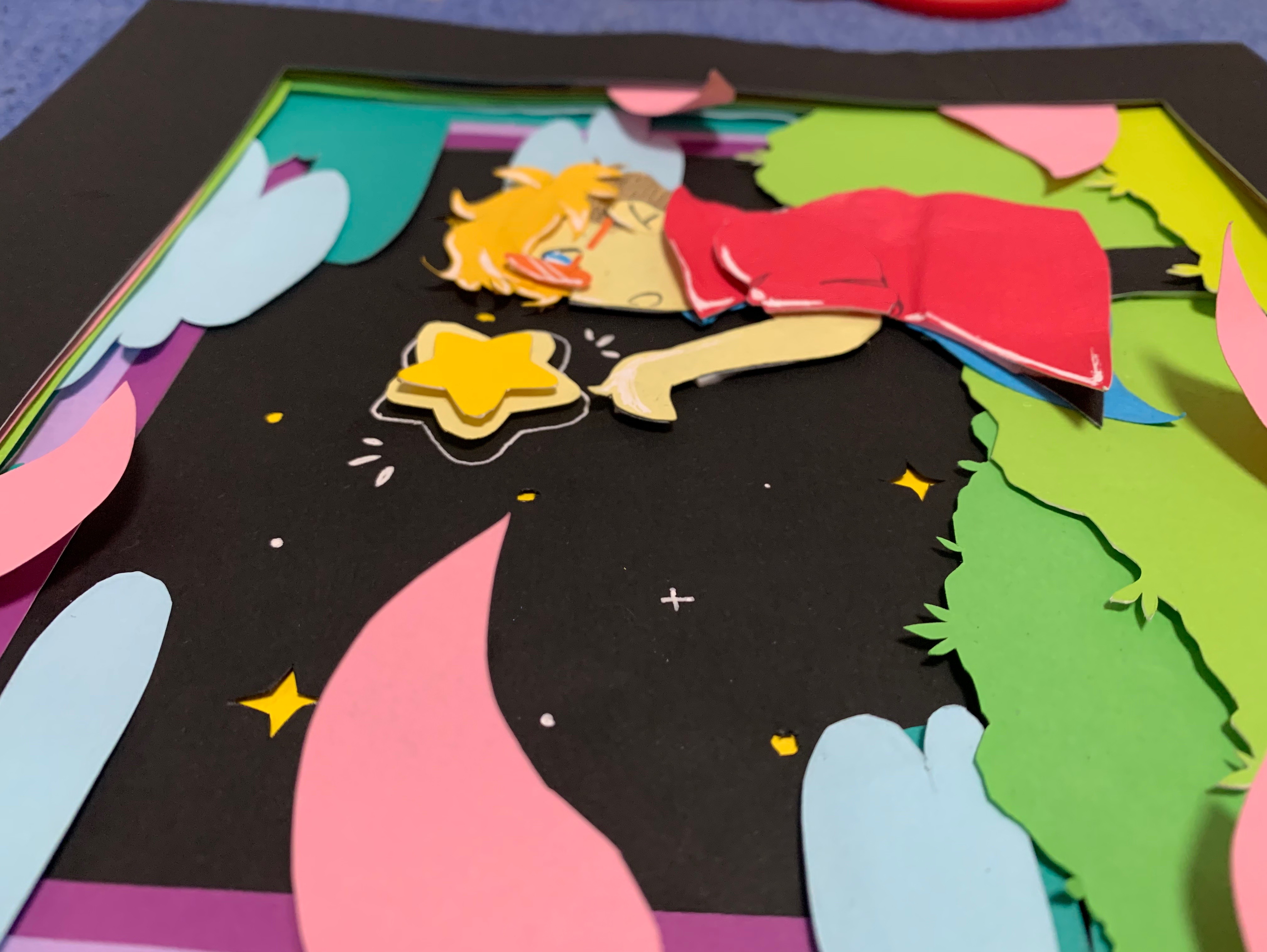
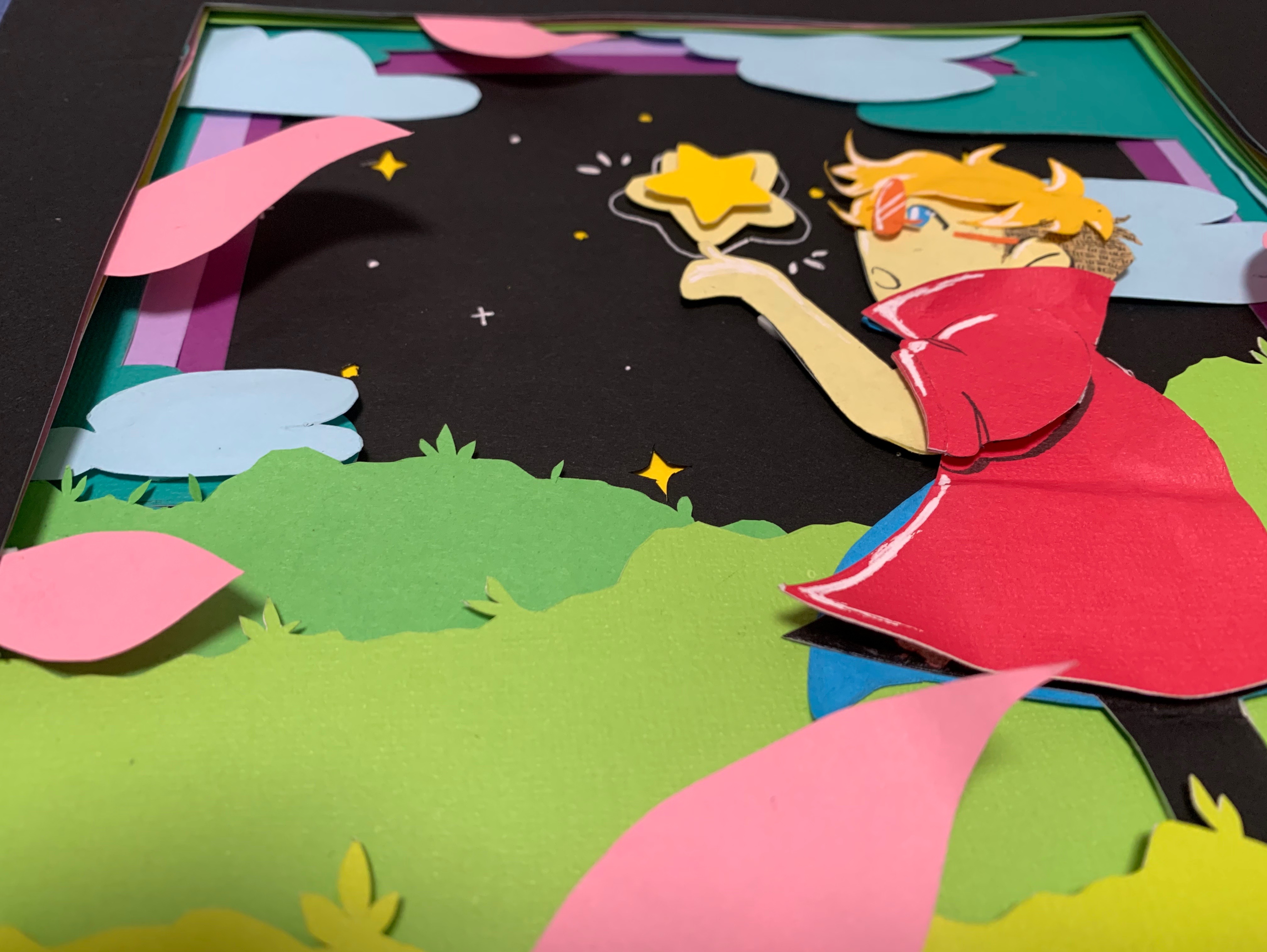
How does my project address the theme of “Drawing Into Space”? It uses layered paper that adds depth to the piece and has overlapping shapes going on to really sell that. Plus, the use of negative and positive space with the paper layers is what is being used to “draw” each element into the overall scene, and when all combined, show a collated scene with depth to it because of the layering.

If I had more time to work on this project and wanted to improve on it, I would’ve loved to add all the other details with the flowers, leaves, and branches that are in my digital rendering of the scene, and I wish I would have gotten a thicker adhesive foam tape so that the layers had more depth to them. I also would’ve loved to have put this in an actual shadowbox frame that was the perfect size for it.

(Trees) Group Project

Week 1: Before starting our project, we scouted potential places to put our tree installation. After settling on a place to the side of the art building between two trees, we got together and discussed about the materials that needed to be ordered such as yarn, solar-powered string lights, and UV lights. Then, we took a picture of the location and made a layout sketch of the installation on top of a picture to get a better idea of how we are going to make the trees look. After getting our materials and having a sketch to work off of, we started wrapping some of the yarn around the tree barks. We also did some prototyping with the biomorphic shapes to get a better idea of how we wanted them to look on the trees. Then, added getting more chicken wire and white spray paint to our materials list.

Week 2: By this week, we finished wrapping yarn around the tree barks. Then, we moved on to wrapping yarn around the large branches and started “spider-webbing” the branches together with the yarn to add more interesting details. By the next class, we decided to just finish wrapping the tree branches in yarn and anything within our reach since it didn’t seem like a good idea to go any higher because of the rainy, windy weather that day. Afterward, we ended our work early, and we got more chicken wire and spray paint for the biomorphic shapes to be put on the trees accompanying the yarn.

Week 3: Since we weren’t going to be here during the Spring Break, we tried to be as productive as we could be on Tuesday. We spent the day doing some more spider-webbing with the yarn wrapping between branches. Then, we started stringing the two trees together using rainbow yarn to have them hang between the two trees. We would throw the rainbow yarn between the tree branches and around the barks to get the stringy hanging piece. 

Week 4: We spent this week adding some solid-colored yarn to our hanging centerpiece to go with the rainbow yarn hanging already. Then, we started working on getting the biomorphic shapes onto the trees, so we measured them and put them up to see if they look good and/or needed tweaking. After making a couple of the biomorphic shapes, I started to spray paint them white outside on a large piece of paper as a covering to not get paint on the benches. I managed to spray paint 3-4 shapes before running out of white paint. We planned to buy a few more cans for the next class to finish spray painting the remaining shapes. After getting more white spray paint, we sprayed paint more of the biomorphic shapes. Afterward, we started putting up the shapes onto one of the trees and added some white mesh fabric into the shapes so they popped out more. They look like little clouds attached to the tree which actually looks pretty nice, especially with the yarn acting like the “rainbow” coming from them. To secure the biomorphic shapes onto the trees, we tied a yarn on one end wrapped it around the tree, and tied the other end to the other side of the shape.

Week 5: By this week, we were pretty much done with our project for the most part with the exception of adding the final white biomorphic shapes to the other tree and securing them onto the tree by tying them around the tree with yarn. Then, we wrapped the string lights around part of the barks before stringing them along with the yarn to hang. We tried to make sure to put the mini solar panels for the string lights in a position where the sun would hit them, so the lights can charge during the day and light up at night. Lastly, we added the UV lights by using the extension cord to better reach the trees and plug the UV lights into them. Then, the project was done.

Personal Contributions: I helped wrapped yarn around the branches (“spider-webbing”), helped with hanging the rainbow yarn between the trees, and spray paint the biomorphic shapes white.

Ale Rambar

Ale Rambar is a Costa Rican artist that makes 3D art using layers of paper. During his time as an architect back in 2013, Rambar was drawn to the beauty of topographic maps. He found the concept of the topographic map with 2D layers transforming into 3D elements and this concept became his main artistic work.

Rambar makes each of his pieces by analyzing and following the topographic map of human bodies from their bumps and crevices to their indentations and protruding elements. He sketches out everything to perfectly map out each person’s topography.

“Each piece is cut separately, layer by layer, and then assembled by hand to create ‘human topographies’” as his work. The reason Rambar enjoys using paper is that he is drawn to how clean and crisp the end results are once you learn how to manipulate the paper properly.

Rambar believes that art should try to change society and bring attention to issues that are a part of our daily lives. This is why Rambar uses his work to open conversations about the experiences of sexual identity or the discrimination people have felt from their identities.

Daria Aksenova

Daria Aksenova is an artist known for her suspended narrative shadowboxes made with layers of paper and ink. Aksenova focuses her work on telling stories of mythology and folklore with the use of cinematography through constructed dynamism of layering hand-cut and inked paper to make her complex works. These works are then suspended inside decorative boxes for all to view and enjoy.

Aksenova’s work is primarily in black and white and the reason she uses that color scheme over using more colorful variations is that it challenges her creativity by removing the distraction of colors to pay more attention to the details of composition, anatomy, light, tone, and narrative. Technically, Aksenova’s work isn’t fully achromatic since some of her inks have sepia and blue undertones that add some subtle coloring to her work, but primarily nothing more colorful beyond that.

Aksenova has stated that her “mission is to bring back our childhood imaginations that are drowned out by the everyday bustle in our ever-busy lives.” So Aksenova turned to children’s stories of folklore and mythology in order to “draw the viewer back to the [stories] of their youth, hoping to create artwork that inspires the dreamer within.”

Cartoonish Amalgamation – 3D/Cardboard Post

For this project, I wasn’t all that excited about working with cardboard, so I tried to just dive into the project and not do any prep work for it. I only had the idea to get some cardboard boxes and cut a bunch of different small shapes out of them. After doing that and having a bunch of shapes, I started to just assemble together to form some sort of sculpture. 

I used a combination of super glue and cutting slits into the cardboard pieces to make these pieces stick together. Getting close to using up all the pieces for the cardboard sculpture, I realized that I needed to make it taller to fulfill the height requirement of the project. After some thought, I decided to grab a random piece of cardboard that was still partially still intact to use as a base to hold the whole sculpture up. From there, I drew the outlines and extra lines for each part of the sculpture to make it appear more 2D comic book-like. Then, I was done with the project.

Not the biggest fan of this project, but it got done and it wasn’t completely bad looking. I think if I had more time and motivation to work on this project, it could have ended up looking better.

Robert Forman

Robert Forman is a yarn/string painting artist that began his journey back during high school in 1969. Before the yarn painting, Forman was already highly skilled with drawing and then discovered he could combine his drawing skills with his mother’s embroidery threads to make paintings that utilized these threads. This technique gave birth to his specialization in making yarn paintings. Forman continued to develop his yarn painting technique well into college at The Cooper Union. Foreman graduated from The Cooper Union with a BFA in Painting for his string paintings.

A Walk in the Park (2021)

Forman’s painting professor and mentor, Jack Whitten, brought Forman to Mexico where he learned that the Wixárika people, or Hurichols, use yarn painting as a traditional art form. This allowed Forman to develop relationships with other yarn painters and learn from them how they go about with their yarn paintings.

Crosswalk (2020)

On Foreman’s website, he describes his process on how he goes about creating his paintings.

First, he creates full-scale drawings, traces them, and then transfers them over to a clayboard with carbon paper. Next, he uses Elmer’s Glue to glue yarn of various weights, colors, and materials (cotton, silk, linen, and rayon) to the clayboard. After all the yarn has covered the drawing on the clayboard, Foreman seals the finished painting with fabric glue and then frames it using a frame he built himself in his wood shop.

Foreman mentioned in an interview that his most important tool when making his paintings is a small screwdriver that he uses to press the yarn strands and move around the glue. “This screwdriver, a pair of thread snips and a small Elmer’s glue container are my indispensable tools.”

El Gringo Rojo (2019)

Eric Rieger / HOTTEA

Eric Rieger, or his street name “HOTTEA,” is a Minneapolis, Minnesota-based graffiti yarn artist who uses colorful yarn to make interesting and non-destructive street art.

Rieger started out as a graffiti writer who spray painted his work before he ran into a cop during one of his graffiti ventures and the cop used a taser gun on him. As Rieger describes the encounter:

“The story goes I got tasered like four or five times. […] I went to jail and seeing my family going through all that pain, and just knowing that if this happened again they’d be going through the same amount of pain again, and I just couldn’t do that, and so I stopped doing graffiti art.”

Eric Rieger (2011) – Interview by Euan Kerr with MPR News

After that experience, Rieger decided to focus on getting his graphic design degree from Minneapolis College of Art and Design before graduating in 2007. Rieger became a freelancer for a bit before he started missing the excitement and enjoyment he got when he made graffiti. Within the same year, Rieger’s grandmother passed away and although they had a language barrier between them with him speaking English and her Spanish, the two often bonded and communicated through knitting. It is from this that he decided to combine the knitting skills he learned from his grandmother in a transformative, non-destructive way to create his graffiti writing again.

“I thought with my love of typography, how can I involve typography and yarn with street art? […] And then hence came about the fencework.”

Eric Rieger (2011) – Interview by Euan Kerr with MPR News

This is when he started making his yarn art on fences and most often would be the words “HOT TEA” which is where it developed into his street name and became a part of his identity.

The reason for HOT TEA, as explained in Reiger’s Vimeo bio section, is meant to show how the two words as interconnected and have a relationship with one another to present themselves as new combined meaning that wouldn’t exist if the two were separated. One word cannot exist without the other or else they both lose their combined meaning.

As best phrased in the Vimeo bio: “Like the phrase itself Hot and Tea are two totally different words brought together to represent something new, which reflect on the media and surfaces that the [HOT TEA] project makes use of.”

Rieger’s work as a graffiti yarn artist exploded as his work was seen all over Minneapolis. From there, Reiger’s work evolved beyond the streets and began having installation showings inside buildings and being hired by businesses to create work for them. Even though his work can now be enjoyed indoors, he still enjoys and creates his street work outside to be viewed by all who pass by.

Clare Celeste

Clare Celeste Börsch is a collage and installation artist based in Berlin, Germany with her husband and son. As an environmentalist artist, she uses her work to create immersive installations of flowers and fauna that bring awareness and inspire action toward the ecological and biodiversity crises around the world.

Biodiversity

“68% of biodiversity has been lost in just 50 years. As I rip down, and then mend, 68% of my installation, I share a message of love, urgency and hope.”

Celeste’s love of collage comes from her own background of having to grow up all over the world. She compares her life to a collage of sorts and establishes her love of creating collages on a personal level. She would start by collecting, cutting, and sorting out all her collected images before delving into focused sprints of creativity to make her large works.

Celeste has even stated in an interview that her most prized object in the studio is her image collection. She has her collection organized into boxes with labels of what they contain such as “reptiles and amphibians,” “tropical flowers,” “roses,” “succulents,” and “snakes” just to name a few.

Holding Light (2021)

“Holding Light is a rotating chandelier made from images of flora and fauna. The work was accompanied by three personal essays that wove together personal narrative with broader issues of racial, social and environmental justice. The closing component was a guided meditation. The meditation was offered as a gift and a way to gather strength and light in dark times.”

Celeste’s mission when creating her work and installations is to:

• Partner with those committed to a just, regenerative and biodiverse future that is powered by 100% renewable energy.
• Create collaborative works that engage audiences of all ages on the importance of biodiversity.
• Use art as a form of environmental activism.

The Healing Garden

“The Healing Garden’s branches were foraged from local forest beds and the translucent leaves are made from a homemade bioplastic of red algae, plant gelatine, water, and organic food dyes.”

Celeste’s Links:

Barbara Licha

 “The complexity of people’s behaviour has always intrigued me and inspired me to visually express the range of human emotion.” – Barbara Licha

Barbara Licha was born in 1957 in Poland before moving to Australia in 1982. Licha studied Graphics and Sculpture at The Academy of Fine Arts in Wroclaw, Poland from 1979 to 1981. After moving to Australia, Licha got a BA (1985 – 1988) and a Graduate Diploma of Fine Arts (1989) from the City Art Institute in Sydney, Australia.

Licha uses various mediums for her work from painting to sculpture, but her favorite material to work with is wire because it is a material she has worked with for more than a decade and has never had any reason to complain about using it. This seems to track given that the majority of her works use a lot of wire to create her meaningful sculptures.

Licha has expressed that she has “always been interested in the complexity of human condition and the variety of human behaviour” and emotions. She explores that in her work through the use of human-like figures to represent “symbols of emotions” so that they can represent everyone and let viewers project themselves into her work. As Licha has expressed, her favorite thing about being an artist is the dialogue between herself and her work and how that transforms into the dialogue between her finished work and the viewers. This communication is what makes her enjoy creating her work and being an artist.

Sculpture Pictures from Barbara Licha – Contemporary Art Website

Window of Visibility – Translucent Layers Project

Since there were no real parameters for this project, I decided I wanted to do something relating back to my interest in drawing characters. So, I started by doodling a random character sitting on a table looking out a window. I imagined this person was very tired so they would have a cup of coffee next to them and they would be resting their head on their hand.

I decided that I liked the cartoony and round-looking doodle on the right and went with that doodle for my project.

I first experimented with how I wanted the layers to be and look like for this project by making a smaller scale version of it with tracing paper and some of the Translucent paper we got to use. I made a total of 5 layers each serving a piece of the overall project: background of the interior room, a cone of orange-to-yellow light, a ceiling light fixture, the table, and, lastly, the sleepy character with the steaming coffee cup next to them.

I used some illustration markers I had in my possession to color the layers and used some regular inking pens to outline the some of the elements to standout more and make the piece feel more cartoonish. After I glued the layers on top of one another, I decided that for the final version I would try to use less layers since it became hard to see the interior background at all and I wanted it to show up a lot more than it did in this mini test.

I made the background of the interior room on a piece of Mixed-Media paper from my sketchbook and then made each piece on tracing paper. There was a layer for the ceiling light fixture and the table, and another layer for the sleepy character and coffee cup. As mentioned, I used less tracing paper layers so the background interior room would show up more while also letting the tracing paper layers push it to the back to let the other elements appear more in the mid-to-foreground.

I made the line art thicker on the character and mug this time around and used a white gel pen to make the glasses’ shine and add highlights to the character’s hair. I mainly used a lot of the ink pen and gel pen to make the piece look more cartoony such as with shines, hatching shading, and creating thick outlines around the important elements. To make the piece feel complete, I used the browns and orange illustration markers to make brick patterns around the window to make it look like a piece of a window from a brick home/cafe versus it being a plain floating window.

After a suggestion from Hollis, I outlined some of the other elements to make them pop-out more in the piece like the table and some of the picture frames in the background. I think this made the piece a lot more cartoony and brought in some more elements into view.