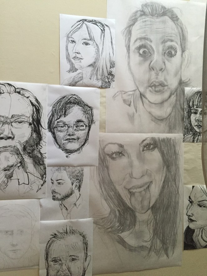
Working on this show is certainly an experience I will never forget. I had never worked collaboratively on a project before, and now that I have I can honestly say, it is not as bad as I thought it would be, but it is extremely challenging. It is never easy to work with people who have different styles and ideas. I think the hardest part for me on this project was being able to find a part where I belonged. I think the biggest problem that was in our group was communication and procrastination. If we had been able to work through our problems and begin when we were supposed to I think the show would have been even stronger. With that being said, I still think the show was a success. I am so grateful I got to incorporate my pictures because I put a lot of time and effort into each individual drawing. For me, this was a great experience because it taught me about all the work and anticipation that needs to go into the show experience. It truly was an amazing and humbling experience.

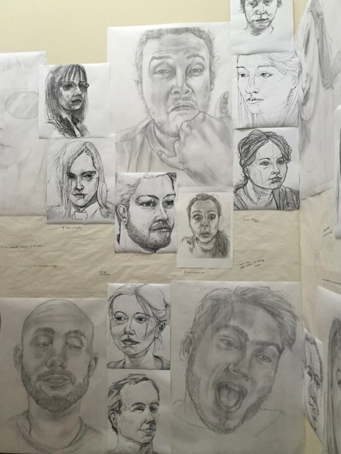
Progress: Week 2
This week we finally got the wire on Thursday and started wrapping. Being that it was in its beginner stages I was asked to make more portraits since Javi was wrapping. This week I made 3 successful portraits that I believe are good enough for the show. The idea has changed now that we are in the final stretch, and once I am back from vacation we are having a group discussion about it. But these portraits have been my contribution to the project.


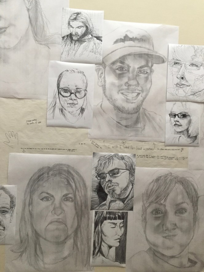
Progress: week 1
For this project week my main focus has been creating portraits of different people. I asked them to make a face that expressed themselves, and then I drew them as realistically as possible. No wire yet, so this has been my plan of action, this week I finished 2 highly rendered portraits, and 2 were trashed because I did not like them. Overall, feeling good about the drawings, and excited to make some more! Group agreed e would enlarge the portraits and put them on the wall behind the sculpture.


Project 6
By; Kimberlyn Cook and Spun Ngoensritong
For this piece our concept was focusing on animals and extinction. It is a scary thought to think that twenty years from now the animals we grew up with and have known and loved may not be on this earth, and so with this piece we wanted to create awareness. The first thing we did for this project was take the brown paper, ball it up, and then wrap it in tape. Next we painted the sphere blue and green to represent the earth, and then created animal silhouettes and pasted them on. We chose cardboard because it is decomposable just like the species of animals. We wanted to add flare to the silhouettes by adding different forms of lines. So for instance the kangaroo has line work done with hot glue, and the wolf has horizontal lines across his body. Originally we were thinking of making a mobile but were afraid it would be too kitschy. So we felt it was a new interesting way to project our idea.


Project 5
A piece by Kimberlyn Cook and Spun Ngoensritong
For this project our challenge was to create something that really interacted with our space. The question we wanted to answer was: how do we create linear perspective in a 3D space. One of our other challenges was incorporating the tape we used to connect the piece together. So we decided to create a design by placing the tape in an interesting, linear design on the floor. We loved the space we chose due to the window, it was interesting to see how the piece changed according to the time of day, things in the background, and the light. Since we chose such electric colors, it was clear to see the impacts the different light variations had on our piece. If we had chosen cooler colors I think the piece would not have been as lively and reacted as well as it did with the warm colors. We wanted to engage the entire space so we decided to connect our yarn to the light fixture and the bench, this way the entire window was engaged rather than a small corner. Our original idea was creating a linear perspective, but once we connected the yarn from the fixture to the bench we realized the piece needed more, so our solution was more linear lines. My favorite aspect of this piece is the waterfall like yarn on the left side that cascades down yet is pulled tightly. I think it was a smart decision because it added more of a dynamic element.


Sarah Sze
Sarah Sze was born in Boston in 1969, and now she lives and works in New York. In 1991 Sze got her BA at Yale University in New Haven, CT. She got her MFA in 1997 at the School of Visual Arts in New York. One thing that is interesting about Sarah Sze is that she is interested by multiple subject matters, so her work is always new and changing. For instance, some of her work plays with disorientation, movement, and disintegration, while other pieces play with the objects actual orientation, either making it ironic or contradicting. Sze has also found interest in one of the most important human senses sight. She has also created pieces that can and some are part of larger pieces. it is as if the objects are a part of one bigger machine, creating imagery that goes beyond the frame. She has also found interest in weather, atmosphere, and fleeting situations. Besides her wide range of multiple concepts, Sze uses numerous types of technology to create her projects, for instance, lithography and silk screen.
Currently, Sze lives in New Yok and is a faculty member at the School of the Arts at Columbia University. She teaches the Advances Printmaking Course with for the MFA program with her co-professors, Kiki Smith and Valerie Hammond. Sze has collected a large range of awards, including:the Radcliffe Institute Fellowship (2003); John D. and Catherine T. MacArthur Foundation Fellowship (2003); Louis Comfort Tiffany Award (1999); and the Rema Hort Mann Foundation award (1997).

- Print Title: Ripe Fruit Falling
- Date: 2012
- Medium: Laser-cut silkscreen paper with hand-painted pebbles, string and 4 blue pushpins
- Packaging Size: 47 x 19 1/2 x 1 in.
- Carrier: Coventry Rag
- Edition Size: 18
“LeRoy Neiman Center for Print Studies.” LeRoy Neiman Center for Print Studies. N.p., n.d. Web. 14 Feb. 2016. <http://www.columbia.edu/cu/arts/neiman/Sze/>.
“Biography.” Sarah Sze. N.p., n.d. Web. 14 Feb. 2016. <http://www.sarahsze.com/Biography.html>.
HEESEOP YOON
Heeseop Yoon was born in Seoul, South Korea, and currently resides in Brooklyn, NY. In 1999, Yoon received her BFA at Chung-Ang University, Seoul, Korea. In 2004, Yoon got her MFA at the City College of New York, City University of New York, NY. And in 2005, Yoon graduated from the Skowhegan School of Painting and Sculpture, ME. Yoon creates massive pieces that usually span across entire walls. Her inspiration is derived from real life spaces that are extremely cluttered and messy. She says that she tries to find places where there are items from all different time periods, and no humans, so it is hard to guess what time the work takes place in. In order to create her giant wall drawings, Yoon uses black tape, she says that it is her way of “freehand drawing.” Yoon uses the additive method to create her installations. One problem that arises is that when Yoon has made a mistake, in the final installation, it is quite apparent. When creating these massive installations, Yoon is testing both the perception of herself and the viewer and the adjustments that take place. She finds it interesting that the more fixes she makes on her installation, the less understandable her piece becomes.
 Still life with Electric Cords, Black masking tape on Mylar, Dimension Vary,2013
“Heeseop Yoon | Artspace.” Artspace. N.p., n.d. Web. 07 Feb. 2016. <http://www.artspace.com/heeseop-yoon>.
“HEESEOP YOON.” Image –. N.p., n.d. Web. 07 Feb. 2016. <http://www.heeseopyoon.com/#/0>.
Hew Locke
Hew Locke is a British contemporary artist born in Brixton, London, and was born in 1959. Locke graduated from Falmouth University in 1988 with his B.A. in Fine Arts, and then in 1994 he received his M.A. in sculpture from The Royal College of Arts. Locke is best known for his sculptures and visual art. Locke drew attention to himself in 2000 when he won a Paul Hamlyn award and the EASTinternational award. Locke uses an extensive amounts of materials, which includes, but is not limited to: painting, drawing, relief, fabric, sculpture, casting, collage, and found objects. In the beginning of Locke’s art career he derived from and was inspired by colonial and post colonial history. This early inspiration, being that the topic was so broad, stemmed off into much more symbolism, motifs, and ideas than Locke originally had anticipated. Even though all different ideas have stemmed from the colonial and post colonial period his main focus was power. Early works of his included portraits of queens and monarchial figures, and other upper class figures important to the government; in order to give it contemporary and commercial relevance. Recently another focal point of Locke’s art work is ships and what they symbolize. He claims that ships represent trade, culture, and warfare. Locke says that if he had not pursued his career in art, his obvious alternative career would have been a historian.
“Hew Locke.” Hales Gallery. N.p., n.d. Web. 31 Jan. 2016. <http://www.halesgallery.com/artists/15-Hew-Locke/overview/>.
“Hew Locke Home Page.” Hew Locke Home Page. N.p., n.d. Web. 31 Jan. 2016. <http://www.hewlocke.net/Homepage2ndsite.html>.
The Wine Dark Sea : BB, detail, 2016. Mixed media with hand embroidery, full size 76 x 33 x 98cm
Val Britton
Val Britton was born in 1977 in Livingston, NJ, and now currently resides in San francisco, CA. For her BFA, Britton attended and graduated from the Rhode Island School of Design, and from there she received her MFA at the California College of the Arts. Britton has found numerous successes through her art which has resulted in gallery shows, grants, residencies, and commissions. Britton is known for her paper and mixed media works which represent maps, astronomy, and diagrams. Britton was inspired by her father who was a long distance truck driver. When he passed away early in Britton’s life, she found inspiration within the maps that her father had to use to navigate his long travels. Britton uses numerous methods within her pieces; from staining, to collage, to printing, stitching, etc., although this may be a long process, Britton finds it meditative, and claims that her pieces blur the lines between imagination and memory. Britton’s goal in her pieces is to create movement, since her pieces are abstract she says that this is her challenge. Currently, Britton is trying to figure out a way to push her work to represent a tension of imposed order and pandemonium. Britton says that the retelling of our stories of our journeys, and the reconstruction of those experiences, work together to create an understanding of the now, and so the retelling itself is in fact a journey.
Collapsible City
2012
Approximately 6′ h x 7′ w
graphite, ink, tempera, and collage on paper
“Statement – Val Britton.” Val Britton. N.p., 2000. Web. 24 Jan. 2016. <http://valbritton.com/statement.php>.
Mia Pearlman
Mia Pearlman was born in the USA in 1974. Ever since graduating from Cornell University in 1996 with her BFA, Pearlman has taken the art world by storm; with publishings in numerous contemporary art books, residencies, galleries, and commissions. Some of Pearlman’s most successful works of art were a part of her recent show of installations in the Foley Gallery on the East Side of New York. These installations were a part of her “Slash Paper Under the Knife” show, and were open to the public from, November 19, 2014 – January11, 2015. Pearlman creates giant paper installations on the walls which play with space and natural light. The New Yorker states that Pearlman’s pieces were,“The best pieces, notably Mia Pearlman’s crashing waves of cut and painted paper in the windows, dig into the connection between creation and destruction.” An example of some of her work is, INRUSH, the goal of this piece (since it sat on the corner of the gallery) was to make it seem like there was no distinction of interior and exterior space by playing with natural light. The unique quality and factor of Mia Pearlman’s work is the fact that everything is completely hand cut. Her installations create a whole new space, and draw the viewers away from their current situation and into a whole new world.
“Mia Pearlman – Cloudscapes.” Mia Pearlman – Cloudscapes. N.p., n.d. Web. 24 Jan. 2016. <http://miapearlman.com/CUT_PAPER/cut_paper.htm>.
