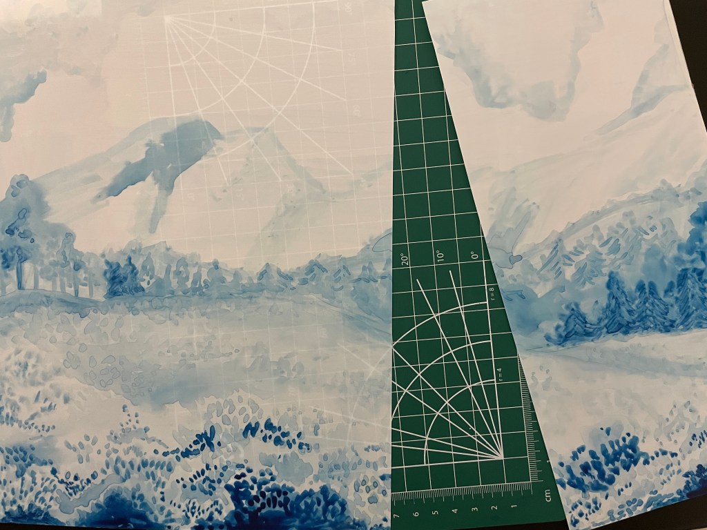
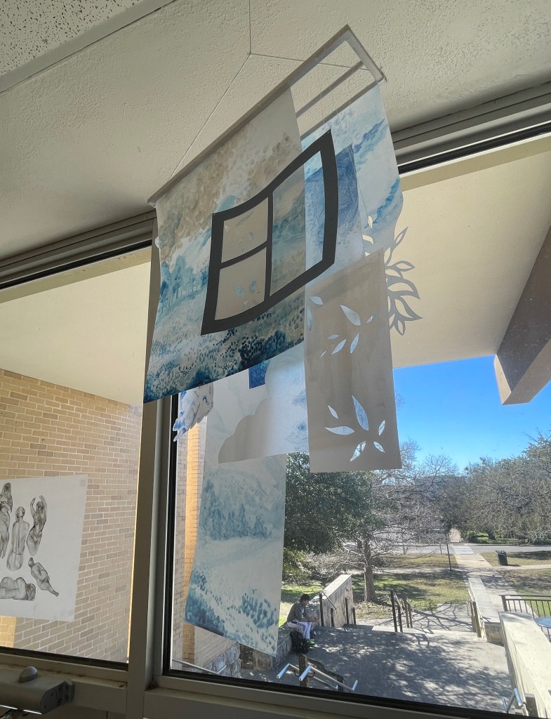
In class when we were shown inspiration images for the project I most liked the ones that were hung, so I knew that I wanted my project to be one that hung also. I started by making a structure with some square wooden dowels that I would then later attach each of the pieces onto. After making the structure I started by drawing on tracing paper, I drew a few clouds that I cut out once they were done. When drawing the clouds I used a blue marker, and later decided to make the whole piece monochromatic.
I then began to paint a landscape on the yupo paper using water color. I would later go back and add some white acrylic paint on the back and also cut the image. On another piece of yupo paper after painting I cut a leaf pattern into it. I also cut the leaf pattern into a little window that I made.
Once I finished each piece I started to poke holes in them and using fishing wire to attach them to the wooden structure. Overall I really enjoyed using the transparent paper and hope to experiment more with it in the future.
Michelle Segre is a sculptor who has been exhibiting her work in various places since the mid 1990s. She attended the Cooper Union School of Art and graduated in 1987. Throughout the years her work Has grown to be more abstract. As her work grew more abstract, so did her interest in creating something that was more surreal and played with reality. In her work she uses colored yarns, found objects, metal and pieces of her past works.
Segre began to work more with yarn because she enjoyed how it was something that could be more expansive than an object with bulk and mass. She also grew to enjoy that while string was capable of taking up a lot of space it also was something that could be broken down and stored more easily and generally just take up less space than work she made in the past. Another prominent feature of Segres work is color which she says she uses as a way to further energize a space. She spoke about how individual colors of yarn represent differing levels of energy that interact with each other. Finally she also uses color to express or induce emotional responses. In the work below she was aiming to create a feeling of rage.
“Red Sun”, 2021, canvas, acrylic polymer, acrylic ink, yarn, thread, wire, lotus root, 125 x 125 x 9 inches, Photo by Mario Gallucci. Courtesy of the artist and lumber room
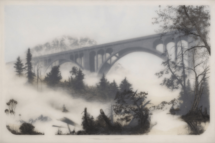
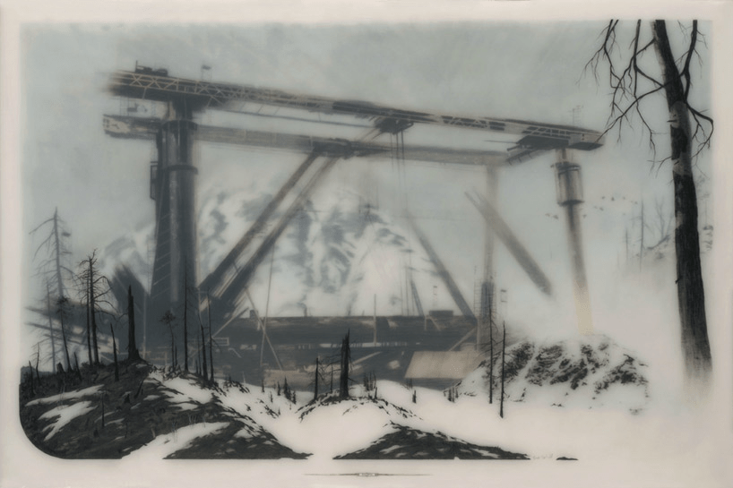
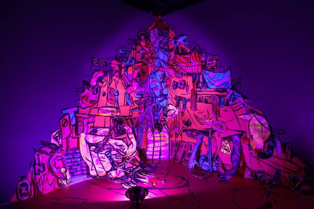
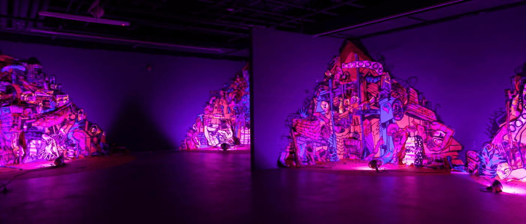
Brooks Shane Salzwedel is a great example of a an artist that works with translucent layers in his work. Brooks is a graduate of Art Center College of Design and during his time in school is when he began experimenting with working with translucent layers. To create his work he draws on sheets of Mylar, acetate, and Duralar. On these sheets he uses graphite, charcoal, and sometimes watercolor/spraypaint. After drawing on each layer the sheets are placed together one on top of the other, which allows certain elements of the drawings to become more or less clear. The final step in his process is to seal the layers with resin.
In his work Brooks often uses a combination of nature and man made elements, layering the two together. In a good number of his works he began using the subject matter of bridges. He was interested in exploring how the architecture of the bridge itself allowed him to experiment with the composition of the works. In and interview with Design Boom he spoke about how he has an interest in looking at images from the industrial revolution as inspiration. Which is an interesting point to know because often his works do feel sort of dystopian or reminiscent of something we’ve seen before but it’s not an exact match.
To start my collage the first thing that I did was go through old projects that I had to see if any of them would work to be cut up and repurposed. In doing this I found some test prints of a risograph print I made last semester. After finding them I decided that I wanted them to be the main element of collage. I also decided that I wanted the base of collage to be a round shape. From there I began the process of covering the cardboard in newspaper. I also went in with some black paint to make it so the text was less readable because I didn’t want it to be the focus.
I then began cutting cardboard to make backings for each of the frames and also covering them in newspaper. I made small collages that I glued on the back and fit into the frame.
Before attaching the frames I decided to paint some leaves on the back of the collage. At this point I also added leaves/ vines that I cut into the frames. The hand drawn element that I included were some bugs (moth/butterfly, ladybugs) that can be seen in the final image. Ultimately with this piece my goal was to have the frames exist as sort of portals that one could look into. I also wanted there to be a 3D element with the leaves coming off the piece and also have the frames coming off at different depths.
Amanda Burnham creates large scale drawings that are often site specific installations. Burnham has a BA from Harvard University in Visual and environmental studies and an MFA from Yale University in Painting and Printmaking. She is now a Professor as Townson University. Throughout the years she has had her work shown in many places; a few to note would be the Delaware contemporary, Smithsonian Anacostia Museum, and the Aldrich Museum of Contemporary Art.
Civic Body
Site specific installation at Visarts, Rockville Acrylic, flashe, paper, and tape on wall/floor approx. 30′ x 10′ 2017 photo credit: Joseph Hyde
The works shown below are a series of wall drawings that are of cities. A subject that became of interest to her when she moved out of the midwest to the east coast for school. The cities in the east coast were so much different than what she knew back home that it caught her attention. In and interview with inertia studios she specifically points out how “spaces that were dense, dynamic, and mixed use, where a lot of space is shared, and neighbors weren’t a thing you mostly avoided or ignored”. These are themes that I think come across really clear in her work.
In the work she often uses paper scraps. Her process starts by her taking time to walk around in the city to get inspiration and ideas. From there she then begins the process of making quick gestural paintings using acrylic. These paintings are then collaged together on the wall and armatures on site. Lighting is also an important aspect of this work as it is used in a way that emphasizes the layering in the work and as Burham states animates it.
Untitled (Under Surveillance)
Untitled (Under Surveillance) (installation view) Site specific drawing installation at Arlington Art Center Flashe, acrylic, paper, tape and lights 2016
When a show/exhibition is over Burnham will tear down all the paper from the works and put it bags with the intention of using it again in future works.
Upon looking through the images in my camera roll I felt that none of them really had a clear sense of foreground, middle ground and background which led me to make the decision to combine two images. I first decided on the image of a lake I took in Angel Fire NM as what I wanted for the background but when it came to the foreground I had two possible options that I was considering. The first was an image I took at the Van Gogh Experience and the second was of some lilies. After drawing a few thumbnail drawings I decided to go with the image from the van gogh experience because I wanted to experiment with drawing the large swirl and have it overlap with other elements of the images.
Starting off the drawing process I struggled with the order in which I should approach each section because though I knew starting in the back and moving forward would be a good strategy, I was having trouble deciding what tones needed to be in the background in order for it to push back in space. After working in class I made the decision to start fresh since I wasn’t happy with how I started to tone the background. In the new attempt I started off by working on the sky and really wanted to experiment with filling in the area relatively loosely and did the same with blocking in the different sections of trees in the background. Moving to work on the foreground I wanted to focus on making sure that it had the most variation in tone.
Though for a while working I just wasn’t going as dark in some areas as I should have been which made it so the swirl and houses in the front were not coming forward like they should. After critique I went back in and redefined some areas along with adjusting the size of the lanterns so that they moved back in space. In making areas darker especially the swirl I think I was able to create a more distinct sense of foreground middleground and background.
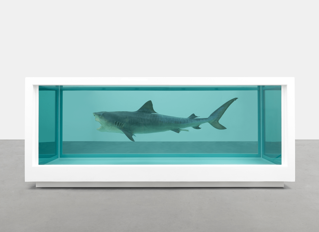
Damien Hirst is an english artist who rose to fame during the 1990’s. At the beginning of his career he was a painter and attended Goldsmiths College in London. Over the years Hirst has become somewhat controversial. This started with a series of work that brought a great deal of attention and often also criticism as the work displayed various animals such as a shark and cow submerged in formaldehyde. Hirst has also faced controversy throughout his career as some of his works have been called out for plagiarism.
However the series of work that relates to the idea of multiples are his spot paintings. These spot paintings are a stark contrast to Hirst’s previous works with dead animals. These paintings relate to the idea of multiples as the same subject matter is used in each one while the color and arrangement of the spots are what changes in each of the paintings. Hirst estimates that he has created a total of 1400 spot paintings. He first started the series in 1988 where he created the first five works on his own, but soon after began employing his assistants to help create the works as they are quite labor intensive. Below are some examples of Hirst’s spot paintings.
Hello, my name is Jade Perea and I am a sophomore double majoring in Graphic design and art. So far during my time at st eds I have primarily taken classes that either involved mix media or creating 3d work. I have come to really enjoy the process that comes with creating 3d forms. In that process I think it has encouraged me to be more experimental with how I approach creating. I have always been someone who gets stuck when a piece isn’t coming out how I envisioned it but slowly I think I am becoming more process oriented instead of product oriented.
Drawing was the first form of art that I tried and has always been one of my favorite ways to create because of the multitude of techniques and styles. When drawing I prefer working in black and white so I often use charcoal, graphite, and pens to create. I really enjoy the process of layering and building up areas of shadow. I also have a love for using different shading techniques, my two favorites are cross hatching and stippling. I would like to experiment more with drawing like I do when creating sculpture and I think this class is going to be a step in that direction.