Wassily Kandinsky (research)

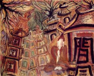
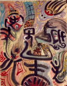
Wassily Kandinsky is one of my favorite painters and the one I draw a lot of my inspiration for color, composition and style. His paintings for one explore a vast array of colors that I hope to use and explore myself as I advance in the Painting BFA program. He also creates such engaging spaces with dynamic uses of simple lines and shapes. It is the nonobjective that I find personally stimulating, it is something that can engage me as a viewer without relying on a preconceived notion of what it is. The painting on the left really makes use of a chaotic order that builds and builds upon itself while filling the space and almost leaping out towards the viewer. The openness in the background is created by a tactful use of an yellow ochre tint that gives the viewer the crucial areas of rest for their eyes. This is something that I wish to emulate in my own paintings to come. The painting on the right is an example of some of his more regimented and ordered works. It still is open and nonobjective but it has more clearly defined shapes in more recognizable geometric patterns. However he is still able to create an open floating space with perspective lines and open moments for the canvas and the viewer to breathe. I hope to be able to see one of his works in real life so that I can really experience his work.

Andy Goldsworthy (research)

I first learned of Andy Goldsworthy in my Conceptual Practices class with Professor Rothrock. We were doing an assignment that dealt with nature and manipulating it in someway. I think his work, and specifically the ones I picked, really exemplify a spatial drawing. Andy almost always only uses materials that he finds on location so the work is impacted heavily by what the space provides. In the first one it appears he used a thing grass or vine of some kind to enunciate the circular contours of the stones and draw attention to the space they fill. There is a sense of movement that is reminiscent of orbital charts that I personally enjoy about it. The second image relies heavily on the colors available from the fallen leaves of nearby trees. The glowing contour that is created by the yellow leaves totally changes the way the tree stands in the space. The final image is a motif of sorts he replicates in various mediums but this one is exquisite in its own right because it is a loose construction of twigs that create a full circular form due to its reflection off the surface of water. We perceive a tunnel like space yet its all just an illusion that will change over the course of the day. Another aspect of his work that I find really intriguing is how impermanent they are. Their essence is captured in the one photo but as time goes the leaves or sticks will blow away or decay, surely changing the aesthetic and maybe even the concept of the original work. He is manipulating the space but not attempting to tame or contain it.

Dreaming into Space (Progress 2)


Once we had the space shrouded, the ceiling canvas stretched and the cube hung our main issue was which light bulb(s) would work best for our projections. Our first attempts were with a single bulb and we were finding that some were either not strong enough to project clearly or the bulb was too large and the projections were blurred and hard to make out. We knew a light source that was projected in a specific direction would create the clearest image. Hollis was able to find an ideal solution with a light fixture that could support multiple USB plugins. We plugged six manipulatable LED mini-spotlights into the fixture and then the challenge was how to project each side clearly without distorting the other panels too much. Jenny and Hollis proved to be quite adept at this stage in the process and since it was already night at this point the projections were quite clearly recognizable. The orientation they finally settled on worked well and allowed for the piece to really create the dream space we had hoped for. The difference in images also created a dynamic space since the amount of light being let out varied from where you stood and as the cube slowly turned. In the end I think it was successful and the last minute drapes were the final touch it needed to close of the space.

Dreaming into Space (Progress 1)

IMG_3602

The early goals and obstacles for our project were to build the pieces we would need to help create the specific space for our installation. We knew we would need something to block out the light from the gallery so our projections would be clearly visible. After acquiring the hollow core doors we connected them together with screws, tape and puddy. After sanding and painting we were able to hang it where it concealed a good deal of light. However we realized we may need more to block the open spaces beside the wall for a better shadow.

One of our main objectives from the start however was getting each group members panel cut. We had the wood and I took it to the wood shop and ripped it down to fit into the laser cutter. After that it was a matter of signing up for a chance to use the cutter. Fortunately for our group we had members who were familiar with laser cutting so we were able to get everyones pieces cut correctly and in time for installation. Each panel was supposed to be based on dreams or an amalgamation of specific dreams, mine however was influenced by the night sky and how I associate that with nocturnal dreams. I coupled that with the doodles I frequently do during class while day dreaming. The aesthetic I hoped would emulate a night sky but not a specific recreation of it, like how must dreams are a hodge-podge creation of what may be on our mind that day or week. I had chosen to do the top panel so this image would hopefully help the viewer step into a dream-like world that they could react to on all sides of the room. Unfortunately in the installation process some of the center line work is lost due to the way we mounted the box to the light. I think the piece still conveys its point however.

IMG_3624

Cardboard Project

This experiment was reminiscent of assignments from 3D Design but due to the open nature of this assignment I was able to create something a bit less traditional and explorative. I started by creating multiple different pieces that were sturdy three dimensional forms that I could piece together with glue. The materials I chose to use were beer, wine and coffee shipment boxes. A common feature on a lot of these is their preference to design amusing or eye catching marketing to decorate the cardboard box. This provided already colored pieces I could juxtapose with traditional brown cardboard. Some where along the way, as I began attaching different forms, the piece took on a moveable and interactive tone. The orientation shown in the pictures is the most sturdy but it can be manipulated and held to create other viewpoints or meanings. I think that cardboard can be used to create stunning or evocative works of art, however I don’t prefer it myself. I did enjoy using some for my collage, they work well creating a layered aesthetic.


String/Linear Installation

This project was interesting in its creation because where we chose to install it would heavily influence the work itself. The location Mollie and I chose ended up being quite dynamic due to the wind the is blown through that section of the sculpture yard. This allowed us to create line work that would not only mimic movement but also move itself whenever the wind blew. We used tape to cover up certain areas so that the translucency of the bars didn’t subtract from the wind elements. With the tape and the ribbon we were able to create linear elements that operated on different axis while being contained within the same piece. The tape was more sporadic in its placement but was still static and did not move, while the ribbon was extremely dynamic in how it moved with the wind but the ribbons were all placed more specifically to create a unified movement across the gate. The experience was interesting since the piece grew and developed into something more the longer we worked on it. Specifically when the weather varied so the reaction to the piece was different at certain times and called for different attachments in various ways. Even when the wind was not blowing the piece still evoked what we hoped it would so it was still successful windy or not.

McColl Visit

The visit to the McColl center’s event was rather enjoyable, especially since a decent number of my classmates also attended. The downstairs reception gallery had a varying mixture of 2D and 3D works on display however I was more drawn to the works that were spread out near the artist’s studios. One of the artists, whose name I’ve unfortunately forgotten, had done a series of laser cut images in glass that depicted planet-like shapes. The artist used the repetition of the images to create a greater image yet allowed each individual image to stand out for its own unique traits. The images, while being seemingly related yet also unique, held me as a viewer longer because I wanted to explore each one and related it to others near it. Also I thought that Hollis’ work took full advantage of the wall space in a few of her pieces and stood out among others. The ink drawings on vinyl were my favorites because your understanding of the drawing changed as you got closer and you saw the texture was not paper and the line work was not all the same type of medium.  I think Hollis’ work also resonated well at the McColl center since it too had experienced a fire early in its history and moments of disaster like that are reflected in her work.

Chi Thanh Mai


These drawings drew my attention because of the unique ways in which large seemingly flat linear elements invoke different sensations of space. In the first drawing, which depicts a Buddhist temple, the stacking and layering of the different towers help to develop a sense of depth and perception in space. With the tree limbs acting as visual guides to move us around the negative space we eventually converge on the dense patch of leaves in the background. This focal point in the drawing/painting helps generate a sense of shrinking back to a singular moment in space. The temple facade on the right side of the painting sets a very stark foreground in contrast to the tunneling effect of the buildings and tree limbs. The figure which appears to be some what abstracted from the reality of the painting by hovering between foreground and background. The whole drawing almost seems to reach out while still beckoning you deep to the tree line.


The other two drawings dealt less with creating an illusion of depth or perception, rather their effect on me was mostly a projection of space from a 2D plane. The wide strokes are angled in ways that almost make them seem like they are coming off the paper and filling the space between you and the wall/screen. The one on the right with the white line work creates such a noticeable vacuum on the bottom half between C shape objects. The triangle that is formed by the negative space opens up the painting to the viewer and creates a path into the painting.

Vincent van Gogh in Saint-Remy and Auvers

I came into possession of a book which depicts and describes the works done by Van Gogh after he left Arles and went to stay at a facility in Saint-Remy to be cared for. Most of his works from that time are heavily influenced by the spaces he observed from his room or the grounds of the facility. While I chose paintings for this post, there are also a plethora of drawings in the collection as well.

Below is his painting referred to as “Country road with Cypress and Star” and his traditional heavy handed marks, which blur the line between a drawing and a painting, are effective in seemingly showing details that would be closer to the viewer in space and then they proceed to become less harsh as the painting moves further into space. The use of the road as a physical landmark that leads you from foreground to background is what makes full use of space in this work. One follows the road to the back middle and the cypress trees behind the small cottage throw you up into his night sky and beyond.

Van_Gogh_-_Country_road_in_Provence_by_night

Below is another painting from entitled” Enclosed Field with Ploughman” and I think it attempts and succeeds to show us such an expanse of space. For me it is how he uses his marks to created concise movement in some areas that lead you off and away into the distance while other areas are more haphazard and created the illusion of detail that is closer and more apparent. His skies also are extremely important in creating a sense of space, using his mark making to show rolling clouds that always lead off the canvas and never are wholly contained within the painting. Finally his windmills help create the illusion of receding farther and farther back help add to the wide and open feeling in this painting. The one in the middle sets the far away point but then a smaller one to the side shows us how far back he can see from his vantage point and only goes to create miles between the viewer and the hills in the distance.

Vincent_van_Gogh_-_Enclosed_Field_with_Ploughman_-_Google_Art_Project.jpg