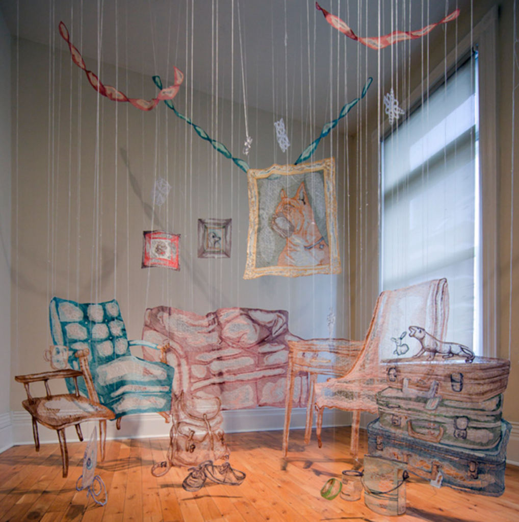
Maggie Nowinski is an artist, educator, and curator who is based in Western Massachusetts. She currently teaches at Manchester Community College, and is the interim director of the drawing program there. Her work is mainly drawing and printmaking. But she often displays these through installations. Like the one featured below, she uses these large drawings and takes it further to transform a space and show the work in an interesting way. Nowinski creates work that explores human emotion, in a style that resembles botanical specimens. She is very interested in the process of mark making and roots a lot of her work in the repetition of these marks.
I take a lot of inspiration from the way the work is shown. It could have just been hung on the wall, but she takes it a step further. This is something I will continue to work on when creating my own art.
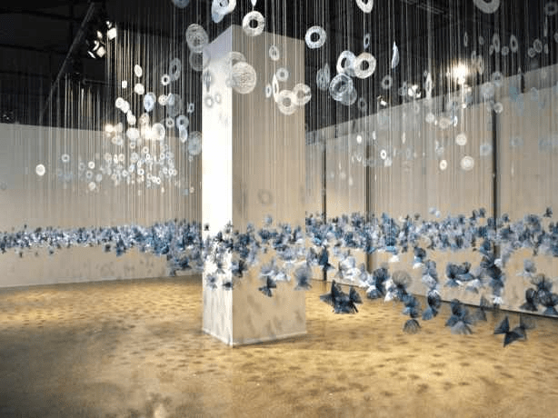
Amanda Mccavour is an artist based in Toronto. She makes large installations using embroidery to create the objects. Mccavour uses a sewing machine and embroiders onto a fabric that dissolves in water to make these drawings. The purpose is to explore the vulnerability of the thread and the strength it gains when it is sewn together. The installations consist of either abstract concepts or natural phenomena. This ranges from symmetrical doodles to plants, and even the recreation of everyday objects such as an iron.
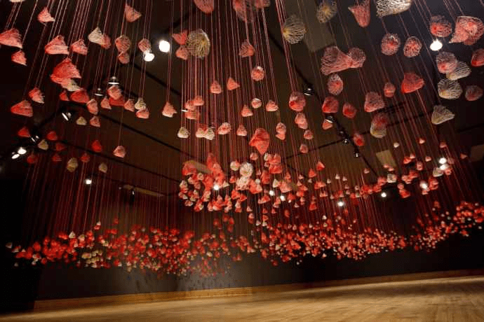
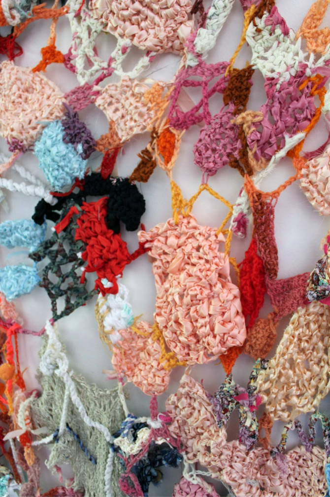
Marina Nelson is a multimedia artist, based in Canada. She creates work that relates to the vulnerability of people and the connections we make through that aspect. Nelson states in her bio “in the end, or in the beginning, it’s all about love”. This particular piece is called “Sunnyside Island Sculpture”. It is exploring the feelings of happiness one would find in an island paradise. Spending a sunny morning by the sea and enjoying the environment around you. The crocheted piece is not only meant to express the feeling but also the landscape itself.
I enjoy the use of yarn and ribbons to create a beautifully woven piece. I also like how the pieces are arranged together and the way that it gives the feeling of happiness in nature. The bright colors are attached together with green and blue borders. I also really like how the more you look at it, the more you can find in it and connect with the piece.
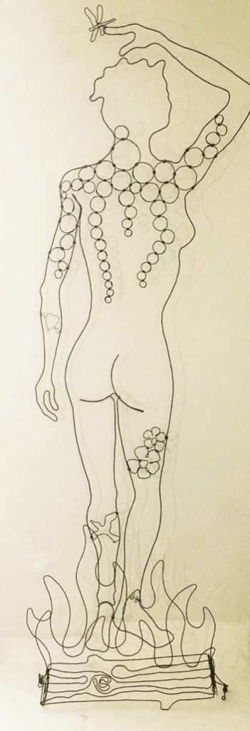
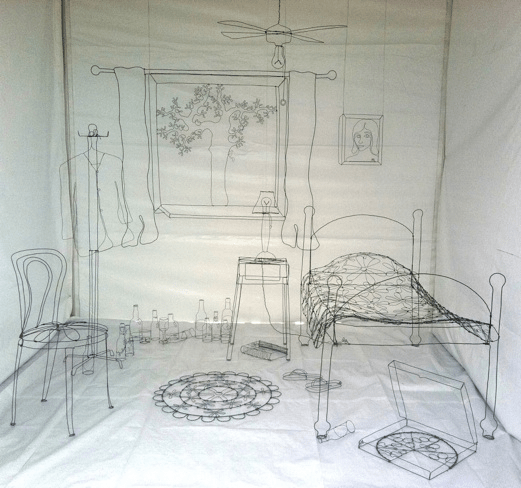
David Zalben is an artist based in Miami but is from Brooklyn New York. He grew up taking pictures and was interested in photography at a young age. He started out working with school newspapers and then began working in photography advertising. After exploring with photography he started to branch out and began to experiment with other ways of art such as painting, sculpture, and poetry.
He likes to work with wire because of the simplicity, yet complexity is supplying. He uses inspiration from his life and personal experiences. Zalben likes his art to resonate the beauty and growth of everyday life.
This is the way I interpret drawing into space and something that I want to somewhat recreate for a project. The use of wire is a cool sculptural way of making a drawing.
“Life-size wirework ‘My Room’ in the Wynwood art fair”
Pia is an artist that currently works and resides in Helsinki, Finland. She enjoys working with the relation between body and space. Pia explores with different perspectives of the world and is inspired by “natural and physical phenomena”. This can be seen throughout her work. She creates artwork that immerses the viewer in these perspectives and creates an interesting space that displays her themes of change, time, and body.
The image above shows an installation Pia did in an exhibition in Paris. Deja Vu VII, 2019, is a work consisting of life-size ink silhouettes on seethrough, tulle fabric. The figures move slightly between each work, and the layering creates the illusion of movement. It also shows the theme of gradual change. With so many sheets and little movements in between it suggests the idea of slow growth.
The use of tulle and the multiples of an image is something that interests me. I may want to incorporate this idea into one of my works this semester. The layering effect of multiple drawings is a way to transform a space and display a drawing as a 3-dimensional work.
Nalini Malani is an artist from India, and most of her work reflects her self-identity and the events occurring in India. She is a refugee of the Partition of India. She creates work that challenges the common beliefs of the masses about India. Malani creates dialogue and provokes discussion about issues from her home. She is a well-established artist and has had many residencies, and exhibitions, with work in the Moma.
I was drawn to her work because of the way she transforms a space using drawing and light. Specifically her work at the Moma. Gamepieces was an installation using video and shadows to create imagery on the wall. She painted and drew images on clear cylindrical hangings and projected light and video through them. I am interested in the way light and shadows can transform a space. I’m thinking of doing something like that with the line project. I like how the video and shadows take up a whole room and immerse the viewer in the art itself.
Maria Wigley is a textile artist. She is from and currently works in the UK, which is where the majority of her work is exhibited. Maria explores the relationship between imagery and text. She often combines stitching and painting to create her work. The juxtaposition of the tight and calculated movements of stitching with the flow and carefree movement painting is a strong theme. Most of her work is personal and based on her own life experiences. She has also done collaborative work with her daughter where they both worked on the same piece and gave their own responses to the same experiences. She combines different textile materials and utilizes a layering effect for most of her work. Using translucent fabric and stitching words onto each sheet, she layers them on top of each other. This is to show the many conversations and thoughts that occur over time.
I really enjoyed looking at Maria Wigley’s work. The layering of words appealed to me the most. I also create work with word poems and reflections of my life, however, I usually accompany them with little drawings and write in pen. Maria’s work will be an inspiration for this layering project.
Kim Jung Gi is a Korean artist who does illustrations like the ones shown. Most of his drawings are done in a .5 perspective. He works primarily with pen and ink. What sets him apart from other artists besides his intriguing style is his ability to recreate scenes from memory. All of his illustrations are created without the aid of references.
Kim Jung Gi currently creates books that are a compilation of his drawings. He has written many short stories and has been published in magazines. He teaches manhwa (Korean comic book) to universities. He goes to various comic conventions and has become renowned worldwide. He offers online virtual courses and posts his own youtube videos for free drawing assistance. Highly recommend checking out his videos!
Kim Jung Gi’s style interested me, because for the atmospheric perspective project I have chosen to draw in this same perspective. I find this perspective interesting and pleasing to look at. I admire the extreme detail he has in this work. It would be interesting to incorporate something like this into my assignment. Not as detailed, however the creation of a scene with people in this perspective.
This is the collage i made. I didn’t really have any solid plan going in I found old magazines in my apartment and just kind of went from there. at the time i was thinking about drug addiction and kind of thinking of where the appeal comes from. then i found a painting i had cut up and decided to incorporate that and printed images of pills as well as text to try to get my idea across. i think i did what i wanted to do and i’m happy and with how it turned out
For my translucent layer project I set out to draw a photograph I took a couple years ago. It is a long exposure which I thought would be perfect because of the layering that the photograph captures.
Adriana Villafranco Long Exposure Photograph 2019 Final Product
I began this project months ago but after trying to go in with a thorough plan, I began overthinking it so I stepped away from it. My initial sketch began with me outlining the main subject figure in the middle with graphite pencil. After revisiting it, I found that the outline of the figure i had created was helpful for me to then go back in and better locate the joints and proportions of the arms and torso. I began working with charcoal now that I had revisited. I found this a lot easier to work with because not only did it allow me to draw more loosely, it made darker marks that would show through the layering of the translucent sheets.
The first layer consists of a somewhat detailed, proportioned figure that you can see in the middle of the photographers. I went in with a black marker to fill in the hair and outline some of the leotard clothing. I also went in with white, black and tan conté to add some highlights and showdows.
Top layer
The second layer consisted of me very loosely drawing the legs, arms, feet, and blurred movements that appear in the photograph. For this layer I went ahead and began by outlining these figures and then I colored them in with tan and white conte as well as with white and black water-soluble wax pastels.
Second layer
For the second layer I loosely outlines the figures (legs, hands, arms , feet) in a gesture like drawing technique to capture the long exposure effect in the photograph. I only used white water-soluble wax pastels and some white conte.
Third Layer
For the fourth and last layer, I did the exact same thing as with the second layer except this time only with black water-soluble wax pastels.