My translucent layers project was kind of just a collage with translucent paper. I wish I had spent more time on this and had gone in with a better plan. The paper we used wasn’t as translucent as something like tracing paper and I really wish I had done that instead. I like my little doodle and the colors are nice, but I don’t know what else to say about it. I do definitely hope to make more work using this method in the future because I really like the effect it gives when done correctly. I think to successfully make an image with it you really need to work from a reference.
For my line project I worked with Meg. We both really like crocheting and I found a ton of knit scraps I had, so we decided it would be cool to cover something with them. Originally we planned to cover a bench, but decided a chair could be easier and wouldn’t get rained on (or would be less likely to) I think it turned out pretty well… I’m not sure if I like it as much as I thought I would. I wish we had had more materials to cover it, but I guess I can continue to add to it until it’s a lot comfier.
for my individual project I decided to do a large drawing. I started over a lot of times because I couldn’t really decide “what” I wanted it to be. First I thought large panels of scribbles, but then I realized I could really do something I WANTED to do. From there I started drawing characters and just kind of went with whatever I felt was working. Honestly, with projects like this, it’s hard for me not to be happy with out it turns out, but they always feel like I could do more. I feel like with this I did what I wanted to do. I used sharpie, pastels, hot glue, string, collage, and cotton stuffing stuff. I really wish I had had white news print, but I feel like the brown works well with the pastels. I can see why someone would think this looks. like a kid drew it or something, but I think thats’s the part of it that really makes it uniquely mine. Overall I think I was happy with it, I’m still on the fence.
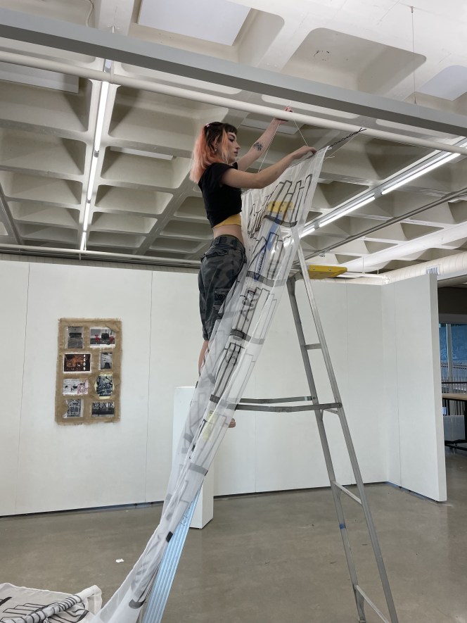
I definitely thought about our use of collage, as well as the idea of a drawing with actual three dimensional qualities. I always think I incorporate artists’s I’m researching styles in my work, but I feel like this stays pretty true to my own style. Installing was pretty easy, but transporting it from Fremont was annoying due to the size and durability of the paper.
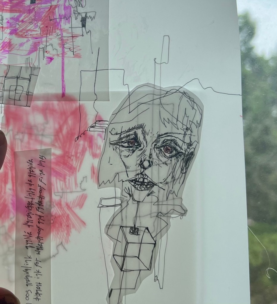
For the translucent layers project I didn’t really have big idea behind the meaning. Instead I wanted to make something that I enjoyed visually and can be interpreted how you like. The concept is layers of hands holding a headless figure. The flower is supposed to be a wilting spider lily which can symbolize death, final goodbyes, abandonment, and bad luck.
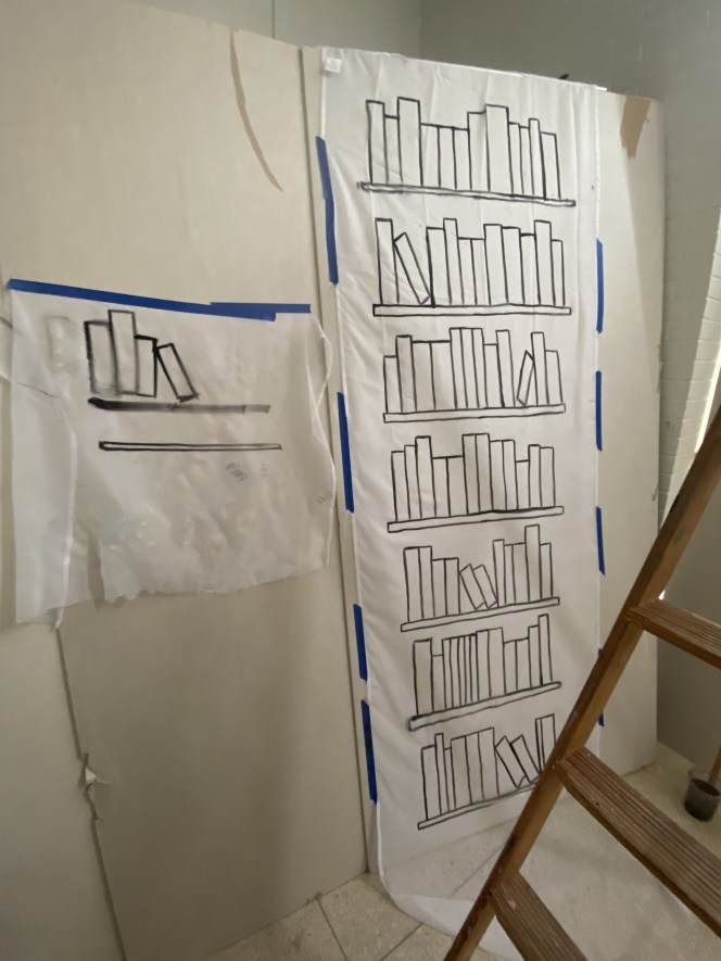
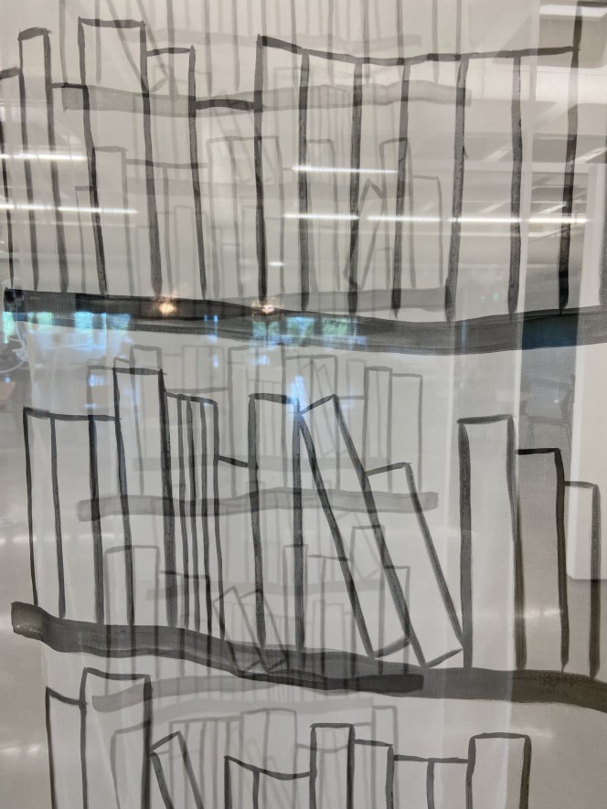
For this piece, my idea was sparked by the location of the gallery. When I heard it was going to be displayed in the Stacks Gallery in the library, I wanted to create work about the library… or lack of one. Ever since they decided to take away the books, I’ve always had a big issue with it. Growing up, the library was always my favorite place. I loved walking through the books and looking at all the different ones I could read or check out. When I came to St. Edward’s, the library was already a big downside. When I toured they only had one floor of books. I hated that, but I thought the pros of the campus would outweigh that. Then they decided to get rid of it all. It seems very dystopian and as the visiting artist, Justin Favela mentioned, it is reminiscent of book burning. I wanted to create a ghost library. Using my project proposal research from before, and my artist research, I decided to use transparent fabric. I originally wanted to embroider, but due to time constraints and also my lack of skill in that area, I decided to use paint. The books were painted onto the fabric using watered down acrylic paint. I used the same piece of drywall to paint each sheet on to have the shelves arranged the same way.
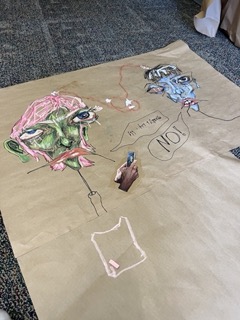
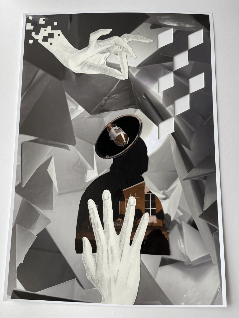
This collage was made with photographs and magazines from a scrap bin in class. As well as hands that I drew. I was interested in the style of the Human Wreckage collages and wanted to do something similar. The idea was that the top hand was holding the silhouette by a thread and the bottom hand was trying to reach for it. The silhouette isn’t meant to be anyone in particular rather just the hope we find through others. while the bottom hand is meant to be people reaching for that hope as its held by the hand of life and can be taken away at any time.
The team project was a fun project to work on. I think my team did a strong job of working together as well. The idea was a combination of Meg and Sydney’s ideas. Through the creation of the project, we had a lot of challenges that we overcame, as well as problem solving. We initally planned to build a structure for a hang out spot/ studio space. But, at the end it became more of a public work that you can go inside. We started off by building the frame of the dome and working out the different contruction problems. We then started to indidually cut and combine each circle. After that we connected them together with zip ties, and made it a large piece. Each large piece was then carried outside and attached to the frame.
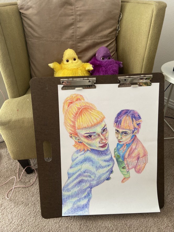
For this project I wanted to choose an image in 0.5 lens. I love taking these photos and the distortion it creates for an image. I chose this picture of my sister and I, and I wanted to draw it in my style. I use crayons to create the shading and add value through color. Working with color is my go to and it is easy to understand for me. It hasn’t been finished yet, but I want to add fish in the background, and transform it into a different space. Rather, that create an work that is just true to the reference image. I plan on using watercolor to create contrast with the image focus of the people.
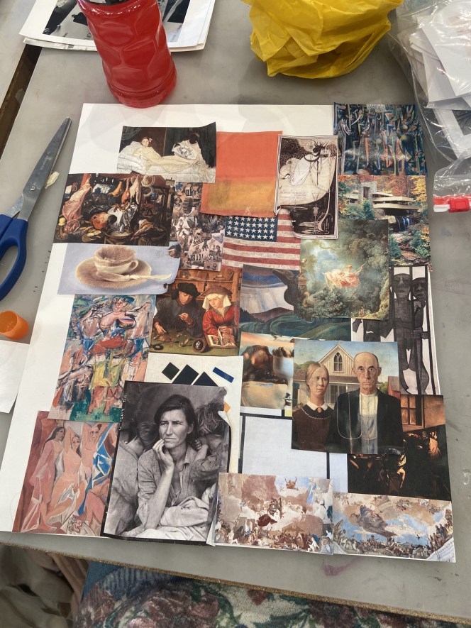
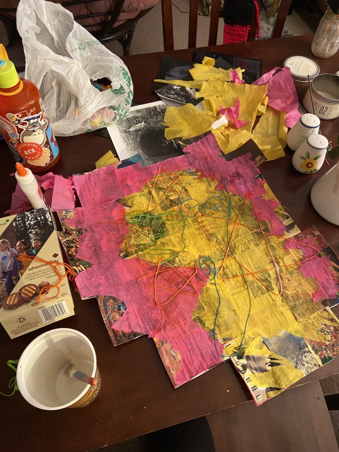
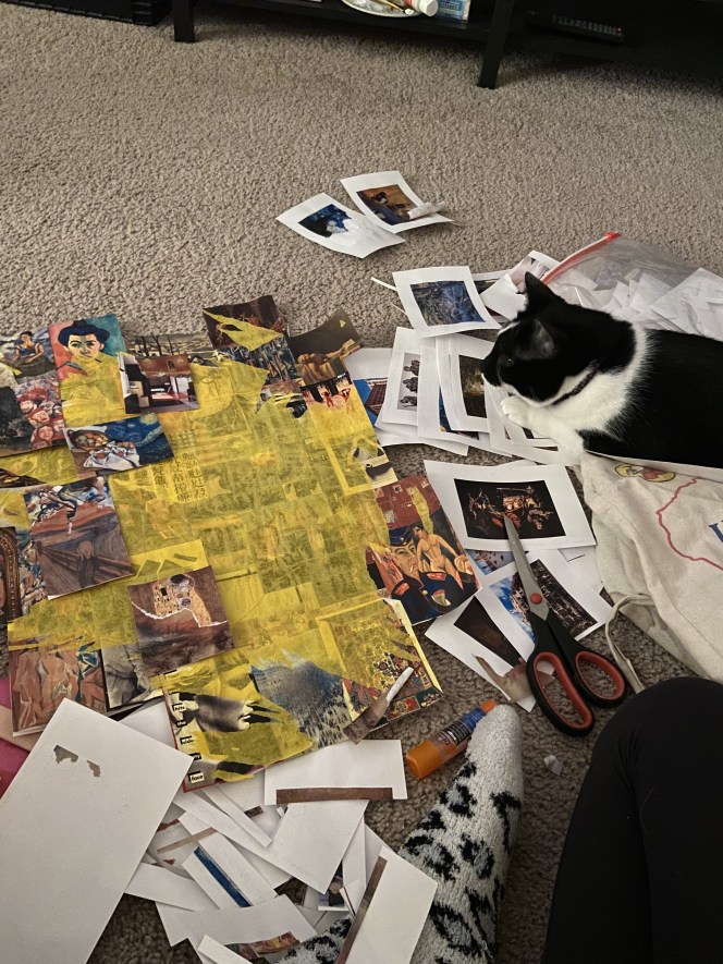
My goal for this project was to reurpose images I had already. I thought of all the art history flashcards that I have made for art history 2 with the images printed out. I saved them for something, and it turns out it came in hand for this project. I went at this assignment with no plan. I felt if I planned it out I would overthink it and it would not be completed. I started by ripping the photos off of the flashcards, or cutting them out, and then gluing them together onto one sheet. Some of the photos were ripped in half, and I decided to combine them with other ripped images. Once they were all glued together, the piece looked overwhelming and I wanted something to mute the images. So, I added tissue paper on top and glued it with modpodge and water. It didn’t turn out as translucent as I wanted it to be, but I went along with it. The next thing was to add more to the top of the piece and I decided string would be a cool way to create imagery. I don’t know what it means, but I added it and liked the way it turned out.
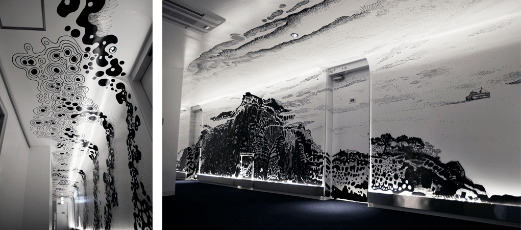
Oscar Oiwa is a Brazilian artist who is known for drawings that become immersive installations. They are drawings that transform a space into another world. He creates work that explores his cross-cultural life as a Japanese man in Brazil, and combines it with science fiction like themes. He uses marker pens to create these works, and goes through more than a hundred of them for each artwork.
In this work, he creates a room and makes it where you can walk through his drawing. This is how I interpret drawing into space, and is also something that is really interesting. I love the idea of making a new world that the viewer can step into and explore rather than imagining the concept.