For this new week’s research post, I have chosen to cover the artist Bharti Kher. Bharti Kher is an artist who is at the center stage of the contemporary art scene in India. In the span of Kher’s nearly three-decade-long career, she has done paintings, sculptures, and installations that have explored the relationship between the body, its narrative, and the nature of things. Kher finds her inspiration from the history and philosophy of India and more so from mundane moments. Using a refined contemporary sensibility, the artist addresses topics of culture and tradition with the use of sentiment unique to India as well as an abundance of color. Kher is internationally known for her signature use of bindi in her works. She explains how most people see the bindi as either a symbol of marriage or aesthetic, but it is actually a representation of the third eye which forges a link between the spiritual world and the actual world.
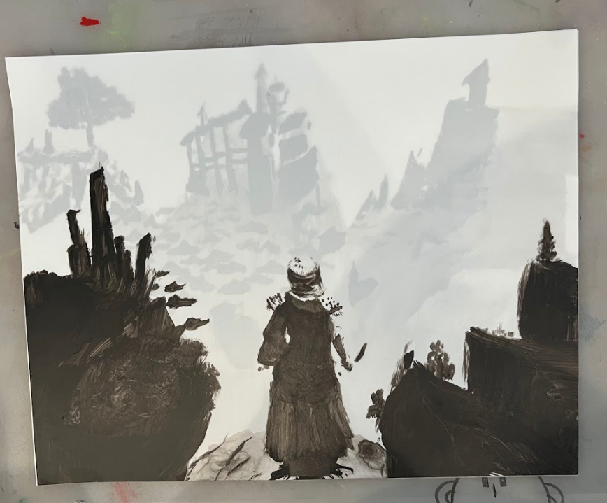
When the project was first introduced I was drawn to the idea in animation of creating a foreground, mid, and background in three separate layers to illustrate the large space when animating, by moving each layer at a different speed across the screen. I saw the translucent paper had the same quality, and wanted to create a scene from a video game to see if the same quality could be mimicked with the idea of layering the two papers. The game I had pulled inspiration from was Elden Ring. In this game, it’s very common to come across these large open spaces that create a desire to explore. I wanted this same quality to exist in my piece so I thought I would be perfect for reference. I used black acrylic paint and began layering onto the paper to build value because I was reducing the color image to black and white. I wanted to really focus on the implied shape of the hair, sword, and landscape without overdoing it. Overall I think this was a great experiment, I would love to in the future go back and add in some highlights of white to help increase the range of values.
Eric Rieger, or his street name “HOTTEA,” is a Minneapolis, Minnesota-based graffiti yarn artist who uses colorful yarn to make interesting and non-destructive street art.
Rieger started out as a graffiti writer who spray painted his work before he ran into a cop during one of his graffiti ventures and the cop used a taser gun on him. As Rieger describes the encounter:
“The story goes I got tasered like four or five times. […] I went to jail and seeing my family going through all that pain, and just knowing that if this happened again they’d be going through the same amount of pain again, and I just couldn’t do that, and so I stopped doing graffiti art.”
After that experience, Rieger decided to focus on getting his graphic design degree from Minneapolis College of Art and Design before graduating in 2007. Rieger became a freelancer for a bit before he started missing the excitement and enjoyment he got when he made graffiti. Within the same year, Rieger’s grandmother passed away and although they had a language barrier between them with him speaking English and her Spanish, the two often bonded and communicated through knitting. It is from this that he decided to combine the knitting skills he learned from his grandmother in a transformative, non-destructive way to create his graffiti writing again.
“I thought with my love of typography, how can I involve typography and yarn with street art? […] And then hence came about the fencework.”
This is when he started making his yarn art on fences and most often would be the words “HOT TEA” which is where it developed into his street name and became a part of his identity.
The reason for HOT TEA, as explained in Reiger’s Vimeo bio section, is meant to show how the two words as interconnected and have a relationship with one another to present themselves as new combined meaning that wouldn’t exist if the two were separated. One word cannot exist without the other or else they both lose their combined meaning.
As best phrased in the Vimeo bio: “Like the phrase itself Hot and Tea are two totally different words brought together to represent something new, which reflect on the media and surfaces that the [HOT TEA] project makes use of.”
Rieger’s work as a graffiti yarn artist exploded as his work was seen all over Minneapolis. From there, Reiger’s work evolved beyond the streets and began having installation showings inside buildings and being hired by businesses to create work for them. Even though his work can now be enjoyed indoors, he still enjoys and creates his street work outside to be viewed by all who pass by.
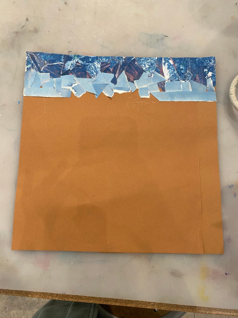
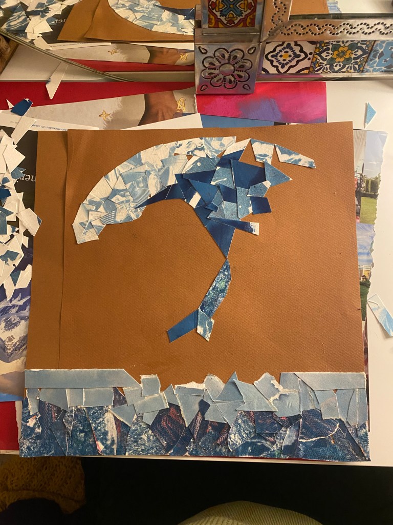
For my collage project, I made use of some old cyanotype photographs and paper, other blue hued papers found in the lost and found box, magazine paper, and oil pastels. I began by cutting the cyanotype photographs into small, random shapes and later doing the same with the rest of blue hued papers. When I began laying the blue pieces down i started with one color (as you can see the darker blues are all together, the lighter ones together and so one) overlapping each other because I love textured art so I knew I wanted to have these random shapes over lapping one another. When I followed with the lighter pieces of blue I still didn’t really know what I was going to create… was it going to be a sky (it was giving sky)? A wave? Add a wave it was. I drew an outline of a wave and continued filling it in with the little cut pieces of textured blue paper. I wanted the textures and different colors of blue in the wave to be uniformed and have some form of harmony so I tried adding different colors of blue (light, dark, textured, not so textured) here and there to tie them all together. To add a one pint perspective I added rectangular pieces of magazine paper inside the wave creating a tunnel-like effect. The surrounding areas were also covered in magazine paper which I then colored over with warm oil pastel colors to allude to a sunset sky. Some magazines I had used as scrap paper where i would test the color of pastels by coloring on the magazine paper. I utilized these scrap pieces in my background as well. Overall, this collage was created using recycled pieces of art.
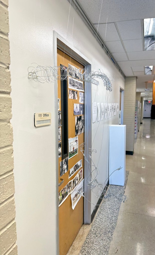
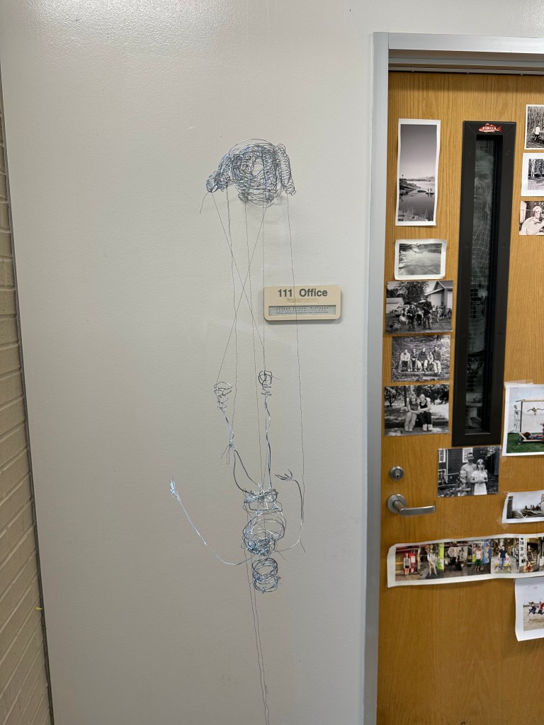
Our idea for this project was to create a story through a hand “controlling” a puppet. The puppet figure is sculpted to be falling down with some strings cut from the hand. This demonstrates the puppet escaping from their controller. We wanted to use line both in the strings as well as the wire figures. We went with a continuous line sort of blind contour style for the figures to give it more “line” qualities. We had initially wanted to install this just laying on a surface with a counter weight in the arm. We then had some help coming to the conclusion that it would look better coming out of the wall. We reinforced it with fishing string holding it from the ceiling, as well as thumbtacks holding it to the wall.
“We have forgotten we are of the planet — Made of minerals and inhaling the breath of trees. A liveable future is contingent upon healing this illusion of separateness. My art offers spaces for reconnection and alignment.“ – Clare Celeste
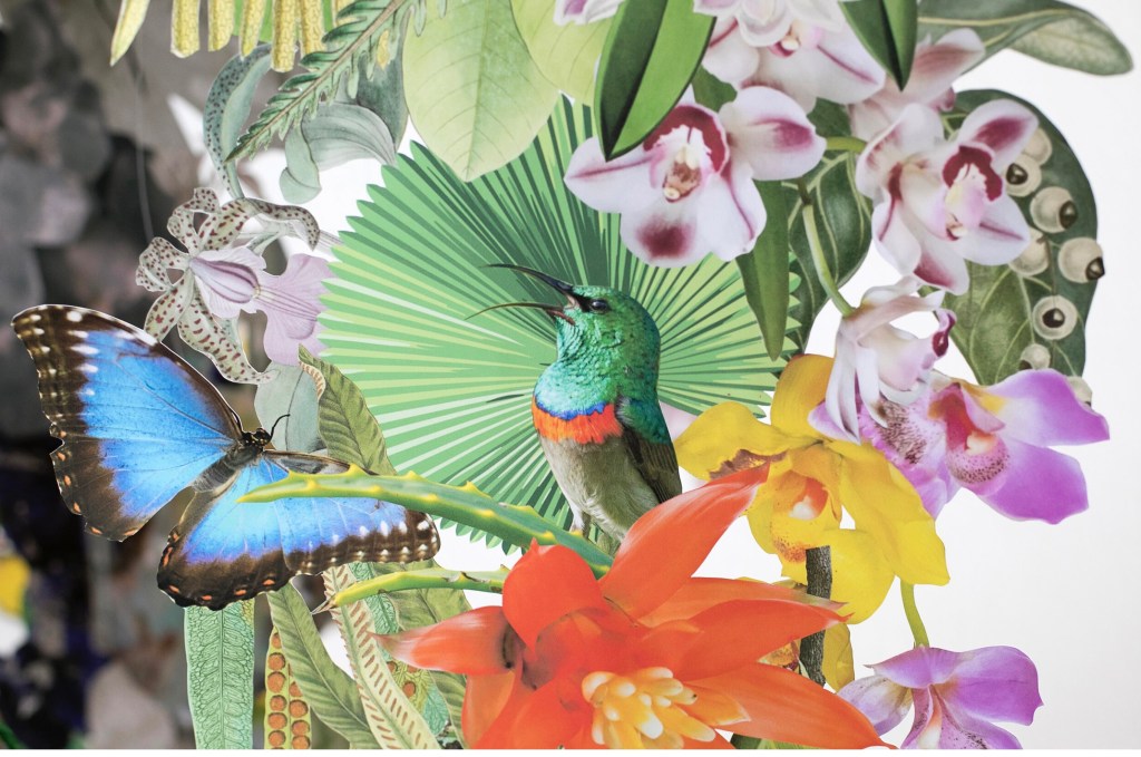
Berlin based collage artist, Clare Celeste Borsch is not only an artist but also an environmentalist. Her installations show great appreciation for our planet’s ecosystems and biodiversity. Through this appreciation she also hopes to bring awareness to the topics of climate change and the prevention of more biodiversity going extinct. In an interview she states that her artwork is a reflection of her love for nature. Fascinated by “the connections between organisms, the intricacies of ecosystems, and the complexity of nature…” she has created her most recent work of art and installation: Biodiversity. This is an immersive art installation made of hand cut paper images of flora and fauna. Borsch states that flora and fauna are reminders that we are “inextricably connected to the larger web of life”. Her ideas stem from having grown up all over the world. She adds that because of this, her life has been a collage of sorts: “For me, it makes sense to collage a Brazilian butterfly next to a North American flower. In my mind, they are intrinsically connected.”
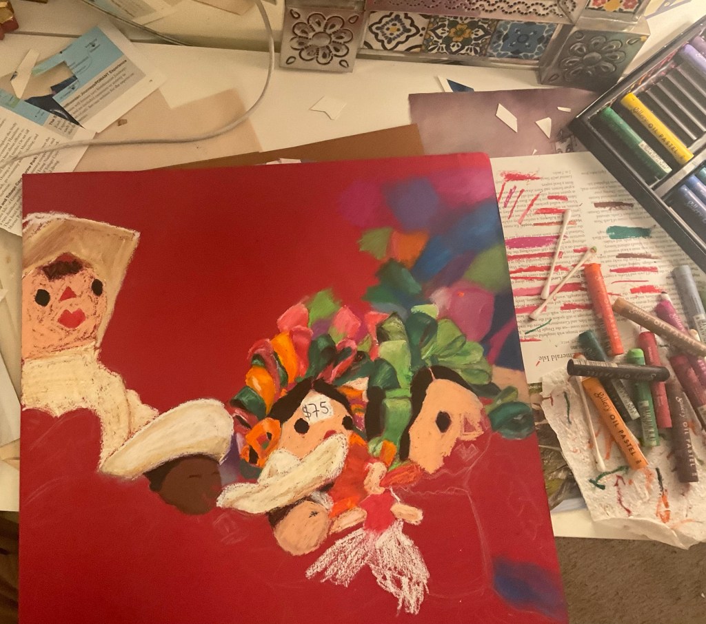
My idea came from a photograph I took of these traditional Mexican dolls known as “Marías’ or most commonly ‘rag dolls’.
This photo was taken using a 5o mm camera lens which allowed for the deep depth of field. I thought this photo was perfect for this atmospheric perspective project because of how in focus the dolls are. I chose oil pastels as my medium because of the softness, variety of colors, and easy smudge effects used to create the blur effect. I began with a thumbnail sketch. I later outlined the drawing on a red piece of paper using a white colored pencil and finally, I went in with the oil pastels. I used q-tips to blend colors, especially in small detailed areas such as the bows.
Sarah Sze, an American born artist, works with various different mediums such as painting, sculpture, video, and installations while also incorporating everyday materials into her work. These may range from found objects to photographs to handmade sculptures and living plants; creating comprehensive and accumulative landscapes that take over walls and stretch across museums. Her works of art take up and transform space through extensive shifts of scale or making use of overlooked and peripheral spaces. Her works also reference the scientific instruments of measurements in an attempt to try and organize the universe by attributing them to a personal system of order. Overall, her works become both a piece for organizing and taking apart information while also serving as a mechanism in locating ourselves to time and space. Her artwork basically alters our sense of time, place, and memory by transforming our experience of the physical world around us all.
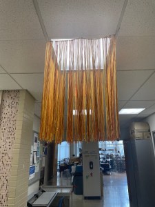
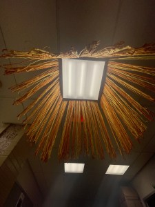
For our line project we knew we wanted to work with yarn and light fixtures. Our original plan was to use balloons to cast molds of yarn dipped in glue, to then create a cage-like fixture around a light source. The yarn cast didn’t turn out like we hoped, so we then decided to create a wireframe and string yarn from. We used yellow and orange yarn in a random pattern and then trimmed then roughly to even lengths. We wanted it to engage with the light, space and each person that walks underneath it.
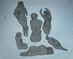
This piece like a lot of my previous is focused on the female figure. I knew I wanted to use tracing paper to layer the figures behind with slits cut in the paper. I then drew figures on upo paper, cut them out, and tucked them behind the slits in the tracing paper. Some of the slits were horizontal and others vertical with the figure woven in between. I also outlined the figure with an ink pen that I knew I could smear and create interesting textures and marks on the figure. I didn’t have a particular vision when placing them I just puzzled them together.