Isabelle Menin

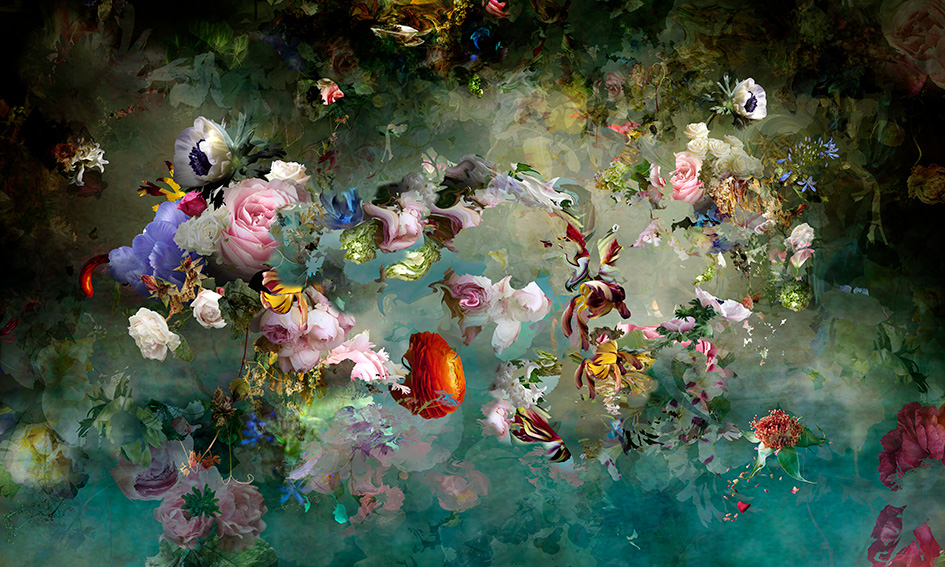
Isabelle Menin is a digital collage artist from Belgium. Her interest in art began when she was just a small child- she attended a theater performance and explained: “Immediately, I was hooked. I fell in love with the sets, the music, the emotions, the intensity – from that point on, my life was devoted to art. I became totally committed to the cause – or at least, to the feelings that it provoked in me.” Once she got older, Menin would go on to attend school at the Graphic Research School in Brussels where she explored painting, graphic design, and photography. Eventually she would develop a great interest in nature, and gravitated towards including natural objects in her work like plants and flowers. The work she does now is mainly digital, and almost always is a flowery composition with beautiful colors and seemingly infinite layers. She achieves this by photographing/scanning her flower subjects individually, then cropping them and layering them, using transparency effects to create a mystical atmosphere. The parts are then moved and manipulated digitally until the result is satisfactory. 

Isabelle Menin, Pink Storm, Digital.
Isabelle Menin, Avant que le monde ne fut roi, Digital.

Collage

To start my collage the first thing that I did was go through old projects that I had to see if any of them would work to be cut up and repurposed. In doing this I found some test prints of a risograph print I made last semester. After finding them I decided that I wanted them to be the main element of collage. I also decided that I wanted the base of collage to be a round shape. From there I began the process of covering the cardboard in newspaper. I also went in with some black paint to make it so the text was less readable because I didn’t want it to be the focus.

I then began cutting cardboard to make backings for each of the frames and also covering them in newspaper. I made small collages that I glued on the back and fit into the frame.

Before attaching the frames I decided to paint some leaves on the back of the collage. At this point I also added leaves/ vines that I cut into the frames. The hand drawn element that I included were some bugs (moth/butterfly, ladybugs) that can be seen in the final image. Ultimately with this piece my goal was to have the frames exist as sort of portals that one could look into. I also wanted there to be a 3D element with the leaves coming off the piece and also have the frames coming off at different depths.

Research Post 3: Grant Wood

Grant Wood was born February 13, 1891, in Anamosa, Iowa. After high school Wood went to The Handicraft Guild in 1910 he later attended the Art Institute of Chicago. Grant joined the military towards the end of World War I where he would create camouflage scenes. 

The style of art that he did was Regionalism. This style is one that I find to be very unique as he focuses on painting the rural midwest, which is where I am from. The painting that Wood is most well known for is American Gothic. This 1930 painting has a male and female in the foreground showing little to no expression while holding a pitchfork. In the background, there is a little white farmhouse with gothic-style windows. 

Toward the end of his life, Grant Wood taught painting at the University of Iowa’s School of Art. In October 1941 Wood was diagnosed with Pancreatic Cancer at the young age of 50. Four months after his diagnosis, Grant died of cancer the day before his 51st birthday.

Today, his art is displayed in museums across the globe. His paintings can be found at the New Britain Museum, the Metropolitan Museum of Art, and in his home state of Iowa where he spent most of his life. 

American Gothic 1930, located at The Art Insitute of Chicago

The Midnight Ride to Paul Revere, 1931 located at The Metropolitan Museum of Art

Research Post #2- Peter Kogler

Peter Kogler was born in 1959 in Austria. His work features paintings, film, and some computer generated art but he is most famously known for his spacial art that engulfs the viewer in the work. Kogler transforms spaces such as lobbies, galleries, and transit centers into psychedelic, atmospheric patterns and lines. When I look at the examples below, it feels as if you are walking through a different dimension, especially with how the walls appear to bend. Most of the works done on walls like this feature black, white and red, creating strong contrast within the paintings. It is a special thing when an artist is able to place the viewer into their artwork like this.

Atmospheric Drawing

Cake- oil pastel

I love dessert and sugar so I thought it would be a fun idea to attempt an atmospheric drawing of bakery items.

Tang Kwok-hin

Tang Kwok-hin is a Hong Kong mixed-media artist with a Master of Fine Arts from the Chinese University of Hong Kong in 2008. Tang’s work tends to be based on “daily and personal contexts to narrate hidden stories” to blend the boundaries of art and human conflicts to express the concerns of human conflicts and their effects on the surroundings. Tang’s work deals with own experiences and personal conflicts such as “growth, inheritance, locality, freedom, urbanization, consumption, nature, politics, norms, existence, etc…”

04:45 PM (2013)

Glass, paper, wood, transparency and adhesive C-print cutout

19.685 x 19.685 inches (50 x 50 cm)

These themes and stories in Tang’s work are based on his own background growing up in a village in Kam Tin which explains his relationship between urbanization and nature. Through his surroundings and introspections of his life, Tang uses his work as a “comprehensive approach to reveal emotions, thoughts and essences deep down at particular moments among chaos” in his life.

Tang uses this connection between art and human conflicts to make collages out of premade objects and materials to give them new meanings by way of exploration and reconstruction.

Image Sources:

TANG Kwok Hin: Needs  鄧國騫《百貨》

TANG KWOK HIN: MIXED MEDIA COLLAGE

Collage

When I heard we would be doing a collage project, I was excited because I do collage work in my free time. My inspiration for this project were the many scraps I’ve collected over the years that have been piling up in my closet; Two pieces in particular I’ve been meaning to use are the floral wallpaper seen in the background of my collage, and the fabric which came from an old book filled with aged textiles. Other materials I used were cut out magazine images, scraps from the St. Eds Art building, seashells, buttons, marbles, and markers. I used a mix of modge podge and water along with hot glue to apply my material to the canvas (13” x 19” sheet of photo paper). For my hand-drawn element of this project, I sketched a little victorian mansion for the top right corner, altered photo tones with green marker, and drew in a few vines.

Collecting my materials
Background layout
Hand-drawn elements

I really liked the vintage feel of the two materials mentioned earlier, so I tried to further emphasize that feeling through the entire piece. I chose to include images that felt old, nostalgic and maybe even a little unsettling to make the viewer feel like they were looking at something from the past, like artwork left behind in an antique shop. Overall, I’m happy with how this piece turned out, from the colors, to the material, to the emotions evoked.

Final Piece!

Collage

This past week we were working on our collages in which we had to incorporate drawing into the collage in some aspect. I started gathering materials by means of large prints that were in the recycling, magazines, newspapers, and cardboard boxes. By scrolling through Pinterest, I found some inspiration collages that gave me ideas as to what direction to go. 

For the backing of my collage, I used a cardboard box which I eventually covered the cardboard with other materials. I started by tearing up a large print in which I found a way that if I tore the paper it could look like snow on the side of a mountain, so I created a mountain range in the back of my collage. Then, from there I wasn’t entirely sure what to put in the foreground of my collage so, I added a lake and some ripples or a current in the lake. The collage was still missing something, so I added some tall grass to emulate a field along the lake. In one of the collages on Pinterest, there were some that had a layer that looked like the newspaper was ripping open to a scene and I thought that it was pretty cool so I incorporated something similar to that in my collage. I found some leftover strips of vinyl to make a frame or border for my collage in an attempt to give it a clean finish on the edge.

Incorporating the drawing aspect into my collage is where I struggled. I was sitting in my apartment during the Texas Freeze the past couple of days and it came to me how I should incorporate drawing. I decided to add some light shading to the edges of the layers of newspaper to give it a little more depth. And that’s the story of how I created my collage for Drawing Into Space.

The first image is after my first day of working on my collage and the second is the final product.

Marjolein Burbank

For this week, I have chosen to research the Dutch artist, Marjolein Burbank. Marjolein’s work moves between textile art and collage art using various materials that can be stitched through. Burbank takes old portraits and paintings and extends the image in an innovative way that deals with issues such as feminism, gender, discrimination, and much more. She would find inspiration from the world around her as well as from her experiences having lived in 26 different countries. Burbank started as a quilter and would make traditional-style quilts as presents for her mom and dad who would ask for only handmade gifts for their birthdays. At the time of her living in Asia, being a traditional quilter no longer satisfied her creative mind as the art there stimulated her to make her own art. She became interested in modern art and began to develop her own style of making fabric art. Marjolein’s big textile portraits took part in exhibitions in Bolivia, Austria, and Thailand.

https://www.instagram.com/marjoleinburbank/?hl=en

Atmospheric Perspective

For our first main project in Drawing in Space, we explored atmospheric perspective. The inspiration for my drawing came from my camera roll- There’s a specific photo in my favorites I’ve always wanted to recreate, and I knew this would be the perfect opportunity. The scene is an abandoned school I photographed in the beginning of 2020, and the eerie fogginess of the scene really contributes to the “atmospheric” component of the project.

I started by importing the photo into a digital art program called Procreate, then I drafted the vanishing points and eye line on top of the image. Once I had a good grasp of the overall composition, I cut a sheet of tan paper down to 15”x 20” and began drawing the lines with graphite in estimated locations. I then drew basic figures like the ceiling tiles, wiring and chairs, and decided to add some imaginary plants in the foreground to emphasize perspective and frame the scene. I continued to refine figures, then slowly built up shading/highlights with graphite and white charcoal. 

If I could change anything about the final outcome of my piece, I would continue to push the contrast (which I worked on after critique) and maybe explore media outside of charcoal that can blend easily without bringing out too much of the paper texture. Overall, I’m satisfied with how this piece turned out. Success!

Before Critique/Going back and building contrast
After Critique