Layers Project

In most of my works I enjoy going big. This project allowed me to do so. I enjoy graffiti art and the controversy behind it. Throughout the week, I was watching the artist RISK do graffiti and was inspired to do something along those lines for my next project. There may or may not be graffiti around austin that I have participated in. I had an easy time constructing this project because I was able to line up the shower bracket things. One thing I wish I would’ve changed was the material of the shower curtains. The paint began to chip after it dried.

Transluscent Paper

When doing research for the last post, I came across an artist named Brooks Salzwedel who creates really interesting nature scenes with translucent paper. She inspired me to draw a foggy forest scene, and I wanted to make it eerie so I decided to overlay it with a face. Most of this project was experimentation, and I used a lot of different mediums (watered down paint, markers, charcoal, graphite) to achieve the effect I was looking for. Since there are so many layers and the tracing paper blurred each layer underneath, it was a challenge to create part of the scene, and then continuously check to make sure each layer was lined up correctly. Most of my process would be making a mark on a layer, combining the layers, stepping back to see what it looked like, and then continuing to alter the overall appearance until I was satisfied with the result. My goal was to have the foreground on the top paper layer, midground on the second, and so on, but towards the end I was working mainly on the top layer regardless. Next time I work with transparent layers, I would like to do something colorful and abstract.

Initial Sketch
Building up layers/value

Layers Project

While looking through my camera roll, I came across a picture of my friend at the park looking through a bubble structure on the playground. I thought the bubble created a cool layer as you could see the silhouette of her body looking through and felt it would be a perfect photo to use as reference for my layers project. The materials I used were a single piece of toned letter paper, archival ink pens, and sumi ink. I drew on both sides of the paper so that the ink on the back side could create the illusion of objects in the distance. 

Window of Visibility – Translucent Layers Project

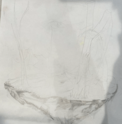
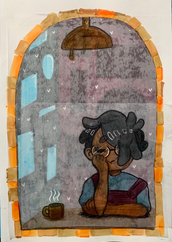
Since there were no real parameters for this project, I decided I wanted to do something relating back to my interest in drawing characters. So, I started by doodling a random character sitting on a table looking out a window. I imagined this person was very tired so they would have a cup of coffee next to them and they would be resting their head on their hand.

I decided that I liked the cartoony and round-looking doodle on the right and went with that doodle for my project.

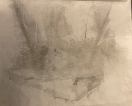
I first experimented with how I wanted the layers to be and look like for this project by making a smaller scale version of it with tracing paper and some of the Translucent paper we got to use. I made a total of 5 layers each serving a piece of the overall project: background of the interior room, a cone of orange-to-yellow light, a ceiling light fixture, the table, and, lastly, the sleepy character with the steaming coffee cup next to them.

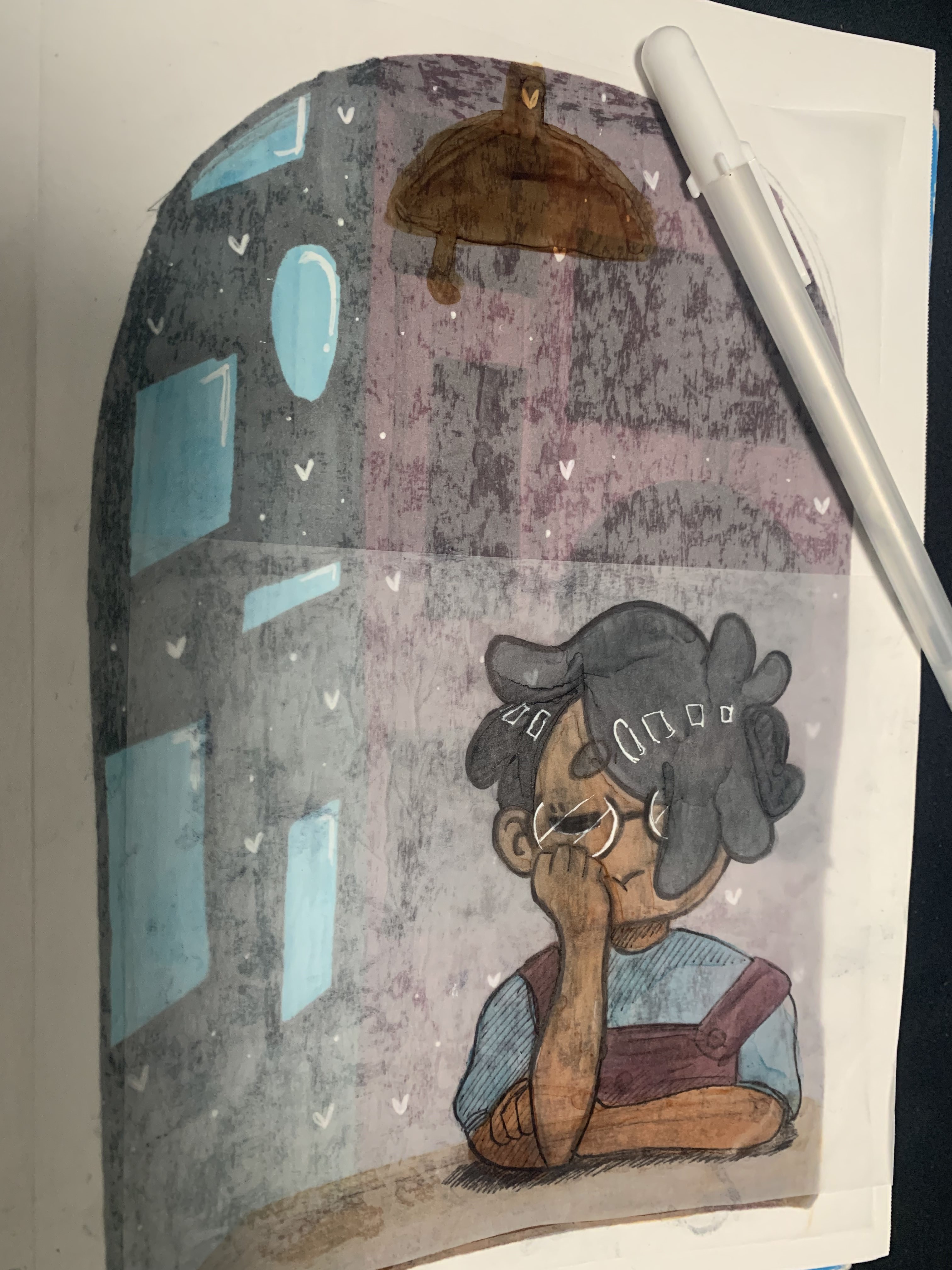
I used some illustration markers I had in my possession to color the layers and used some regular inking pens to outline the some of the elements to standout more and make the piece feel more cartoonish. After I glued the layers on top of one another, I decided that for the final version I would try to use less layers since it became hard to see the interior background at all and I wanted it to show up a lot more than it did in this mini test.

I made the background of the interior room on a piece of Mixed-Media paper from my sketchbook and then made each piece on tracing paper. There was a layer for the ceiling light fixture and the table, and another layer for the sleepy character and coffee cup. As mentioned, I used less tracing paper layers so the background interior room would show up more while also letting the tracing paper layers push it to the back to let the other elements appear more in the mid-to-foreground.

I made the line art thicker on the character and mug this time around and used a white gel pen to make the glasses’ shine and add highlights to the character’s hair. I mainly used a lot of the ink pen and gel pen to make the piece look more cartoony such as with shines, hatching shading, and creating thick outlines around the important elements. To make the piece feel complete, I used the browns and orange illustration markers to make brick patterns around the window to make it look like a piece of a window from a brick home/cafe versus it being a plain floating window.

After a suggestion from Hollis, I outlined some of the other elements to make them pop-out more in the piece like the table and some of the picture frames in the background. I think this made the piece a lot more cartoony and brought in some more elements into view.

Michelle Segre

Michelle Segre is a sculptor who has been exhibiting her work in various places since the mid 1990s. She attended the Cooper Union School of Art and graduated in 1987. Throughout the years her work Has grown to be more abstract. As her work grew more abstract, so did her interest in creating something that was more surreal and played with reality. In her work she uses colored yarns, found objects, metal and pieces of her past works.

Segre began to work more with yarn because she enjoyed how it was something that could be more expansive than an object with bulk and mass. She also grew to enjoy that while string was capable of taking up a lot of space it also was something that could be broken down and stored more easily and generally just take up less space than work she made in the past. Another prominent feature of Segres work is color which  she says she uses as a way to further energize a space. She spoke about how individual colors of yarn represent differing levels of energy that interact with each other. Finally she also uses color to express or induce emotional responses. In the work below she was aiming to create a feeling of rage.

“Red Sun”, 2021, canvas, acrylic polymer, acrylic ink, yarn, thread, wire, lotus root, 125 x 125 x 9 inches, Photo by Mario Gallucci. Courtesy of the artist and lumber room

Citations

http://michellesegre.com/new-gallery/2022/5/15/xtu4lawn18ejhunr7h25wy4jhty721

https://www.derekeller.com/artists/michelle-segre/biography

https://www.artemorbida.com/interview-with-michelle-segre/?lang=en

Translucent Drawing

I started out drawing on the Yupo paper with watercolor paint pens. My original idea was to do something with flowers but time got the best of me so, I started over. When starting over I remember seeing an atmospheric perspective drawing of trees going off into the distance. 

For my final painting, I started by drawing bare trees with black paint with a pathway in the middle on one side of the first sheet of paper that I used. Then, on the other sheet, I was painting I added some brown pretty bare branches with minimal leaves. The back side of the trees with leaves became the front of my entire piece. On this layer, I painted two trees in color with various shades of green. On the backside of my other sheet, which became the back of my final piece I just did some dry brushing of colors that I used on all the other layers to give a darker background to the piece as a whole.

This is the final version of my painting with all of the layers ontop of each other on a light table so you can see the full effect.

Transparency Project

I was sitting in my bedroom watching Twin Peaks, when I started to get bored with the show (if you’ve never seen it, it can be really slow at times.) The idea came to me that I should tape a piece of yupo paper to the monitor and roughly trace the figures as they popped on screen. This was a really fun exercise, the things on the screen moved way faster than I thought they were moving, which made it more challenging that anticipated: but nevertheless I had fun doing it. The resulting image was a bunch of overlapping lines and colors. (I tried to keep the color scheme primary colors plus green.)

After that, I took a piece of vellum and did the same exact thing. On the other side of the vellum: I drew a little self portrait based off an old photo of mine. I glued the vellum to the yupo paper, which made it kinda wrinkly– but I like the texture honestly,, happy mistake. I then trimmed the paper on all sides to give it a cohesive look.

Overall, it’s definitely not one of the best things I made, but I’m happy with it and I had a lot of fun experimenting with transparent paper.

Carl Krull

Since we are going to be making sculptures out of linear materials this week, I chose an artist named Carl Krull. Carl Krull is a Danish artist who grew up creating and surrounded by art, going on to attend the Jan Matejko Academy of Fine Arts in Krakow, Poland. Most of the work he does currently is fully composed of 2D lines twisting and folding together to create seemingly 3d forms. He hadn’t used this method of drawing until one day he stated he was “doing some work with drawing in virtual reality, and found myself drawing in a three- dimensional space,” he said. “It was an eye-opener.” Drawings like his Barrier 04 (see below) take on a topographical feel, “utilizing a striking sculptural technique that break open new territory, showing us our world as if caught by sonar and echolocated in space.” His similar works have been displayed in galleries internationally, and Krull continues to make these unique drawings. 

Barrier 04, 2017

Seismogram VI, 2014

Sources:

https://www.insider.com/danish-artist-three-dimensional-drawings-2018-8#with-the-paper-rolled-around-a-tube-the-images-emerged-as-if-printed-by-an-inkjet-printer-one-horizontal-line-after-another-krull-said-7

Michelangelo Pistoletto

For this week’s research post, I chose to cover Michelangelo Pistoletto. Michelangelo Pistoletto is an Italian artist who is recognized as one of the most influential contemporary artists of his generation as well as a leading figure of the Arte Povera Movement. Pistoletto works with mirrored surfaces such as stainless steel and applies figurative, sculptural, and graphic paintings onto the polished surfaces. The reflective surfaces of his work intend to integrate the viewer and environment into his work, questioning the nature of reality and representation. In the years 1961 and 1962, Pistoletto made his first mirror paintings that reversed the Renaissance perspective by creating an open-up perspective which included the viewer in the work in real-time. These works quickly brought the artist international acclaim and he had solo exhibitions around the world with the most notable institutions being the Guggenheim Museum in New York and the Tate Modern Museum in London.

https://www.nga.gov/collection/art-object-page.164772.html
https://www.simonleegallery.com/artists/michelangelo-pistoletto/

Research #4

This week I chose to research Arturo Herrera. Arturo was born 1959 in Caracas, Venezuela. He studied art at both the University of Tulsa as well as the University of Illinois at Chicago where he received a MFA. In 2003, he moved to Berlin for 11 years for a residency through the German Academic Exchange Service.
Arturo’s practice consists of collage, sculpture, relief, wall painting, photography, and felt wall hangings. He uses fragments of imagery from pop culture. His work is almost in between legible and abstract. When finding and using elements such as books or comics, he enjoys giving the materials a “different” life. Herrera wishes to evoke a memory and recollection from his partially obscured images. His work can be described as both “provocative”and “open-ended”.
Herrera has received many awards such as a Deutscher Akademischer Austausch Dienst (DAAD) Fellowship. He also has many solo exhibitions: Dia Center for Arts, NY, Whitney Museum of Art, NY, and the UCLA Hammer Museum just to name a few.

won’t let me upload photos, so I’m adding his website to view.

https://arturoherrera.org/