Keiichi Tanaami- Research Post 1

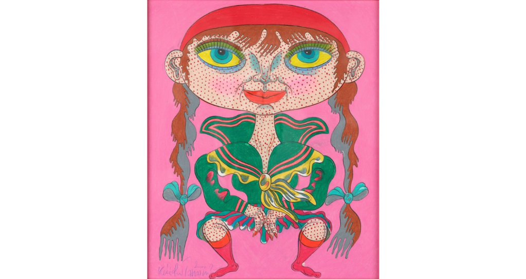
Tanaami is a Japanese artist born in 1936, well known for his style of pop art during the post-World War II era. He is also a graphic designer, illustrator, video artist and fine artist. He uses imagery from pop culture and different references for the 20th century in America. Many of his works are made with color pencils, others use collage, silkscreen, oil paint and sculpture. Much of his work revolved around the psychedelic craze in the 60’s, erotic paintings during the 70’s and soon after Tanaami became the first art director of Japanese Playboy Magazine. At some point in his life he had a near death experience and his work began to center around the idea of ‘Life and Death’.

Here is a link to an interesting interview with Tanaami by Hype Beast Magazine.

Robert Rauschenberg (1925-2008)

Robert Rauschenberg was an American artist born on October 22, 1925 in Port Arthur, Texas. Rauschenberg’s popularity and work started to emerged when he and many other artist were challenging the rise of the Abstract Expressionism movement. 

“I think a picture is more like the real world when it is made out of the real world.” – Robert Rauschenberg

Rauschenberg got his notoriety from his Combines series from 1954 to 1964. Combines was a collection of Rauschenberg’s well-known works that has combined aspects of painting and sculpture from real-world materials and objects combined with abstract painting. At the time, his work made ironic nods to Abstract Expressionism by using self-expressionism to counter the modernist aesthetic as a way of displaying his belief that “painting relates to both art and life.” His works were predominantly mixed media with his main interests being photography and printmaking.

Bed (1955)

Materials: Oil and pencil on pillow, quilt, and sheet on wood supports

Dimensions: 75 1/4 x 31 1/2 x 8″ (191.1 x 80 x 20.3 cm)

Over the following years of life, Rauschenberg’s work would expand to a variety of other fields beyond art such as choreography, printmaking, engineering, writing, and many other fields where he could collaborate with others. This would help to expand his artistic philosophy of collaboration and commitment to humanitarian causes.

Nectar (1993)

Materials: Inkjet dye transfer on paper

Dimensions: 42 x 29 1/2 inches (106.7 x 74.9 cm)

One of Robert Rauschenberg’s most iconic works is that of “Buffalo II” which is a silkscreen painting that ties the world of art and politics together. The work is over 8 feet tall that used a combination of pre-existing pop culture images with the various drips and painterly gestures. Buffalo II served as a bridge between the decline of Abstract Expressionism and the rise of Pop Art movement.

Buffalo II (1964)

Materials: Oil and silkscreen ink on canvas

Dimensions: 96 x 72 in (243.8 x 183.8 cm)

Manon Gauthier

For this week’s artist, I have chosen the Canadian illustrator and collagist, Manon Gauthier. Gauthier is a Montreal-based artist who has over 25 years of experience in art and creativity as well as communications and philanthropy. I came across her work on Pinterest while looking for inspiration for our upcoming collage project and I was in awe of her playful and childlike collage illustrations. The works of Gauthier are done with the use of gouache, pencils, crayons, and paper collaging to create scenes depicting a youthful sense of wonder. Gauthier’s illustrations have been in dozens of children’s books for Canadian and European publishers. You can find her illustrations in the books, “Elliot” by Julie Pearson, “Good Morning Grumple” by Victoria Allenby, “Wash On” by Michele Marineau, and “All the World a Poem” by Gilles Tibo. Gauthier has received numerous awards for her work and has been nominated for the prestigious Governor General’s Literary Award four times.

https://www.behance.net/manongauthier

Amanda Burnham

Amanda Burnham is from Toledo, Ohio. Born in 1979, she focuses on installation featuring scraps of paper with drawings of city architecture. In Burnham’s words, her interest in depicting cities comes from her admiration for the “adaptive sensibility of tinkerers, patchers, foragers, and those who make-do.” (Brunham) One thing that really stood out was her practice of archiving pieces of previous installations and reusing the visual assets in later drawings. I come from a digital practice so to see a similar methodology of reuse of visual assets was really interesting for an installation artist. Burnham will use walls as a pile of trash, or even use street lights as sidewalks, keeping tape and adhesives exposed in order to utilize these tools as a line in the work.

Aside from putting up really amazing work depicting space with a great sense of perspective in black ink. Burnham is currently a professor at Townson University in Rhode Island.

Atmospheric Perspective: color in the darkness

I had a few ideas when I was in class when approaching this piece. I wanted to work with lots of darkness and a splash of color. This is how I decided I wanted to create a girl in bright colors handing something colorful to someone who seems not to happy.

I sketched out a few ideas of this idea before looking online at references I can go off of.

After being set on what I wanted to do, I decided on using charcoal and pastel. I had never used pastels and charcoal sticks which was my true challenge. I didn’t like the outcome of my piece however, I now have more understanding on how these mediums work. The pastels were like crayons and it was hard mixing the charcoal and pastels together without making everything look muddy.

Here is the finished piece. In the future, I hope to come back to this piece and redo it.

Atmospheric Perspective

When I think of atmospheric perspective, the first thing that comes to mind is a field of some sort. Something with a vast amount of space and depth. I wanted to challenge myself with a work that has less depth. I also wanted to do something that takes your eye into a “typical” direction. (Field eyes go back into painting).
Using India ink and water I believe brings out the subtlety of the architectural aspect in this. Architecture isn’t something I typically do, but I found it gave me a sort of “pattern” to go by. Meaning, I could follow lines and shadows easily. The main goal I had was for this to turn out as a piece that was “easy on the eyes” and I believe I did that.

Van Gogh at the Lake – Atmospheric Perspective

Upon looking through the images in my camera roll I felt that none of them really had a clear sense of foreground, middle ground and background which led me to make the decision to combine two images. I first decided on the image of a lake I took in Angel Fire NM as what I wanted for the background but when it came to the foreground I had two possible options that I was considering. The first was an image I took at the Van Gogh Experience and the second was of some lilies. After drawing a few thumbnail drawings I decided to go with the image from the van gogh experience because I wanted to experiment with drawing the large swirl and have it overlap with other elements of the images.

Starting off the drawing process I struggled with the order in which I should approach each section because though I knew starting in the back and moving forward would be a good strategy, I was having trouble deciding what tones needed to be in the background in order for it to push back in space. After working in class I made the decision to start fresh since I wasn’t happy with how I started to tone the background. In the new attempt I started off by working on the sky and really wanted to experiment with filling in the area relatively loosely and did the same with blocking in the different sections of trees in the background. Moving to work on the foreground I wanted to focus on making sure that it had the most variation in tone.

Though for a while working I just wasn’t going as dark in some areas as I should have been which made it so the swirl and houses in the front were not coming forward like they should. After critique I went back in and redefined some areas along with adjusting the size of the lanterns so that they moved back in space. In making areas darker especially the swirl I think I was able to create a more distinct sense of foreground middleground and background.

Atmospheric Perspective: Mr. Shell and His Family

When going through this assignment’s brainstorming process, I went through my camera roll to see if I had any pictures that demonstrated atmospheric perspective. I found a few images that I could see myself using for inspiration for my assignment and then asked the professor which one she thought would be best as I really didn’t care which one I did.

I started my sketch for my drawing a little confused as to how I should approach drawing a conch shell as there are a few of them in my drawing. As I started to sketch out my shells I started to label what colors were in the undertones of each shell so that I wouldn’t have to continuously be looking at my phone at the reference photo. After sketching out my project I started to add color in the form of colored pencil and proceeded to shade and add some dimension by using graphite. I am not yet done with my drawing but, will update you when I am. I think that my drawing would benefit by adding some more texture in the foreground. I was also encouraged to add some more contrast in the foreground. I plan on adding a little more to my drawing before I deem it complete. – Erin

Atmospheric Drawing

For my atmospheric drawing I chose to use a frame from an old video project I did of my little sister as my reference. I referred to the image for the sizing, spacing and objects in the scene, but went off of script and chose a different color scheme. I wanted to achieve a more moody atmosphere and attempted to recreate the kind of weather that happens before it storms. When the sky turns gray, the grass looks yellow, and there’s a cool breeze. 

Continental Club: Atmospheric Perspective

I started this project by looking through some old photos of mine on Lightroom, which is where I found my source image.

I decided to just focus on one panel of the panorama, which is the part with two people on stage and another man looking on. I chose this image because I like the story behind it, the man on the right is going to play on stage next and he’s watching his son’s band open for his.

I was really worried about this project, because my basic linear perspective knowledge is very rusty, but Hollis helped me a lot with getting my angles right. I was also worried that this image was too ambitious because I’d have to draw the human figures and I haven’t studied anatomy at all and have no idea how to draw people properly. My solution to this was to backlight my drawing and have the figures be silhouettes.

After translating what was in my sketchbook, I got a little stuck and couldn’t figure out what was wrong with it. Then I realized I forgot the ceiling.

Lastly, I added the ceiling, fixed some scaling issues and added final details. Overall, I’m happy with it; I want to continue to polish it up but I’m afraid I won’t have time with the way my life has been lately:(