Joao Ruas


joao-ruas-ancestors

Joao Ruas is a 35 year old artist from Sao Paulo, Brazil with a Bachelors in Graphic Design. Ruas’s work focuses on creating mythology inspired landscapes and placing figures into these worlds. The work has an ethereal quality as the figures are created in a realistic style, but are placed in ways that are mythical. Below is ‘Hercules’ which has the figures located within the lion’s head. The lion’s head is almost enveloping the figures like a cloak, but the main figure seems slack with exhaustion. ‘Hercules’ like much of Ruas’s work juxtaposes elements of realism with a dark world of fantasy.

joao ruas2

His work combines a dystopian landscape with ethereal figures that transcend the space and composition. The figures intermingle with objects within the space. Although his work is not limited to graphite, his work has always struck me as drawings. Very meticulous and well articulated drawings of the figure. His compositions are intriguing and balanced. The mystery of them draw you in to further explore the fine details he has included for the viewer to decode the story.

tumblr_mzewpaQymv1qzmdato1_1280

McColl Open House – Thoughts

I found my visit to the McColl Center Open House to be very unique and interesting. This is the first major opening event for a gallery I have been able to attend that wasn’t necessarily UNCC related. Being a part of the bustling, jazzy atmosphere and getting to look over all the artwork was very intriguing. Seeing Hollis’s studio was particularly cool, as I got to look at some of the work she had shown us in class in person (I especially liked the large-scale graphic novel). I also enjoyed the oil paintings of Vicente Hernandez, whose large, colorful, and detailed paintings were rather impressive. All in all, I think it was a pretty cool night, getting to have social interactions with peers outside of the classroom, as well as seeing all the new work from up and coming artists. I’d definitely like to attend events like this in the future.

Dan & Jenny’s Wall Installation

This installation was created by each one of us reacting to the others previous move. First we started of with a grid using the alignment of the brick and stings, after which we started take turns placing an object onto the wall. when it was one of our turns, we used the placement of the object as a reaction the the previous. Our installation was more about the process of creating rather than an actual concrete concept for an idea. This is actually our third attempt at building this installing due to building restrictions and regulations of the Rowe building. The second attempt was still based off of lack of concept, which was scrapped more of from a lack of communication and reaction. The color scheme coincidentally similar to Lunar New Year and was just in time for it. After adding on the main structures of this installation, we decided to add other elements such as ribbons, and a small crane for accents. Most of the extra ribbons was draped or tied to make certain cardboard structures pop more, but also complimented the brick background.

image.jpeg

McColl Visit

The visit to the McColl center’s event was rather enjoyable, especially since a decent number of my classmates also attended. The downstairs reception gallery had a varying mixture of 2D and 3D works on display however I was more drawn to the works that were spread out near the artist’s studios. One of the artists, whose name I’ve unfortunately forgotten, had done a series of laser cut images in glass that depicted planet-like shapes. The artist used the repetition of the images to create a greater image yet allowed each individual image to stand out for its own unique traits. The images, while being seemingly related yet also unique, held me as a viewer longer because I wanted to explore each one and related it to others near it. Also I thought that Hollis’ work took full advantage of the wall space in a few of her pieces and stood out among others. The ink drawings on vinyl were my favorites because your understanding of the drawing changed as you got closer and you saw the texture was not paper and the line work was not all the same type of medium.  I think Hollis’ work also resonated well at the McColl center since it too had experienced a fire early in its history and moments of disaster like that are reflected in her work.

HEESEOP YOON

Heeseop Yoon was born in Seoul, South Korea, and currently resides in Brooklyn, NY.  In 1999,  Yoon received her BFA at Chung-Ang University, Seoul, Korea.  In 2004, Yoon got her MFA at the City College of New York, City University of New York, NY.  And in 2005, Yoon graduated from the Skowhegan School of Painting and Sculpture, ME.  Yoon creates massive pieces that usually span across entire walls.  Her inspiration is derived from real life spaces that are extremely cluttered and messy.  She says that she tries to find places where there are items from all different time periods, and no humans, so it is hard to guess what time the work takes place in.  In order to create her giant wall drawings, Yoon uses black tape, she says that it is her way of “freehand drawing.”  Yoon uses the additive method to create her installations.  One problem that arises is that when Yoon has made a mistake, in the final installation, it is quite apparent. When creating these massive installations, Yoon is testing both the perception of herself and the viewer and the adjustments that take place.  She finds it interesting that the more fixes she makes on her installation, the less understandable her piece becomes.


mixedgreens2.jpg
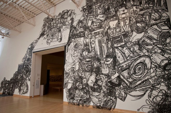
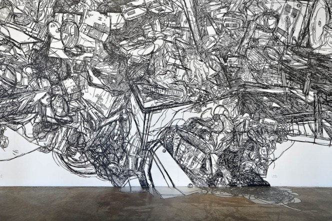
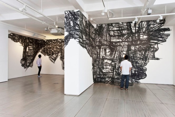
Still life with Electric Cords, Black masking tape on Mylar, Dimension Vary,2013

“Heeseop Yoon | Artspace.” Artspace. N.p., n.d. Web. 07 Feb. 2016. <http://www.artspace.com/heeseop-yoon&gt;.
“HEESEOP YOON.” Image –. N.p., n.d. Web. 07 Feb. 2016. <http://www.heeseopyoon.com/#/0&gt;.


Julie Mehretu

People Places Exchanges- McColl Opening

McColl Center Opening February 5, 2016

I went to the McColl opening of the People Places Exchanges: Art as a Visual Voice exhibition. There were a lot of people at the gallery opening when I went, so it was pretty crowded, especially around the food. I thought that the oil paintings of Vincente Hernandez were really beautiful, especially the one related to Charlotte. There were many awesome works displayed but the crowd made it hard to look at for long, so I made it my mission to go look upstairs at the studios.

One of the artists that I found interesting was Ivan Toth Depena. He was in a studio upstairs and he had these three large mixed media series that I really enjoyed. They were made up of abstracted lines with large block of color on the bottom quarter of the panels.

I went to Hollis’ studio and saw the works from presentation on the first day of class. I really liked the large scale and spatial dimensions that the work has. As someone who likes narrative works, the large comic strip was definitely one of my favorites.

Post by: Rebecca Lempereur

Heeseop Yoon

Arts/Industry Pottery Kohler

http://assets0.madewithcolor.com/2013/05/24/17/09/23/879/ex.lin.2012.0230.jpg Still Life#12, 1/4” Black Masking Tape on Mylar and Wall, 24’x48′, 2012

Heeseop Yoon creates large scale installation drawings and has been exhibited in many galleries in NYC and Korea. Yoon was born in Seoul, Korea and now lives in Brooklyn, New York where she makes her artwork. She receives her BFA in 1999 at Chung-ang University in Seoul, Korea and then her MFA in 2005 at City College of New York.

yoon 6http://assets2.madewithcolor.com/2013/05/24/17/09/28/833/Junkshop_Skowhegan._view1.jpg Junkshop-Skowhegan, 1/4” Black Masking Tape on Mylar and Wall, Dimension Vary, 2006

Much of Yoon’s work is made of black masking tape on Mylar and then installed into a space. She considers her work as “freehand drawings” which I think is interesting and accurate. I was really drawn to her work because of the dimensional, sketchy images she creates with the tape. They create space within the drawings with overlapping of lines and emphasis on some directional lines. These remind me of forms that resemble cityscapes, which probably help with the illusions of space. One thing that I also like is the way Yoon uses the installation space as part of the work. As can be seen in images below, the tape is immersed into the space and wraps around with it. It almost becomes a part of the wall and environment because of the wrapping and the wall showing through as negative space in the images.

http://michaelsteinbergfineart.com/editions/artist/heeseop-yoon

http://www.heeseopyoon.com/

"Still Life #11" by Heeseop Yoon at Smack Mellon

http://assets3.madewithcolor.com/2013/05/24/17/08/47/893/120125EFrossard_SMellon_HYoon_8201.jpg Still Life#11, 1/4” Black Masking Tape on Mylar and Wall, 24’x60′, 2012, at Smack Mellon

"Still Life #11" by Heeseop Yoon at Smack Mellon


yoon 4http://assets3.madewithcolor.com/2013/05/24/17/09/13/14/ararioimage1.jpg Storages, 1/4” Black Masking Tape on Mylar and Wall, Dimension Vary, 2010

yoon 5http://assets1.madewithcolor.com/2013/05/24/17/13/38/72/15.Junkshop_Skowhegan_2.jpg Junkshop, 1/4” Black Masking Tape on Mylar and Wall, Dimension Vary, 2006


Madoka Kinoshita

015
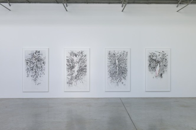
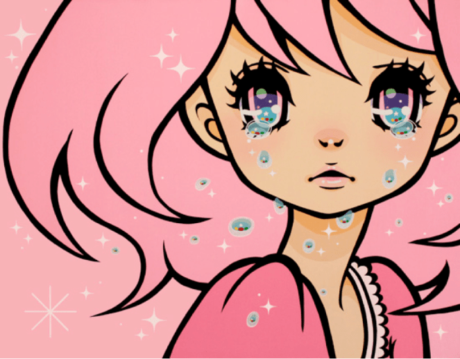
Madoka is a Japanese artist living in Osaka. Her main subject matter is people in manga styled paintings. The people don’t appear to be anyone in particular but rather just tropes of manga characters. The heads and eyes are massive in comparison to the rest of her body. What makes her style so unique is how solid her color is. It looks like a digital drawing printed on canvas. In order to get the crispness of lines she masks off areas, working one color at a time. She will then peel off the tape and tape off a new section. The labor of love produces wonderfully graphic paintings. She updates her YouTube channel with current projects and shows you her process.

She exhibits her work a couple times a year around Japan. Most shows seem to take place in Osaka and Tokyo. She sells original pieces, books, prints, and some novelty products on her website.

IMG_5826Untitled011

Her Official Website

Her Blog

YouTube Channel

Alphonse Mucha and mood

Alphonse Mucha is an extremely influential artist and very well known for his unique style. His work focuses on a stained glass style, often depicting a figure in the forefront, and focusing on a single set of colors for each piece.

I want to talk about his usage of color and lines towards a specific mood, without the aid of scenery.Pieces such as “Four Seasons” or “The Slav Epic” have such depth in their composition and usage of light and colors, that even without much context these images carry a Hand a mood that seem to be unique to them.His usage of space,composition and color are all major aspect of the mood created by his pieces, and the stories they carry,being that he is one of my major influences,I hope to use one of these aspects from his work for this project.

Poetry - Alphonse Maria Mucha - www.alfonsmucha.org

Night's Rest. From The Times of the Day Series. 1899 - Alphonse Maria Mucha - www.alfonsmucha.org

Hamlet - Alphonse Maria Mucha - www.alfonsmucha.org

Four Seasons - Alphonse Maria Mucha - www.alfonsmucha.org

The Slav Epic, 1928 - Alphonse Maria Mucha - www.alfonsmucha.org

Source:

http://www.alfonsmucha.org/